
HandoffProduct
Handoff
A sublease marketplace for students that shows how much you save on every listing.
Handoff started with a survey. We asked 47 students across four Los Angeles campuses how subleasing had gone for them. 81% had struggled to find someone to take over their lease, and most ended up posting on Facebook or Craigslist and hoping.
Those places are built for everyone, so they work for no one in particular. You cannot tell who is a student, a listing says nothing about semester dates, and nobody can see whether the deal is any good. So we built a market for this one job.
On Handoff every listing comes from a student with a verified campus email, and every card shows exactly how much you save against the original lease. Today it is live across 22 campuses in the Los Angeles area.
- 47
- students surveyed
- 81%
- struggled to find a taker
- 22
- campuses live
- 11
- releases in two days
What we built
- The research, the product and its design system
- A full screen map with price pins, clusters and walk times
- Savings against the original lease on every card and pin
- Student only sign up, with the school read from the email
- Listings that hide the address until you sign in
- Smart import from a post, a screenshot or a PDF
- A phone layout that follows iOS conventions
- A homepage that replays the app as you scroll
- An internal dashboard, backups and one command releases
Where it started
The survey said more than the headline. 64% of the students had defaulted to Facebook Marketplace or Craigslist, and 59% had a bad subleasing experience behind them. Missed handoffs, rent paid twice, the odd scam.
The first two versions were quick prototypes, built to test the idea. In September we rebuilt it from a clean start as a React app with a small Express server, its own database and photo storage, and moved it onto a server of its own.
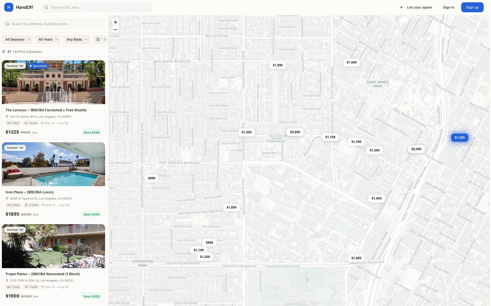 Before
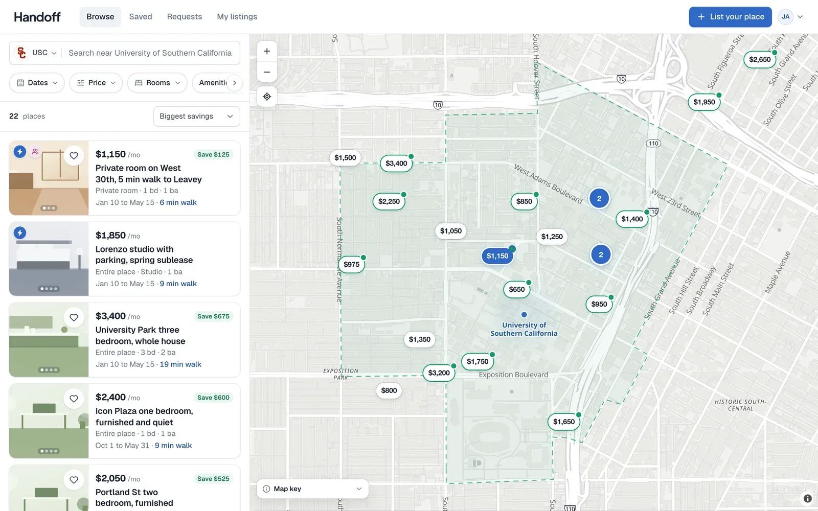 After
AfterA map you can live in
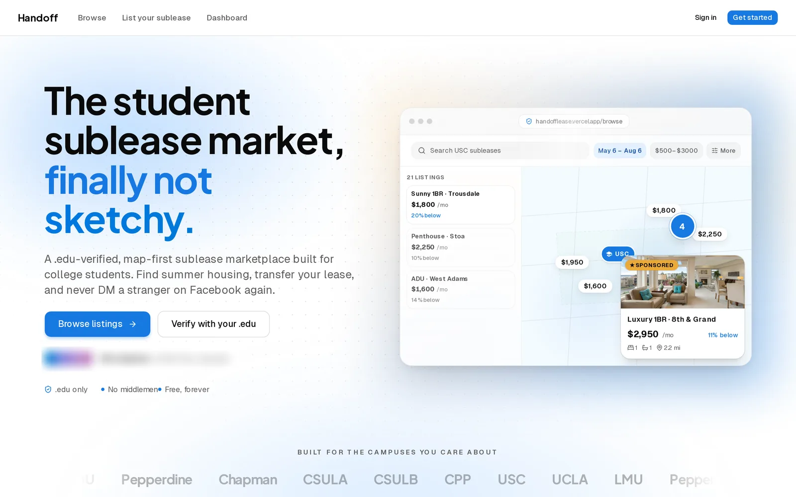
Browse is the whole product, so we gave it the whole screen. Listings on the left, the map on the right, and a divider you can drag, double click to reset, and that the browser remembers. Filters for dates, price, rooms and amenities open as small popovers.
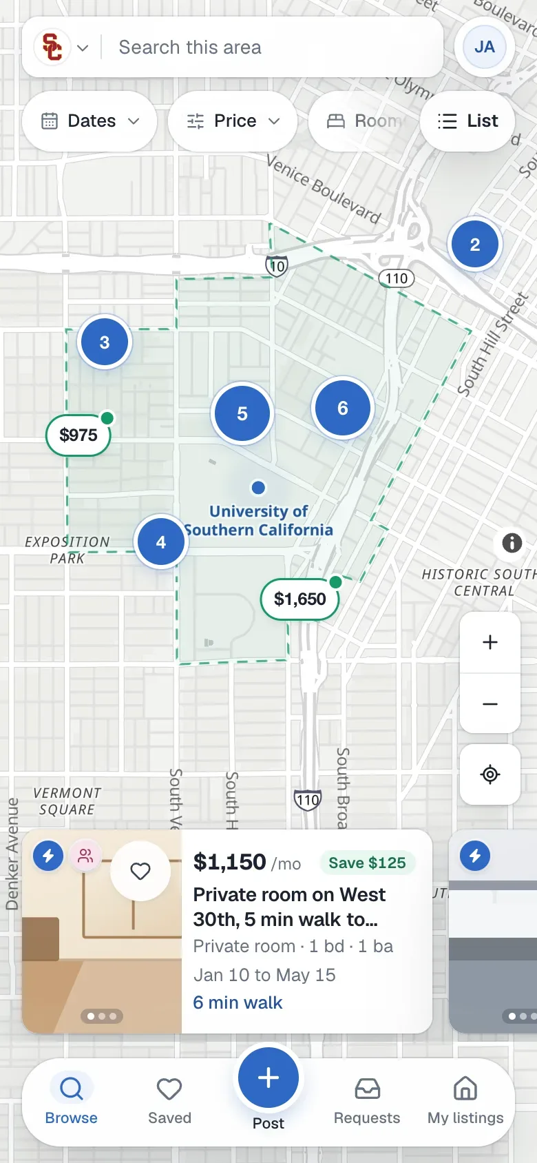
Prices sit on the map as pins. Zoom out and they slide together into cluster bubbles, zoom in and they spread apart again. Hover a card and its pin lights up, hover a pin and a preview card opens beside it.
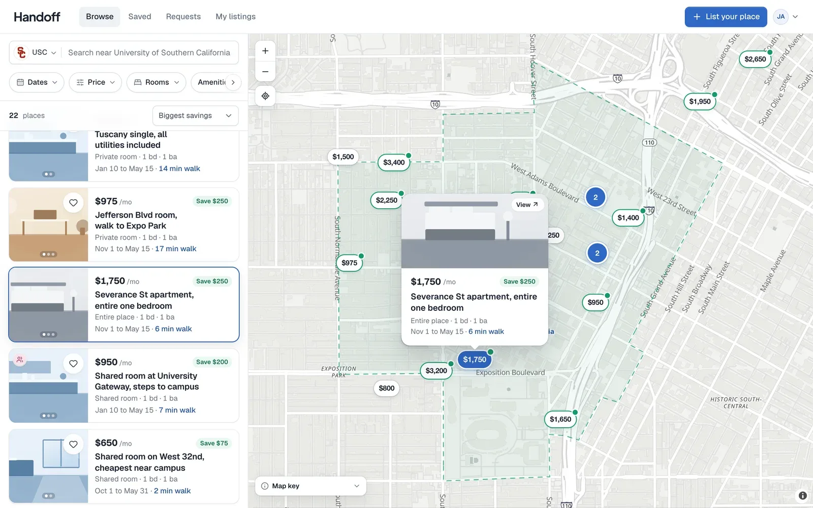
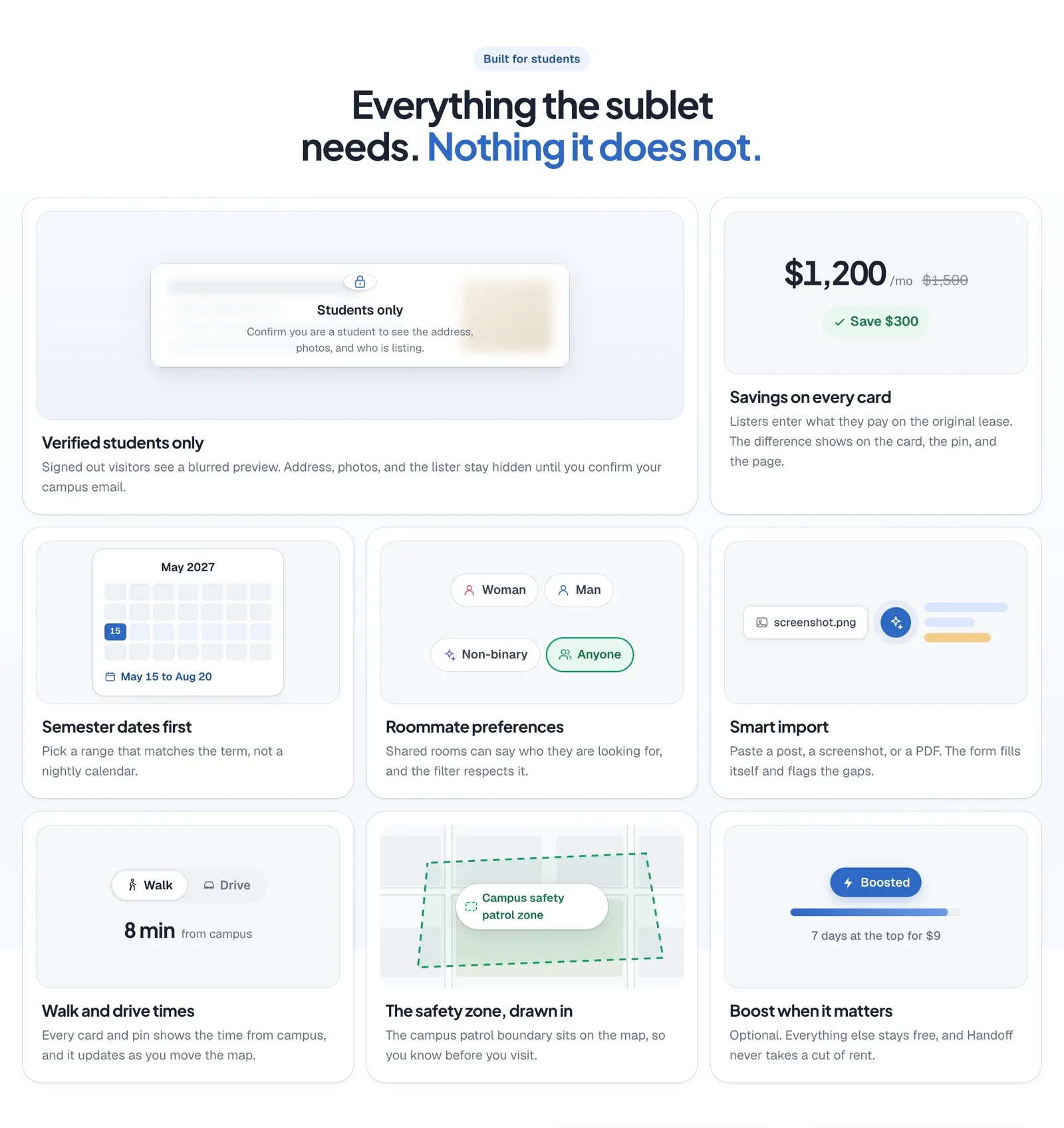
The list follows whatever the map is showing. Each card says how far it is from campus on foot or by car, like 12 minutes walking, and the default sort is the closest first.
Near USC the map also draws the campus safety patrol zone. We traced it from the coordinates the university publishes and checked all 16 of its turns against street intersections, each within 24 metres. It shows where patrols go and makes no promise beyond that.
The savings, on every card
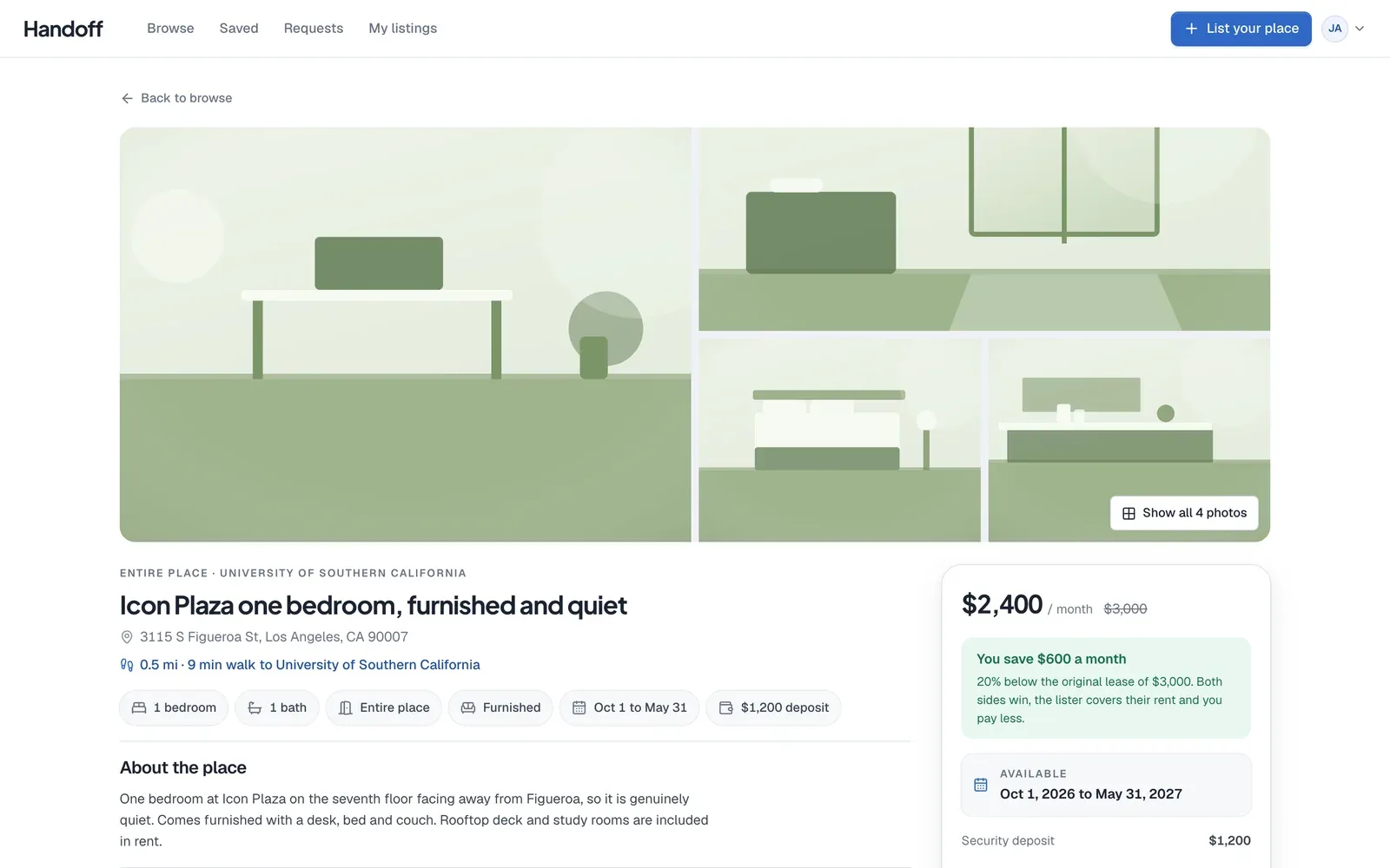
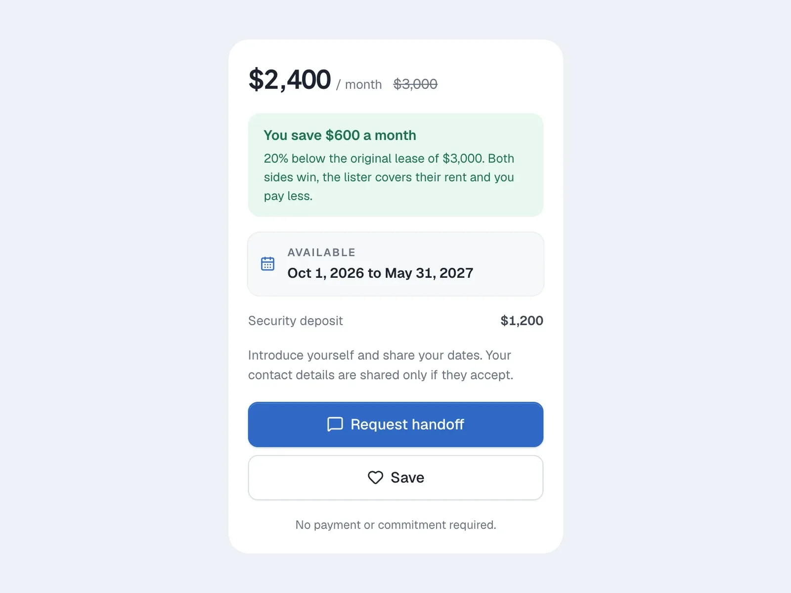
A student leaving a lease can enter what they pay on it now. When the asking rent is lower, a green Save tag appears on the card and on the pin, the listing page explains the difference, and a Biggest savings sort brings those places to the top.
It is the one number both sides care about. The student leaving stops paying for months they will not use, and the student arriving pays less than the going rate.
Only students, and only what you need
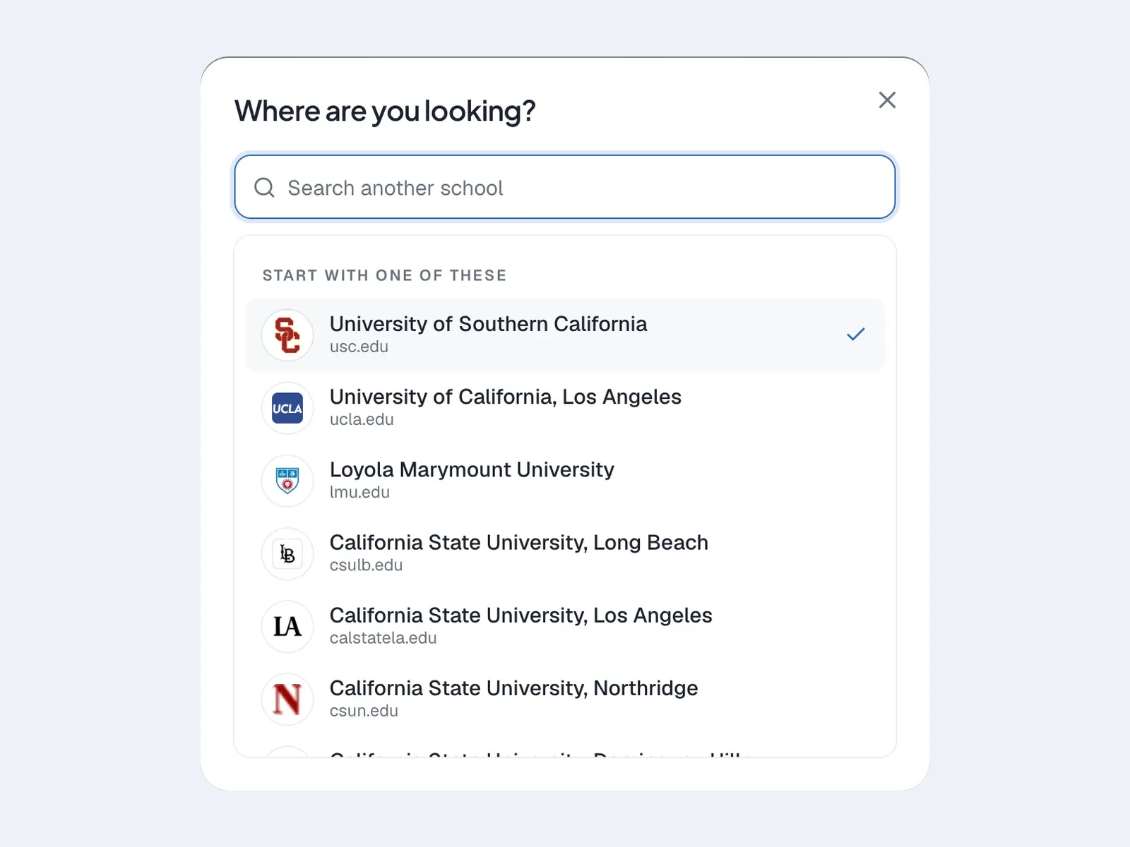
Sign up asks you to confirm you are a student. Your school is worked out from your campus email, out of 2,315 schools, and a six digit code or an email link verifies it. Anyone can browse, and students at live campuses can post.
Before you sign in, a listing shows its photos, price, facts and dates. The address, the description and the lister stay on the server, and the pin is moved by up to 250 metres and drawn as a soft circle.
Emails stay private until a request is accepted. Students can also share a phone number, Instagram or Facebook, one channel at a time and only once they say yes.
Listing without a blank form
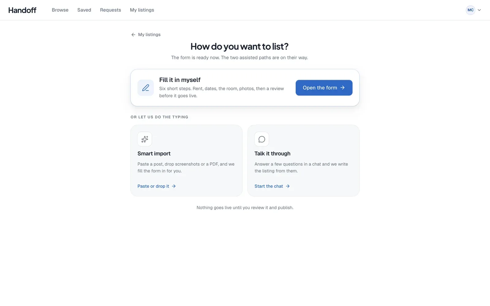
The blank form is where most people give up, so listing starts with a choice. Paste an old post, drop in screenshots or a PDF, and Smart import fills the form for you, ringing anything missing in amber. Or talk it through in a short chat, one question at a time, or simply fill it in.
Typing an address drops the pin for you, and you can drag it to adjust. Dates come from a calendar we designed for semesters. Shared rooms can state a roommate preference, and entire places are always open to anyone, as fair housing rules require.
Made for the phone in your pocket
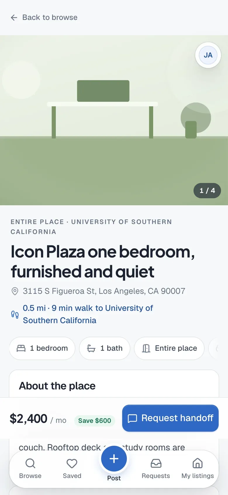
The phone got a design of its own. A full screen map with a carousel of cards that recentres the map as you swipe, one button to flip between map and list, and a floating nav that hides as you scroll.
Every screen follows iOS conventions. Grouped forms, large titles, sheets with a grab handle, touch targets at least 44 pixels, and inputs at 16 pixels so the phone never zooms in on you.
One design system
Every page draws from one set of tokens for colour, radius, depth, spacing and motion. Geist for reading, Plus Jakarta Sans for headings, white surfaces and one brand blue, which a design review nudged darker so its text passes contrast.
Motion is quick and quiet. Hovers take 150 milliseconds, panels open in 250, content rises in with a 40 millisecond stagger, and every button gives a little when pressed. Anyone who prefers less motion gets none.
A homepage that shows the product
The homepage is a replica of the app itself, built in plain HTML and set on a soft sky. As you scroll, the real browse screen rises into view with its cards and pins, and the details float out to its edges.
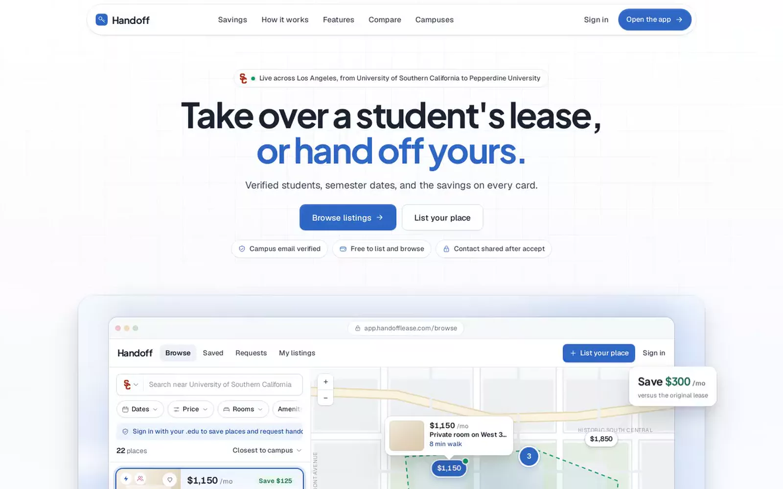
Further down, three short demos play on their own. A pasted post turning into a listing, the map with its walk and drive times, and a request going out. A table then compares Handoff with the other ways students sublet today.
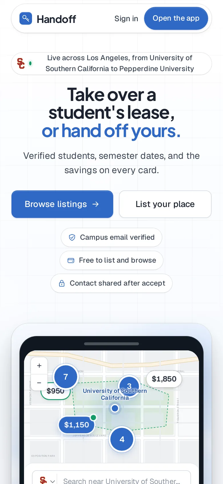
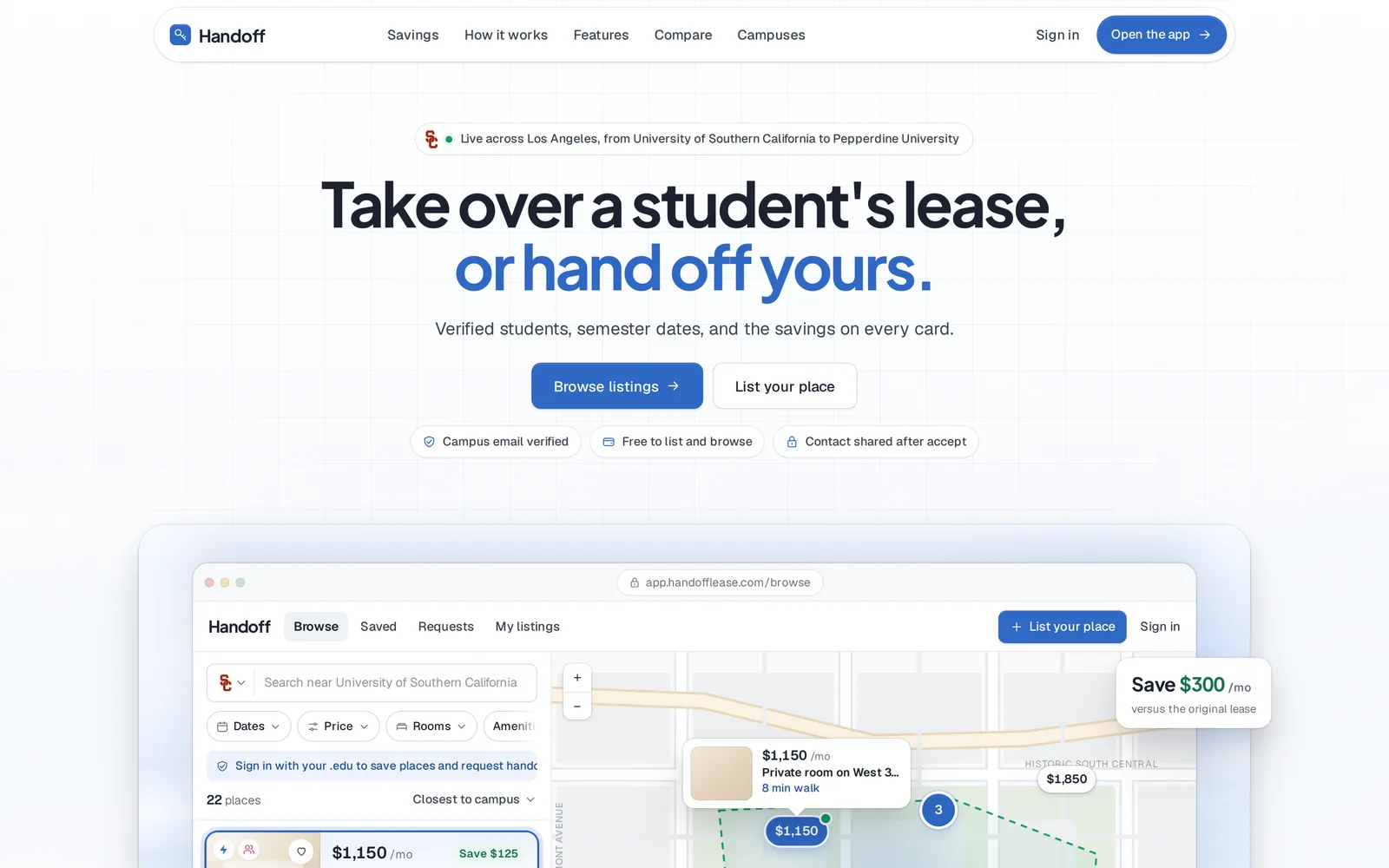
It is plain static HTML, quick to load and easy to crawl, and it carries its own title, description, canonical address and link preview, so it reads well to a search engine and in a shared message.
Running it
Behind the product there is an internal dashboard on its own address, open only to a short list of admins. It charts the last 30 days, and covers accounts, listings, requests, reports, the waitlist, AI usage and the health of the server, with an audit log.
Each release is one command. It runs the tests, builds, backs up the data, switches over in one step and checks that the right release is answering. By the eleventh release the suite had grown to 75 tests, and the database and photos are backed up together every day.
Terms and a privacy policy are written in, and acceptance is recorded before anyone publishes a listing or sends a request.
What is next
Listing and browsing stay free, and Handoff never takes a cut of rent. A Boost for listers in a hurry is built and free during launch, ready for payments when they open. Alerts for a chosen budget and area are next on the list.