
Magic Box LARedesign and rebuild
Magic Box LA website
A new website for a 220,000 square foot event campus in Downtown Los Angeles, built to show the space and to turn visits into bookings.
Magic Box came to us through ShoSoft. Wayne Fernandez runs both companies, and Magic Box runs its events on ShoSoft's software, so we already knew the team. In early June he wrote to us about the marketing site.
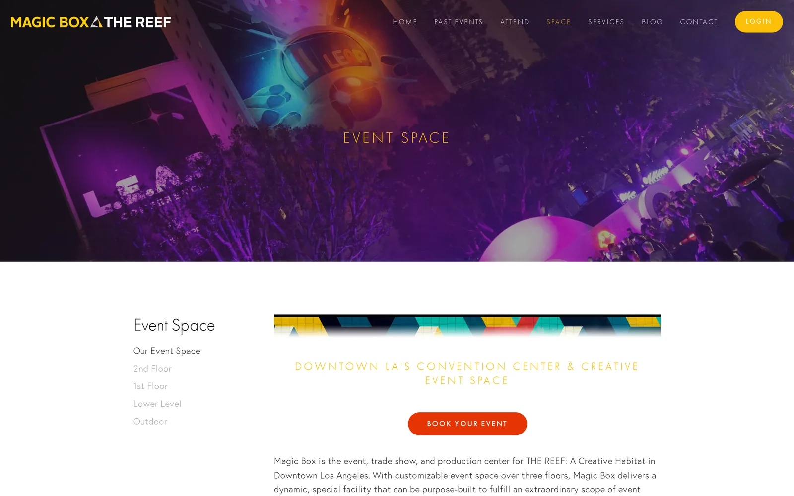
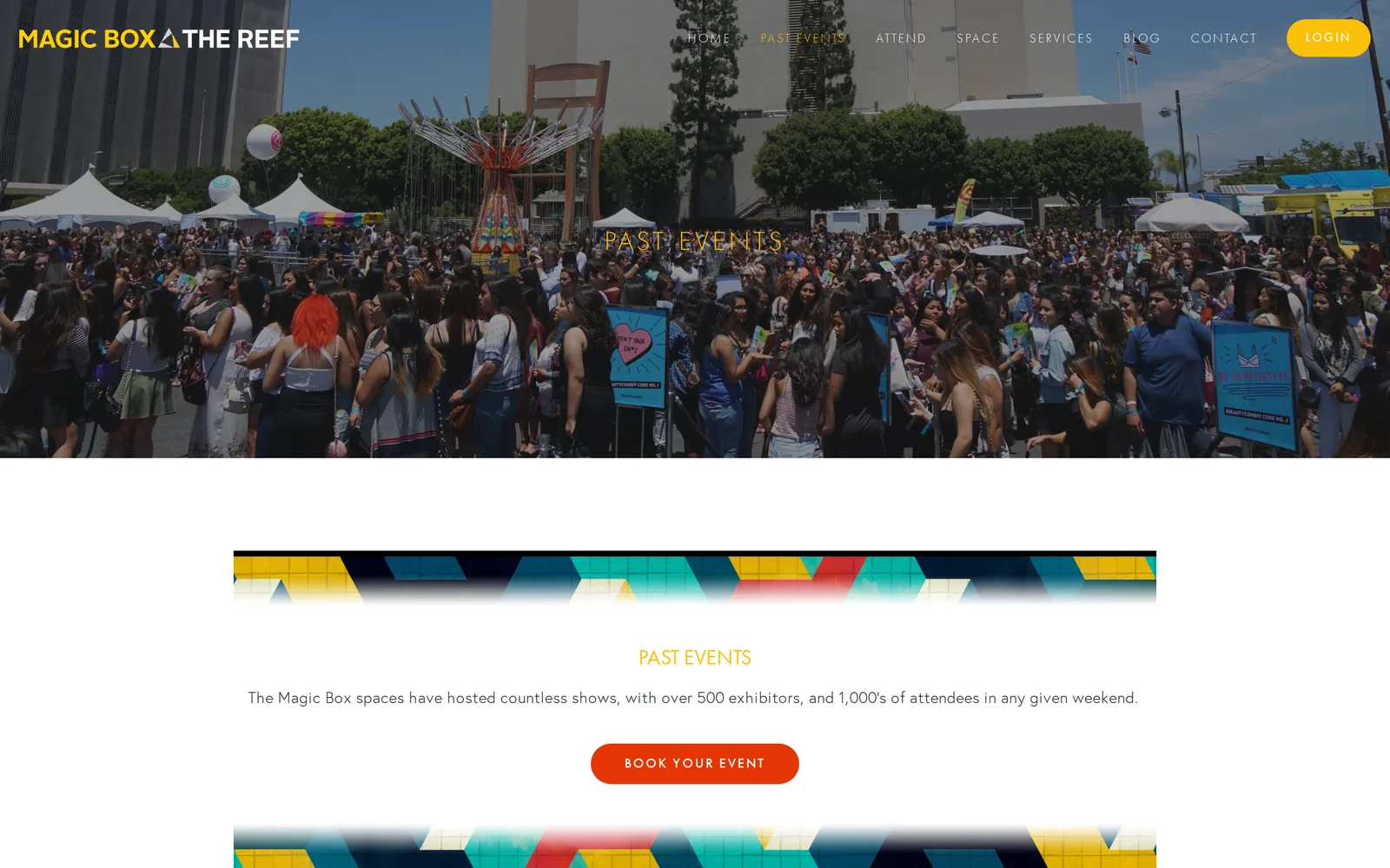
Magic Box is an event campus in Downtown LA, with three indoor levels and 100,000 square feet outdoors. Adobe MAX, SEPHORiA and IGN Live have all been staged there. The website still looked like the old business. It was a Squarespace site under the old name, Magic Box at The Reef, with the old brand, a long list of service pages, and a square footage that no longer matched the building.
They had a new brand book, a new way of describing themselves as much more than a venue, and a sales team that wanted every download and inquiry to land in their CRM. They asked for a site that felt like the events held there, with photography and video doing the talking, a clear way to explore the floors, and lead capture that their marketing agency could measure.
- 7 weeks
- from deposit to launch
- 14
- pages designed and built
- 36%
- lighter images
- 11
- screen sizes checked
Very excited to get this live, it looks amazing, you should be proud of your work here.
What we did
- Design from their 2026 brand book, every page
- A hand built site with a scroll driven homepage and venue tour
- A floor by floor venue explorer drawn from the real floor plans
- Four spotlight case pages and a past events video wall
- Email gated decks and an inquiry form that feed their CRM
- An editor with live preview, hosted on their own server
- SEO and AEO, with every old address redirected
- GA4, Google Ads and LinkedIn conversions, with consent
- Image, font and layout work for speed on every screen
- A full audit before launch and support after it
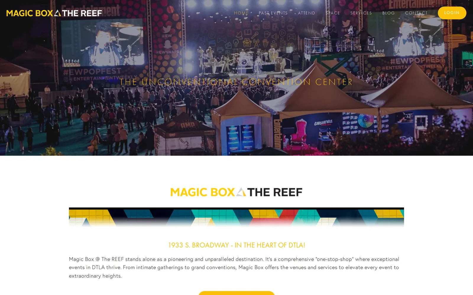
Starting from the brand
Their designer had just delivered the brand book, so we treated it as the rulebook. Headlines are set in Instrument Serif, with an italic accent word in their yellow. Small labels, buttons and captions use Swiss721 Condensed in wide tracked capitals. The palette is yellow, dark grey and cream, with red, purple and green as accents, and nothing outside it.
From there we built a small set of patterns and used them everywhere. Full screen photo heroes that soften and fall back as the page slides over them. Headlines that rise in word by word. Numbers that count up when they come into view. One call to action card, framed in the brand gradient, that closes every page.
We designed in Figma first and put up a quick Framer build for review. The floor explorer, the homepage motion and the CRM forms all needed custom code, so we rebuilt the site by hand with the Figma design as the reference. Each round of feedback from the Magic Box team came back as marked up screenshots, and we put every change live as soon as it was checked, so they could review it in a real browser.
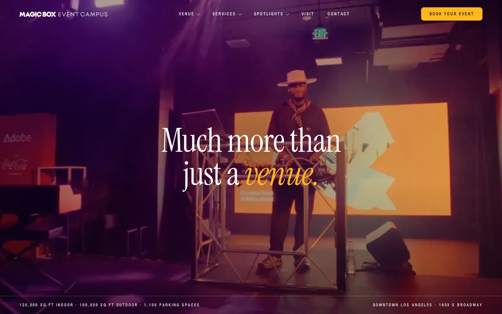
A homepage that opens like an event
The homepage opens on a short loading curtain with the wordmark, then fades to their event video. The curtain waits for the hero to be ready, so nobody sees a half loaded page, and it never shows at all when the page is already cached.
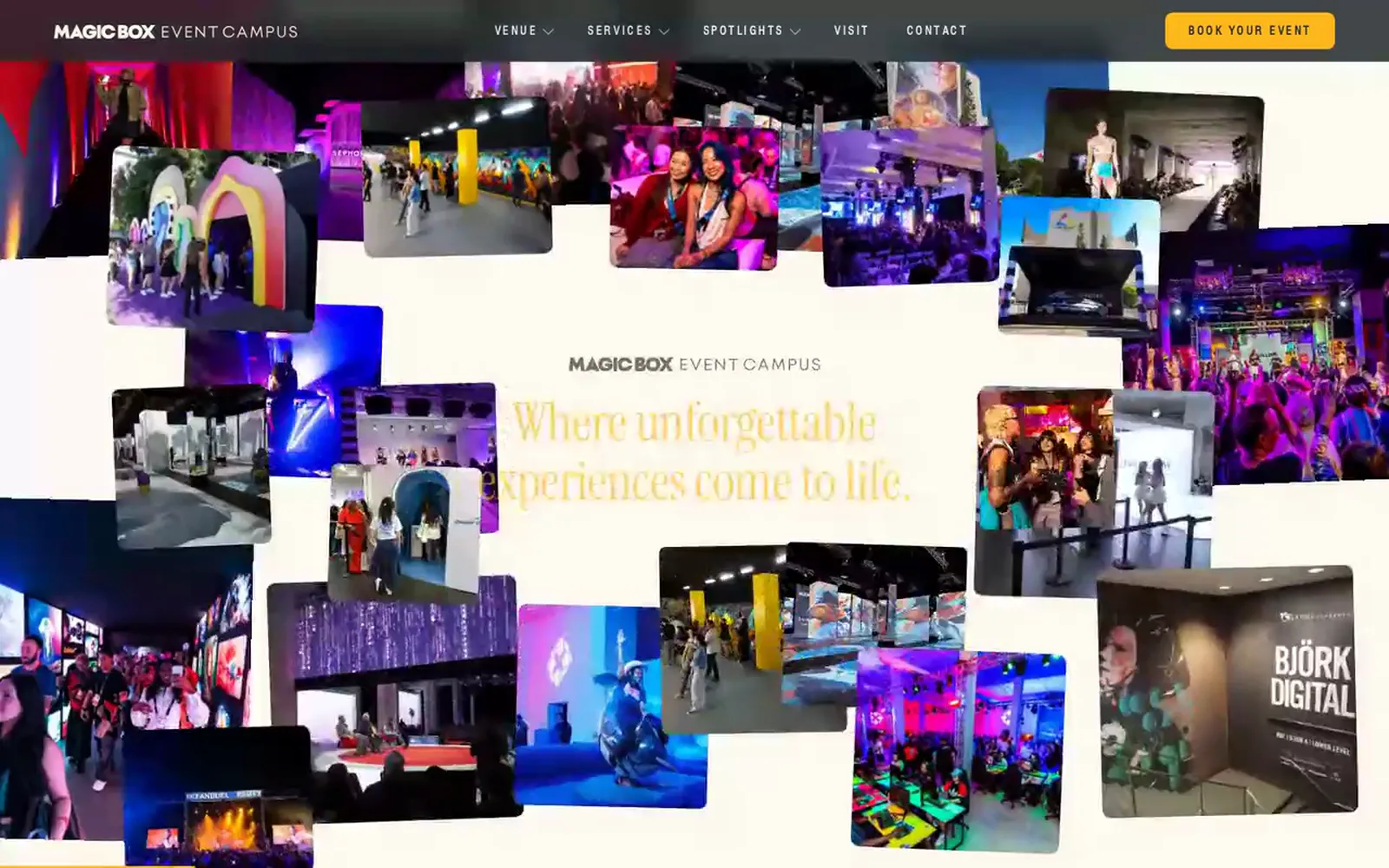
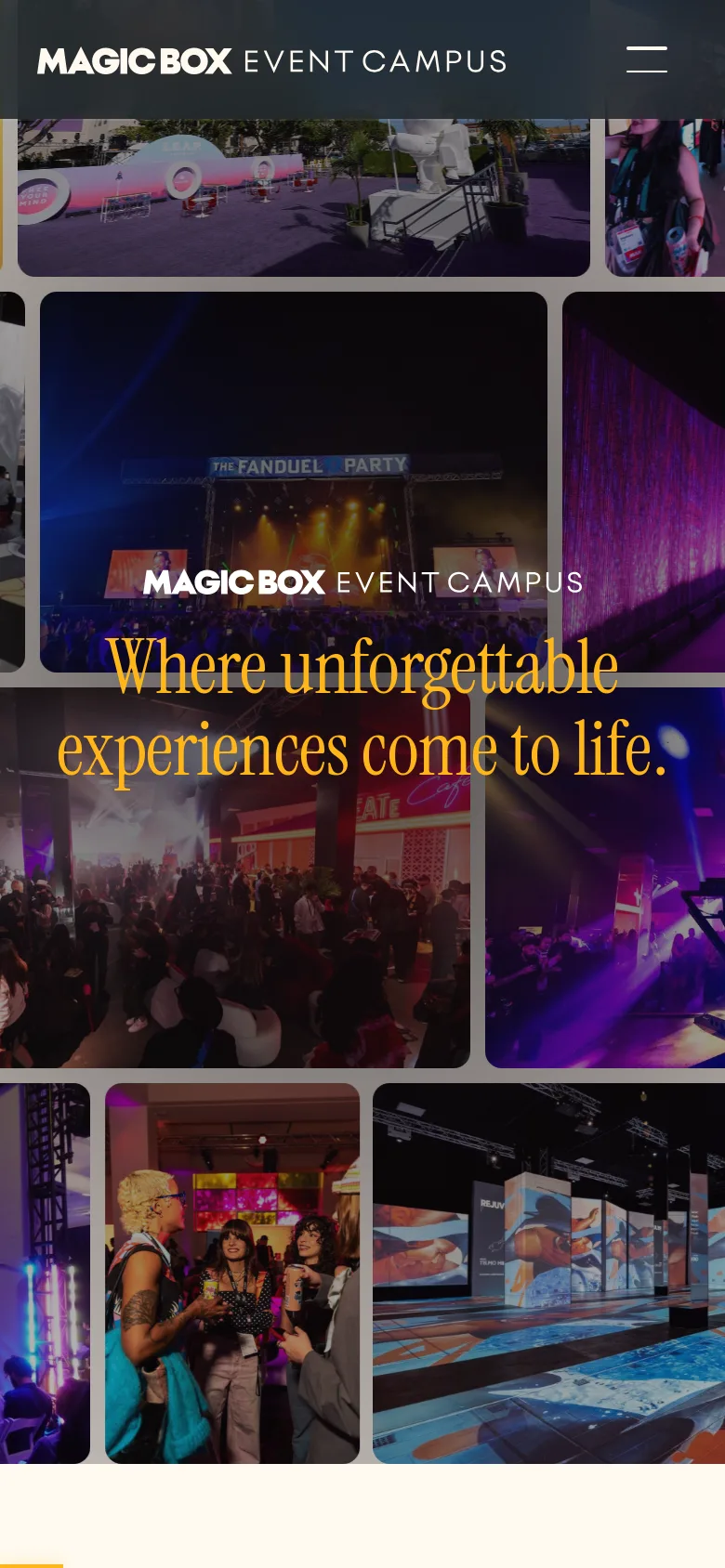
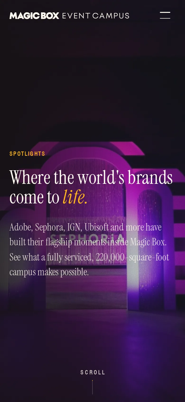
Below it is the part that took the most care. A collage of their event photos bursts out around the line where unforgettable experiences come to life, then gives way to a wall of the brands that have worked there, then to the four spotlight cards. Each scroll gesture plays one step on a fixed clock, so it feels the same on a mouse, a trackpad or a phone. We tested it with fast flicks, slow drags and random jumps of the scrollbar until every one of them landed on a finished frame.
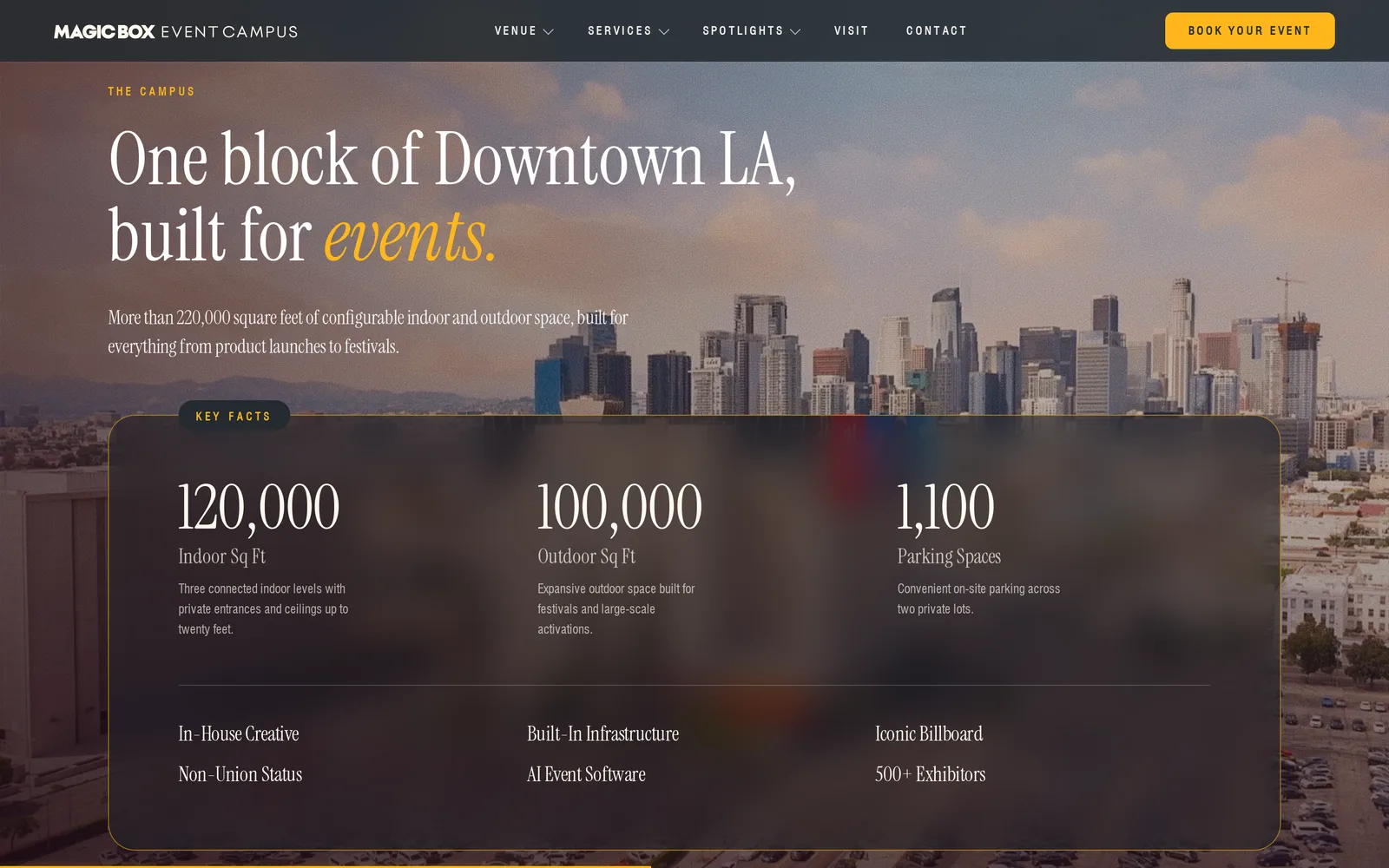

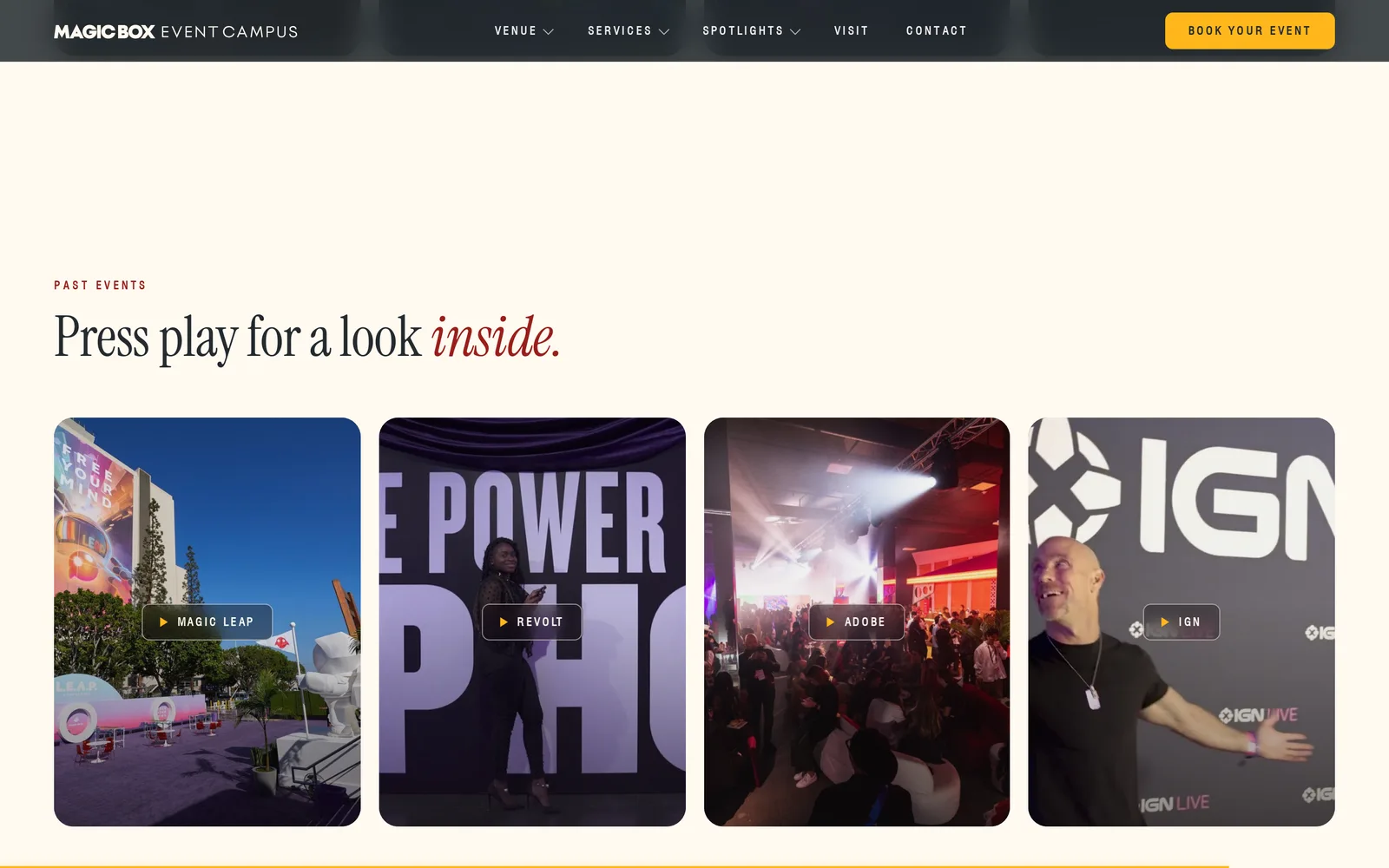
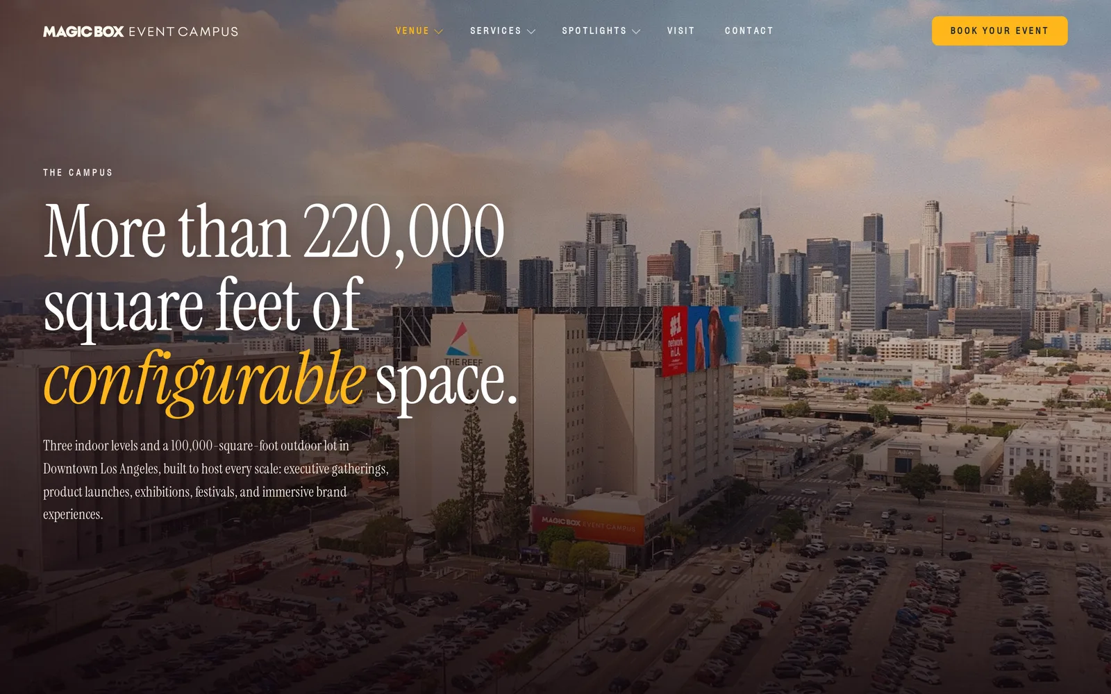
Further down, the key facts sit over an aerial of the campus, a stack of floor plates folds open as you scroll, and a past events wall plays their own films in a pop up player. The films only load when someone presses play.
The venue, floor by floor
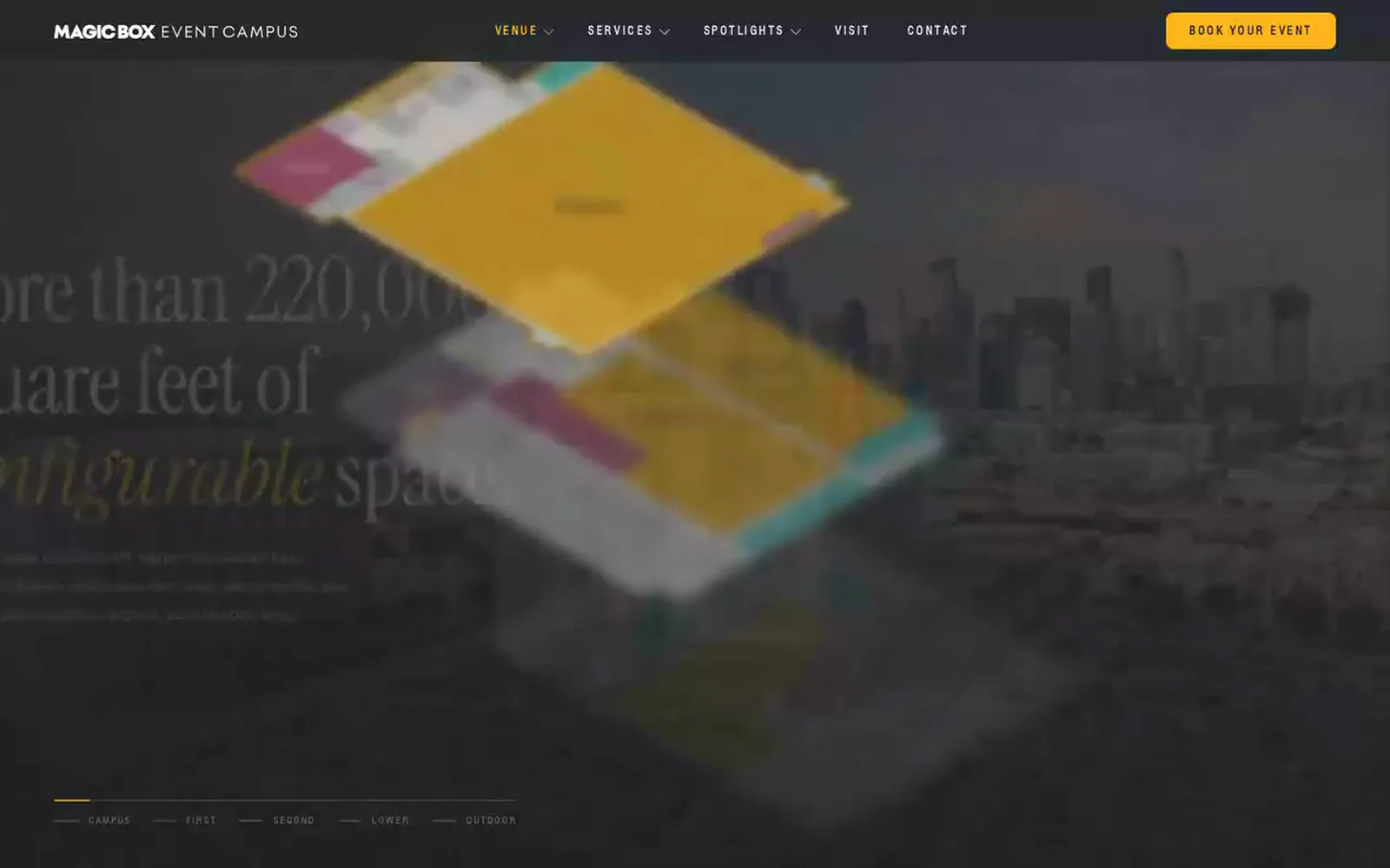
The venue page tells the building as a short tour. The floors start stacked like a model, then each level slides forward with its rooms, square footage and what it is good for, from the ground level activation halls to the 48,000 square foot Exhibit Hall upstairs and the open air lots outside.
 Click a level or a floor
Below the tour sits the floor explorer, the piece Magic Box asked for most. Every floor uses the real floor plan, with each room traced by hand. Point at a room, or tab to it with a keyboard, and the rest of the plan dims while a label shows its name and size. The room list beside it lights up in step, and a click pins a room in place. Links in the menu jump straight to a floor.
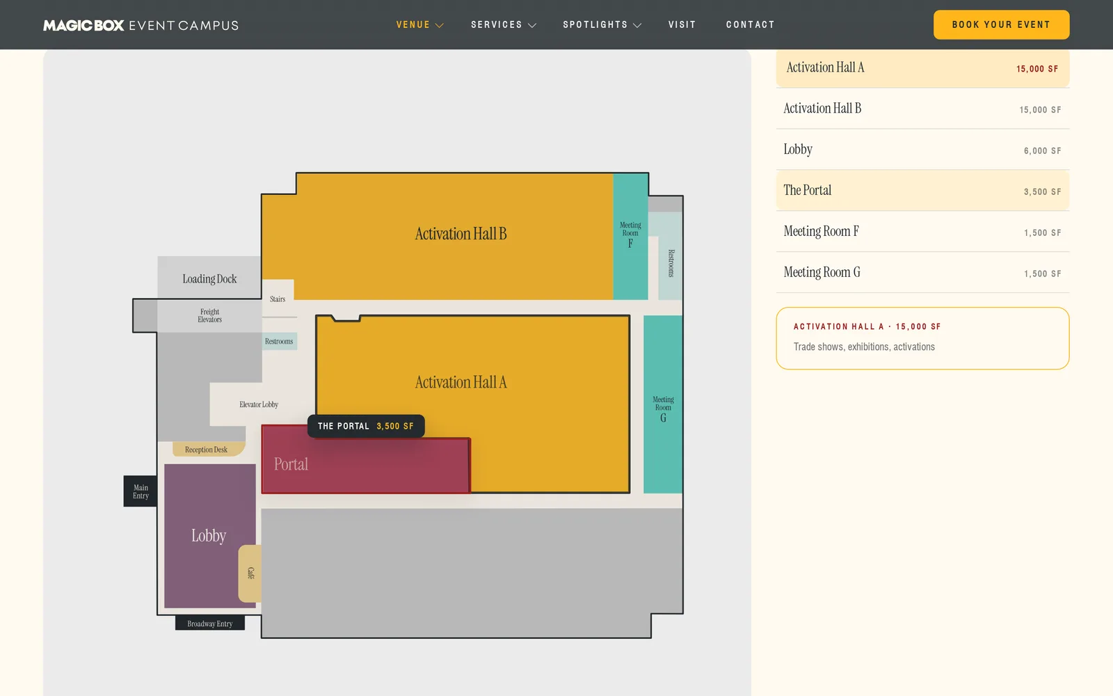 Hover a room
Spotlights that show what the space has done
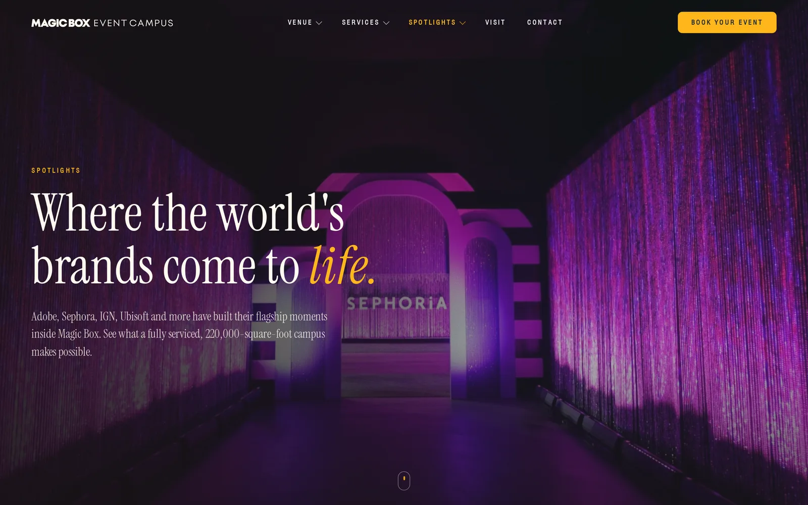
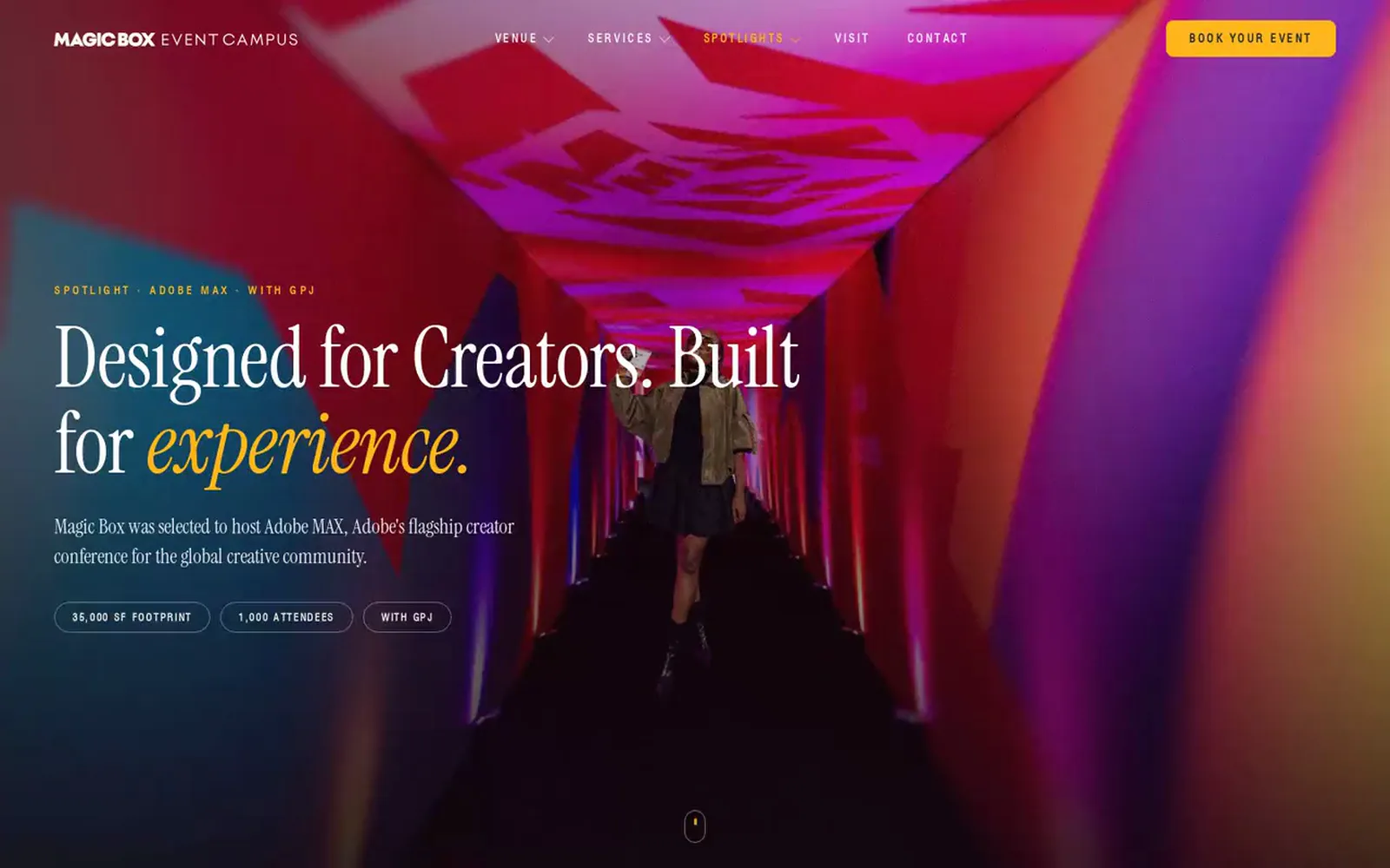
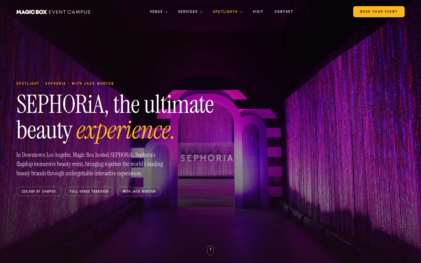
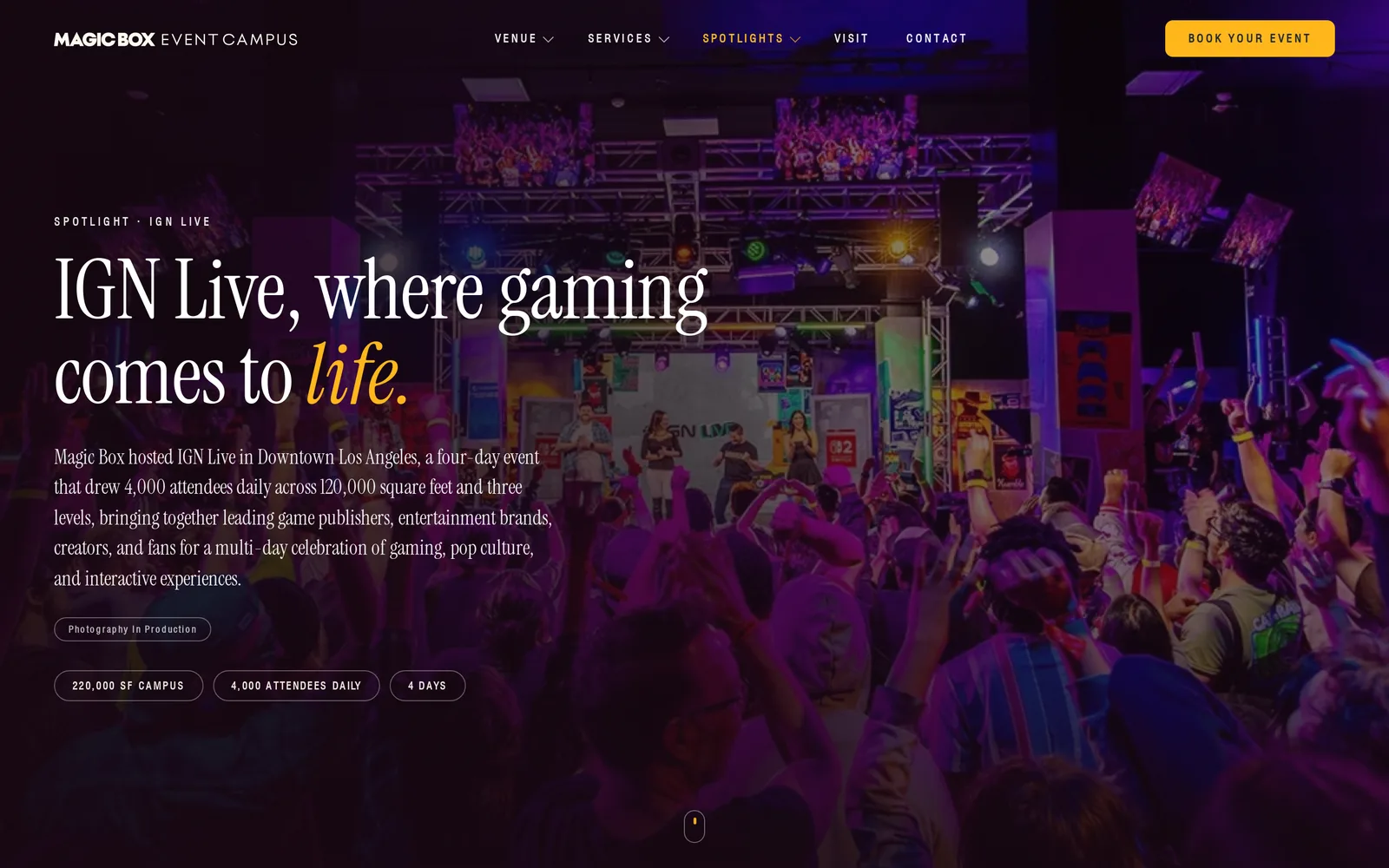
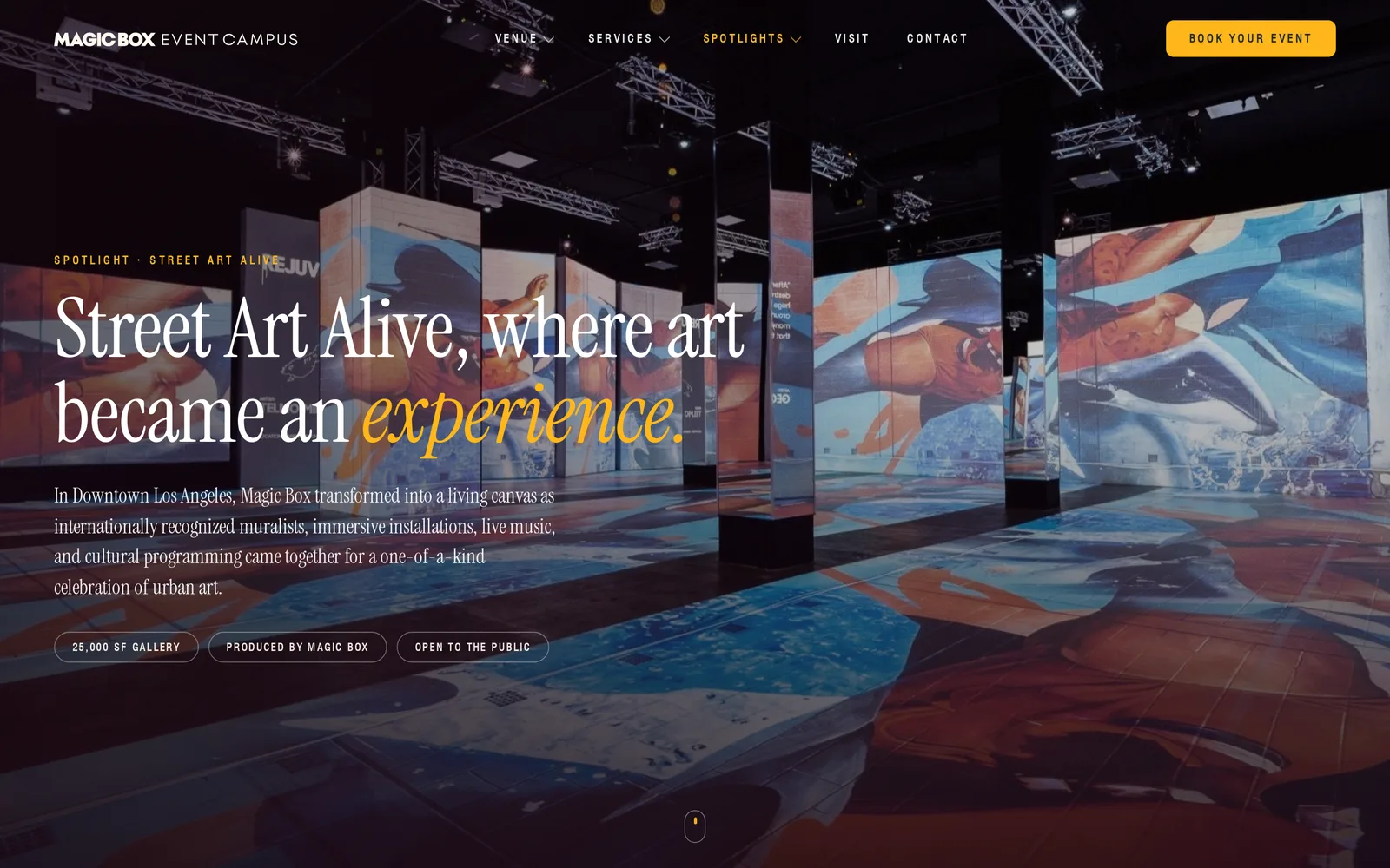
The old site had one Past Events page. Now each flagship event has its own spotlight page, Adobe MAX, SEPHORiA, IGN Live and Street Art Alive, with the brief, the spaces used, the footprint and a gallery from the event. Planners can see what the building has already carried before they ask for a date.
Decks and inquiries, straight into the CRM
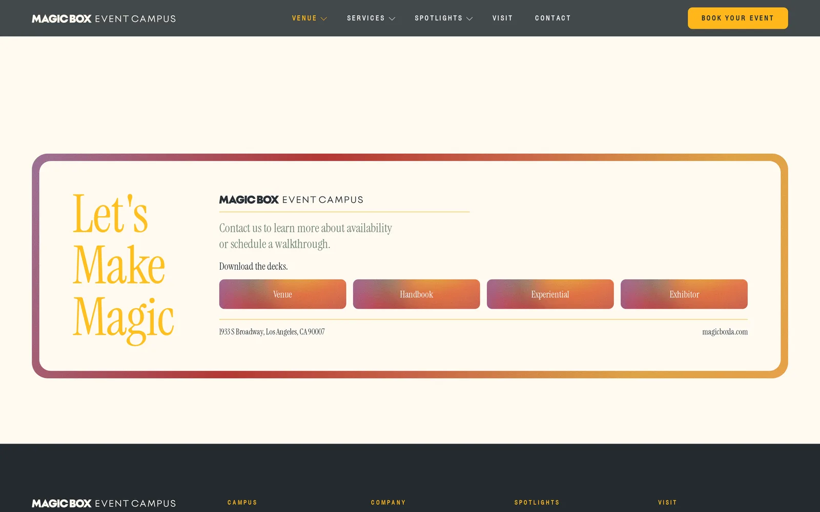
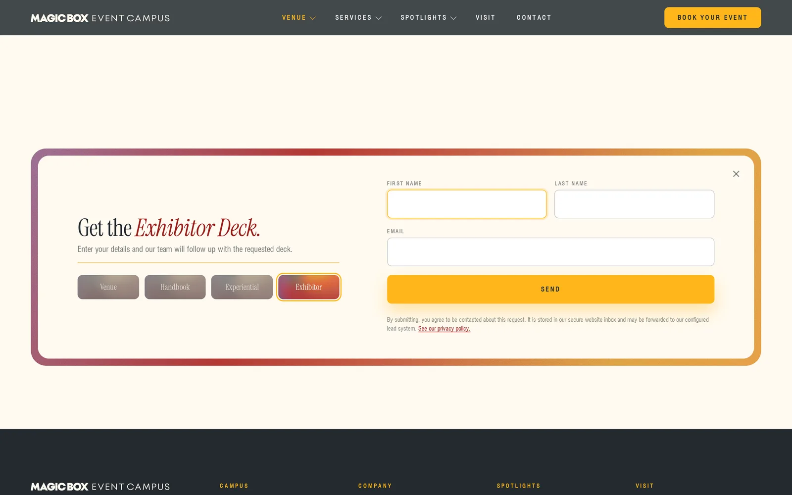
Every sales deck now sits behind a short form. Press Venue, Handbook, Experiential or Exhibitor and a card opens in place asking for a name and an email, and the CRM sends the deck. Each download becomes a lead the sales team can follow up, tagged with which deck was asked for and where the visitor came from.
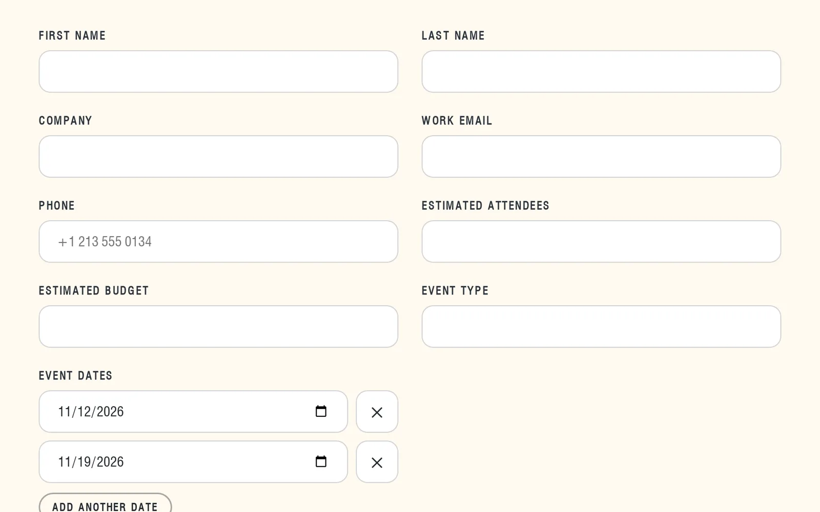
The inquiry form asks what the sales team needs to quote, and it follows the CRM's own list of required fields, checked again on the server so nothing arrives half filled. In September we added more than one event date, since planners often hold a few options. They add dates with one tap, and the site sorts them and drops duplicates before they reach the CRM.
Every form is saved on Magic Box's own server first, then delivered to the CRM, with retries if the CRM is slow. A visitor who presses send twice gets one lead. When automated spam submissions picked up in October, we added Cloudflare Turnstile to both forms, checked on the server, so most real visitors see nothing extra and unverified requests are turned away before they reach the CRM.
The small parts
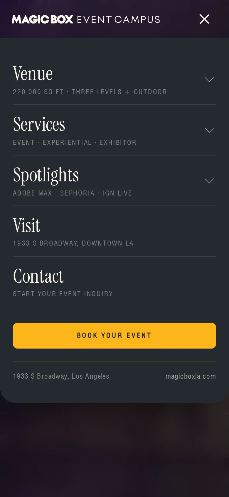
The same navigation runs across all fourteen pages, with dropdowns for the venue, services and spotlights that open on tap as well as hover, so they work on tablets. On a phone it becomes a full screen menu with one section open at a time and the booking button always in reach. There is a skip link on every page, the video player keeps keyboard focus inside it, and the footer carries the address, the floors and the spotlights.
An editor built around the design
The Magic Box team edits the site themselves. The editor shows the real page beside the fields, and clicking any headline, paragraph or photo in the preview opens the matching field. Words change on the page as they type. Photos swap from a picker. Nothing goes live until someone presses publish, and every published version can be restored.
We kept the design safe at the same time. Any field left empty falls back to the approved design, so the site always looks finished. Layouts and motion are locked, and the words, photos and videos are open. 1,267 spots across the site can be edited, up from 310 when the editor first shipped.
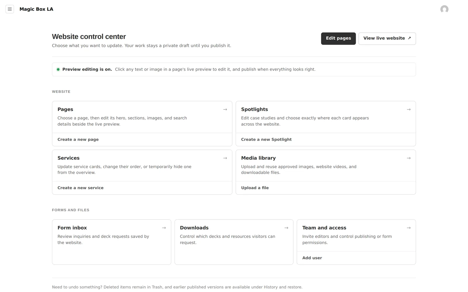
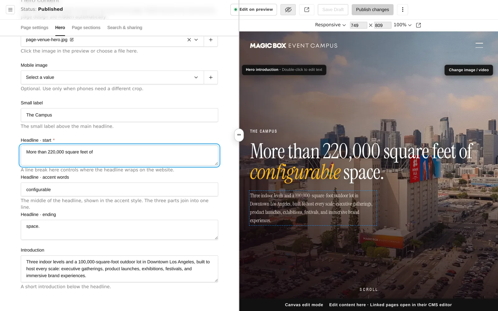
Two copies of every page exist, the approved design and the one the editor serves, so we wrote a parity check. Before every release it renders all pages and compares the visible words against the design, and a release cannot ship if they differ. The whole thing runs on Magic Box's own server, with their data in one folder they own and a backup command to go with it.
SEO and AEO
Moving off the old site could not cost them search traffic. Every old address now forwards to its new home with a permanent redirect, 22 patterns in all, from the old floor pages to the blog and the service pages. In September we made those redirects carry ad and campaign tags through, and proved it with 72 redirect checks.
Each page has its own title, description, canonical address and share image, and they all sit in a sitemap. Behind the scenes every page carries structured data that describes Magic Box as an event venue and local business, with its address, map, location and amenities. The About, Visit and Contact pages answer 27 common planning questions in a form search engines and AI assistants can read directly. The robots file welcomes six AI crawlers by name, and the News page is ready for posts.
Light enough to feel fast
A photo heavy site gets slow quickly, so we measured the largest size every image is ever shown at, across every page and screen width, and resized each one to twice that. Images got 36% lighter overall. The brand logos got 84.5% lighter, since some were shipping at up to 22 times their display size. The headline font moved to a format 60.7% smaller and loads early, so text does not jump. The venue page went from 5.34 MB to 2.75 MB.
Fonts, styles and scripts are cached for a year and pages are compressed on the way out, so a second visit has much less to download.
Every screen size
The scroll tours belong on a big screen, so on tablets and phones the site switches to layouts built for touch. The venue floors stack in order, and the homepage collage becomes a moving wall of photos behind the headline. We checked every page at 11 widths, from a 320 pixel phone to a 2560 pixel display, with nothing spilling off the edge, and cut the number of too small tap targets from 51 to 25.
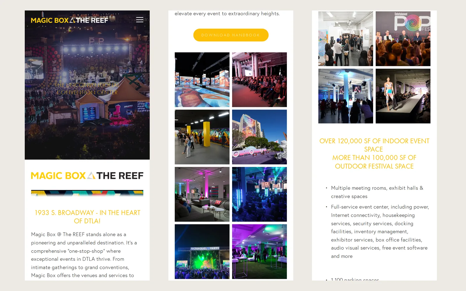 Before
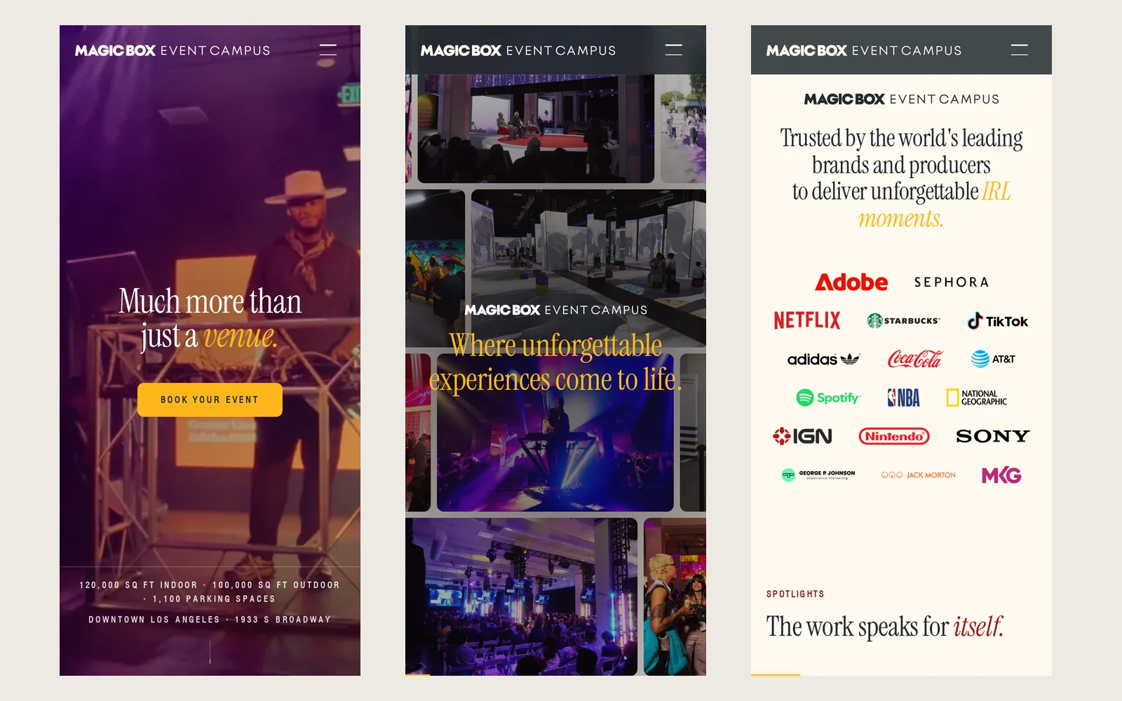 After
After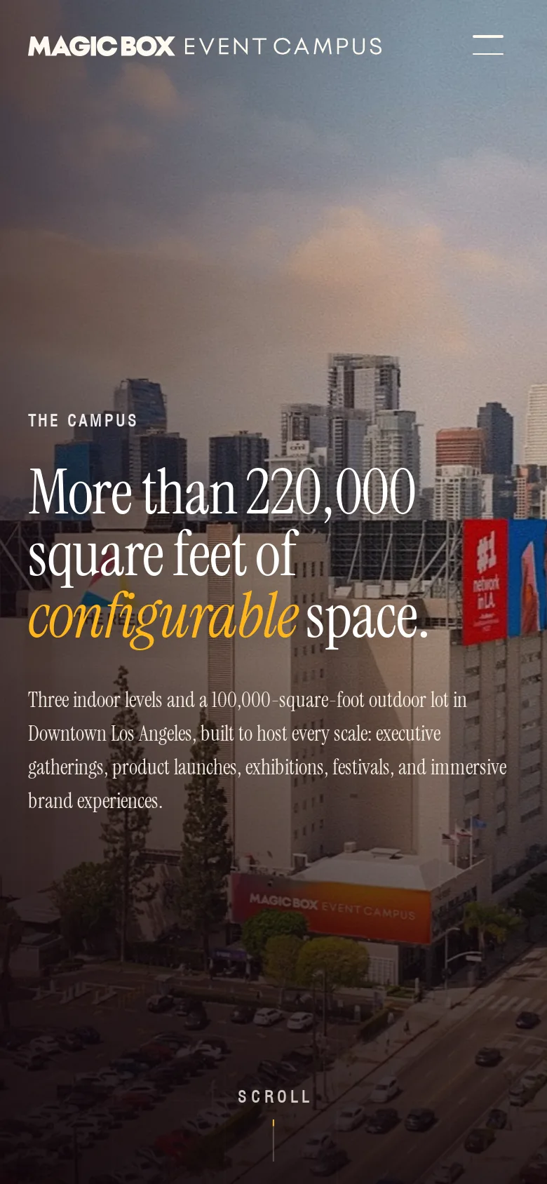
Tracking and measurement
Their marketing agency runs the ads and the CRM, so we built the site side of their tracking plan directly into the code. Every page loads Google Ads and two GA4 properties, the agency's and Magic Box's own. A deck request and an inquiry each send their own named event, so the team can see in GA4 which pages lead to downloads and which lead to inquiries, without any extra setup.
A conversion only counts once the server has accepted the form, and a repeat send never counts twice. When the numbers in Google Ads and the CRM did not line up, we matched them lead by lead. The first gap turned out to be time zones, since the exports were in UTC and Google Ads reports in Pacific. Later we lined up every saved deck request against GA4 events one by one to show which visitors Google could see and which it could not.
All of it respects a consent banner. Declining switches off analytics and ads on both properties. A browser that sends a Global Privacy Control signal keeps analytics but turns ad sharing off.
Ads and attribution
Ad platforms put their click IDs in the address of the first page someone lands on, and the forms live a few pages further in. So the site saves the click ID and campaign tags on arrival and attaches them to whatever the visitor sends later. If the click ID never made it into the address, the site reads it from Google's own cookie instead. Deck requests and inquiries are separate conversions in Google Ads and LinkedIn, and CallRail swaps in a tracked phone number for paid visitors, all only with consent.
Checked before launch, and after
Before launch we audited the whole site and fixed all 47 confirmed issues. Some were small, like a dead deck link. Some mattered, like two square footages on the Exhibitor page that were wrong and menus that could not be opened on a tablet.
The site went live on August 12 on its own server, and the work kept going. Every change since has gone out as soon as it was verified, behind the parity check and a test suite that has grown to 262 tests. We test forms with the real pages but fake endpoints, so no test ever lands in their CRM.
Where it is now
Magic Box now has a site that looks like its brand book, shows its floors the way a planner thinks about them, and sends every inquiry and download to sales with the source attached. The team updates it from the editor. Next on the list are their social links, a lighter hero video for phones, and switching the CRM over to the new multiple date field.
It's live! … I can't begin to tell you how happy I am.