
ShoSoftMarketing site
ShoSoft marketing site
shosoft.ai, rebuilt around the real product, moved off Framer, and run from an editor that reaches every page.
ShoSoft brought us in during May 2026. The first two things on the list were AI onboarding and the website, and the website became the piece we kept coming back to all summer.
ShoSoft makes venue management software for independent venues, the ones running 30 to 300 events a year. It started as the in-house tool at an event campus in Downtown LA, and it puts the calendar, events, staff, inventory, ticketing and billing in one place.
The site at the time was a Framer build. It showed drawn mockups where the real product should have been, and every change meant opening a design tool. We tried a first redesign in July and a second in August. Then in September ShoSoft's team wrote down exactly what they wanted, and that list became the plan.
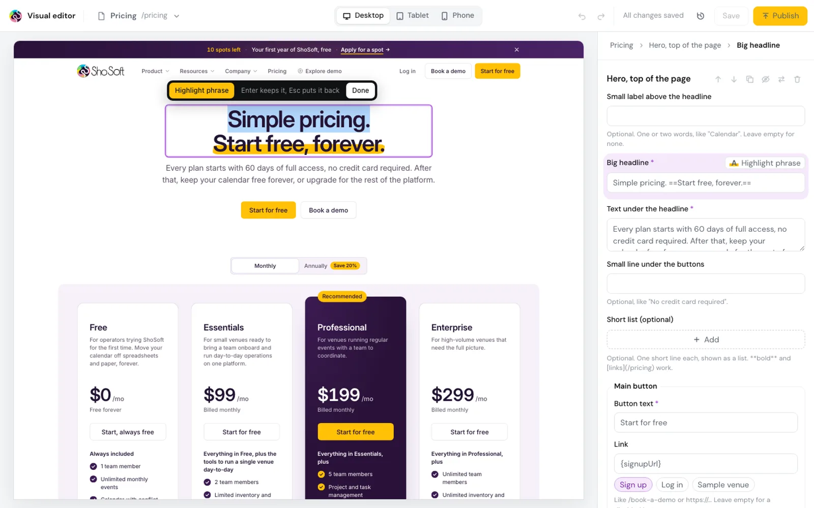
What came out of it is a new shosoft.ai, rebuilt page by page around real screens of the app and run from an editor that reaches every word and picture. We carried the search groundwork across with it and switched the domain over on October 7.
- 120
- pages rebuilt
- 258
- redirects from old URLs
- 624
- open roles listed
- 93
- employers hiring
I am so obsessed with our new website, you did such an amazing job, it looks fantastic
What we did
- Redesign of every page around live app screens
- A component system with templates for each kind of page
- An editor that changes every word, picture, link and price
- The blog, help center, comparison and feature pages ported word for word
- A job board for venue and event people, refreshed every day
- Free planning calculators
- SEO and AEO carried over, with redirects from every old address
- Tracking rebuilt behind a cookie choice, and the legal pages ported
- A lighter build for phones and tablets
- Hosting, launch day and the switch from Framer
Where the old site stood
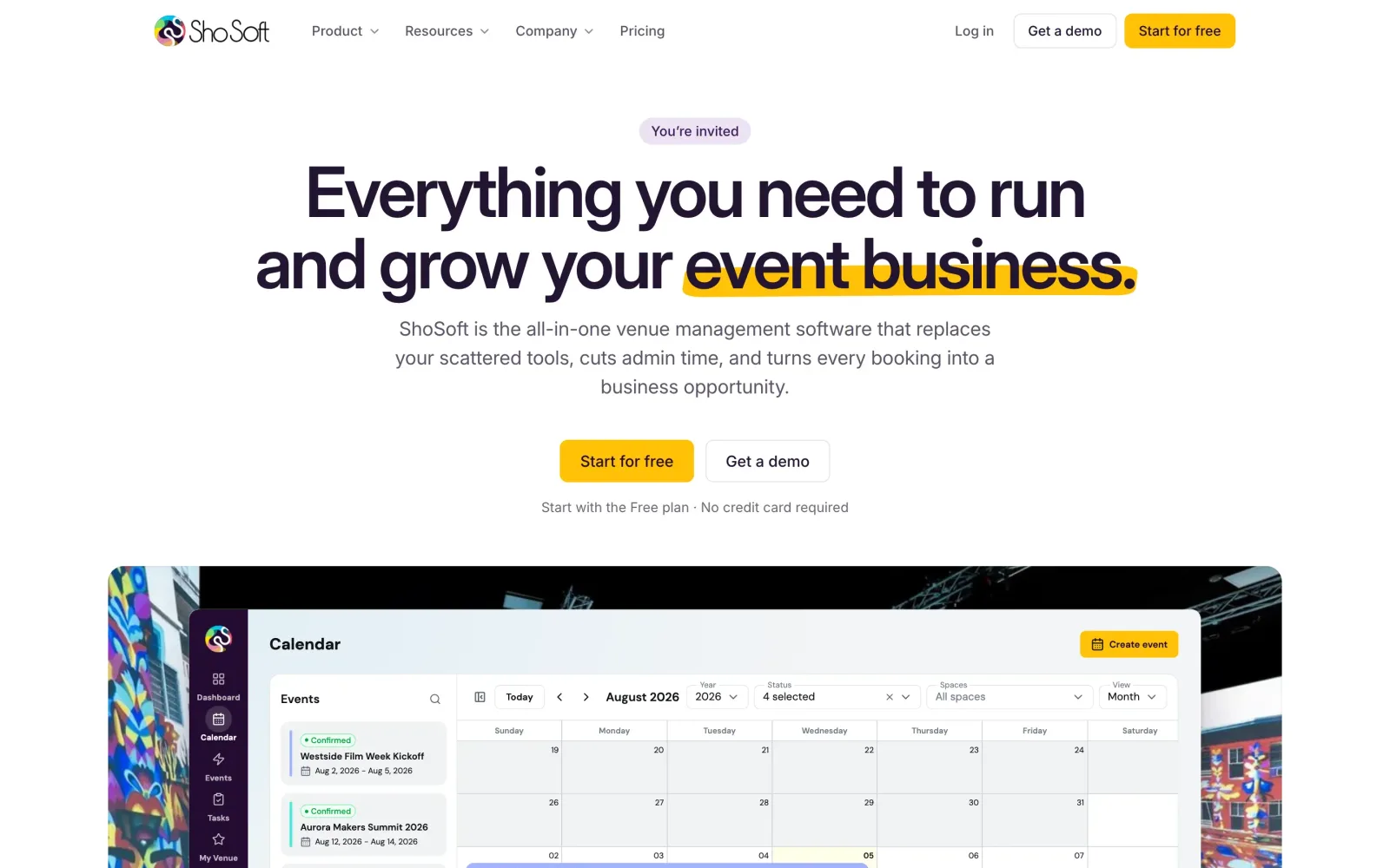
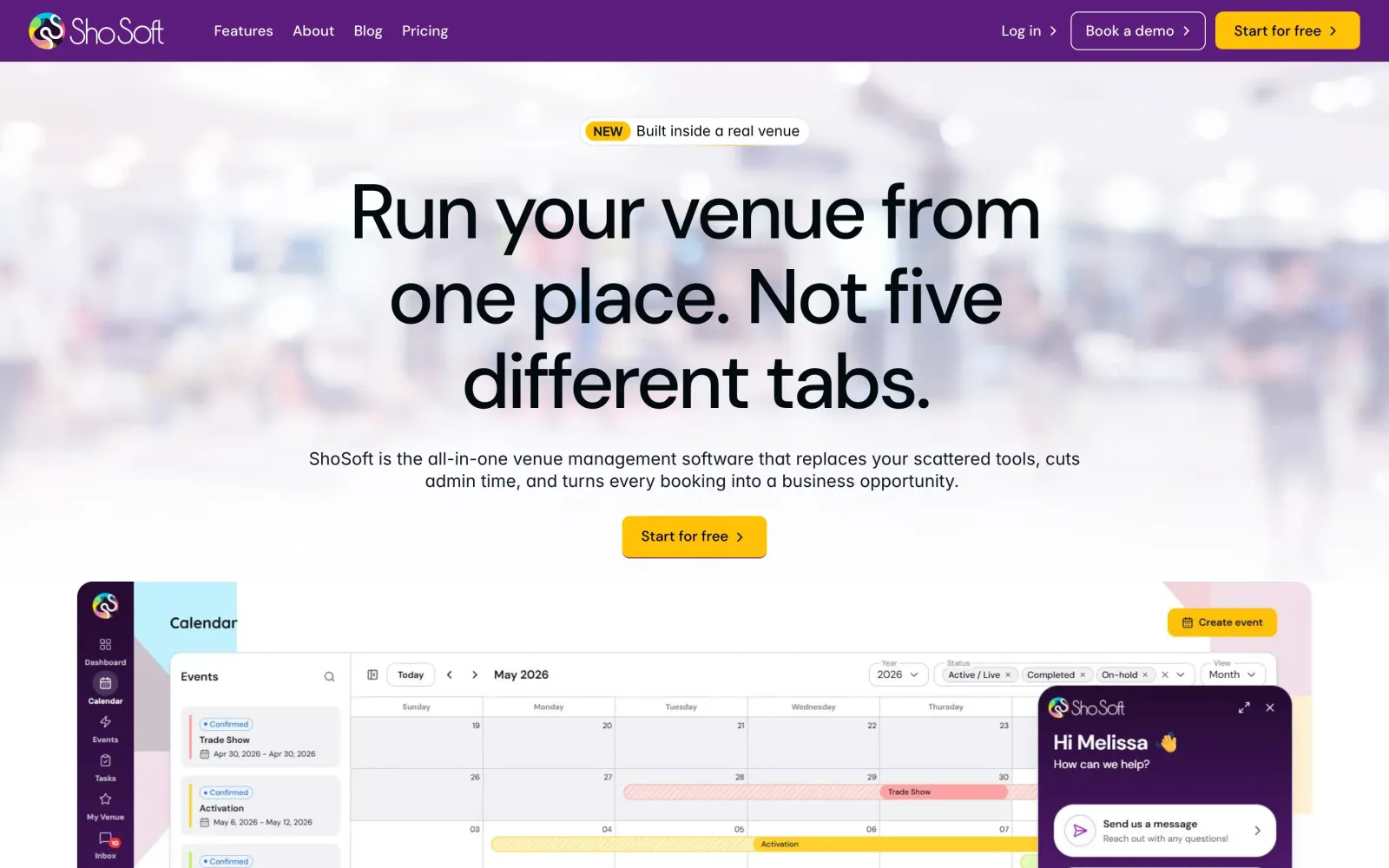
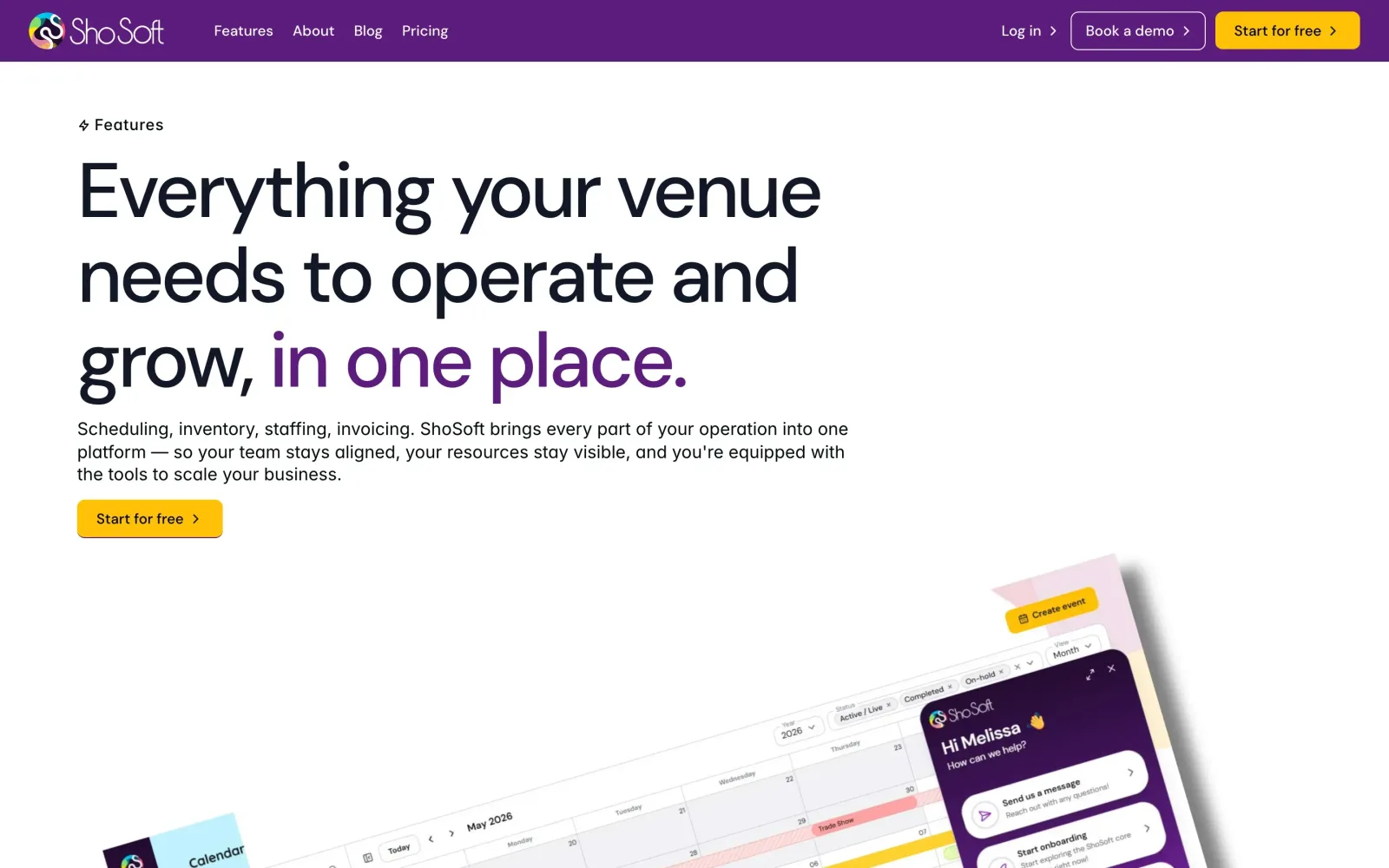
The old site looked like most software sites. Drawn screens, stock photos, a purple bar, and pages that each had their own idea of spacing and type. The blog, the help center and the comparison pages all lived as separate one off layouts.
ShoSoft's COO wrote down what she wanted the new site to be, and we turned her notes into a checklist of 67 items that every page was checked against. Components before pages. Light and simple. One spacing scale. Motion only where the visitor asks for it. And the same copy, word for word, so nothing that already ranked or converted would be lost.
Design built from the real app
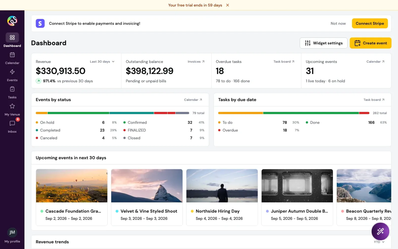
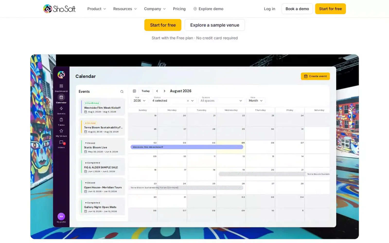
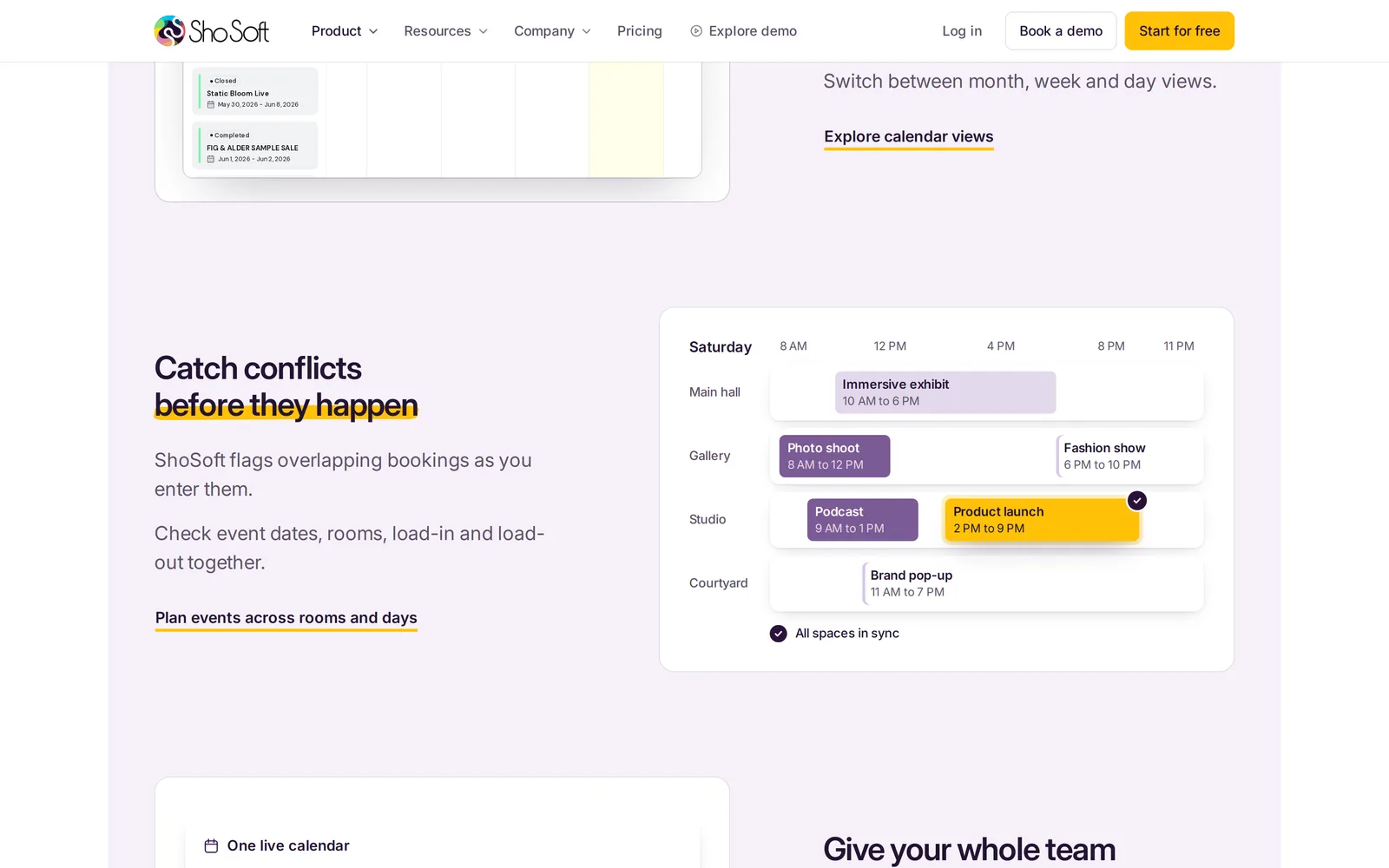
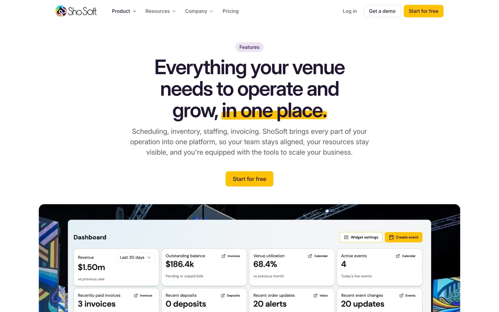
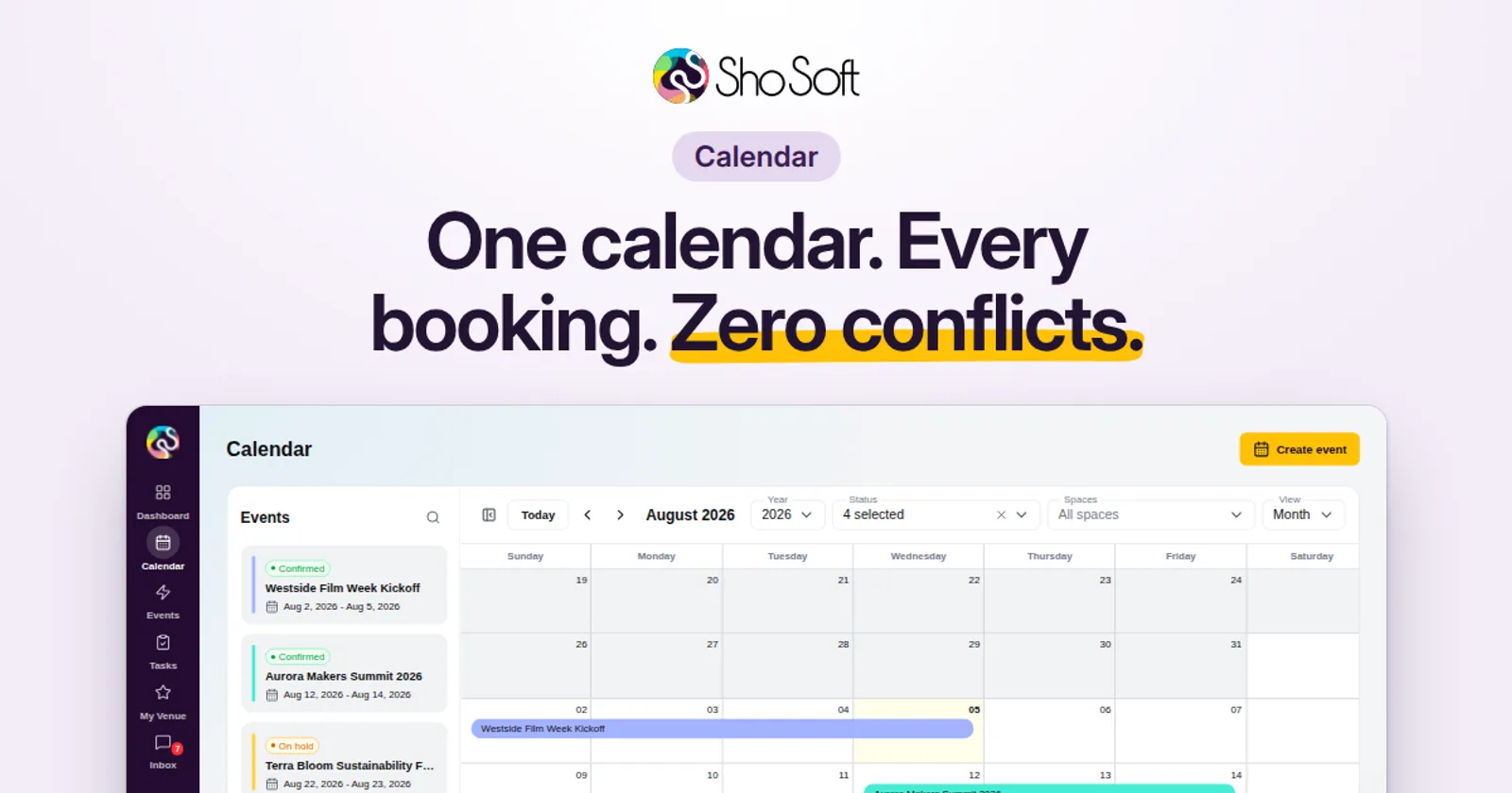
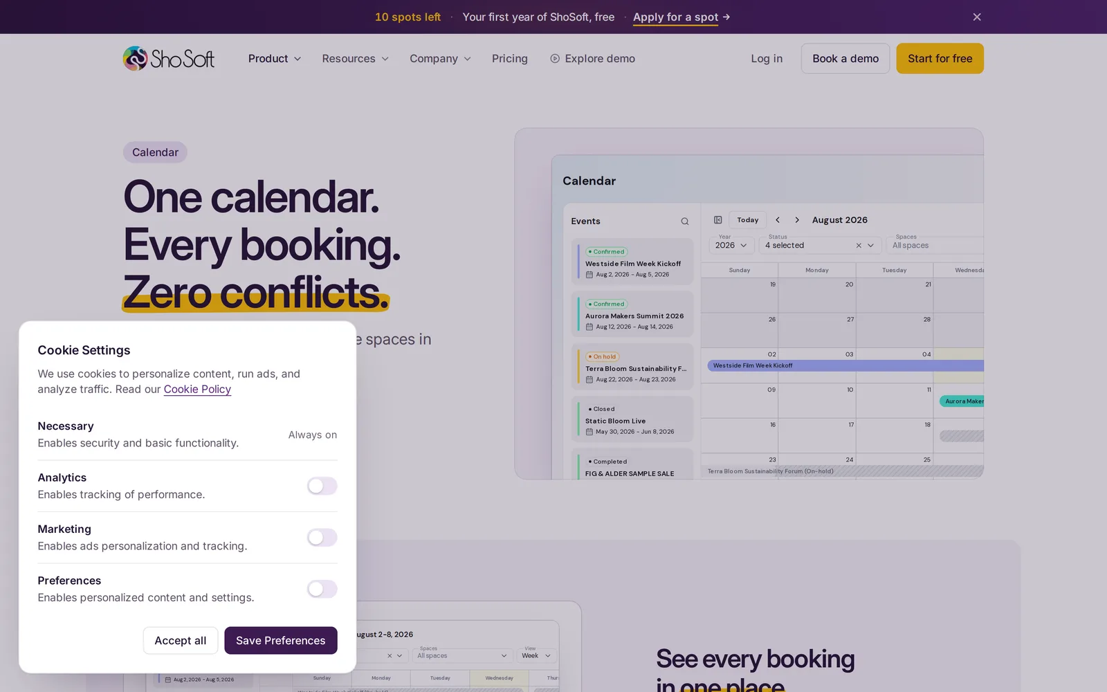
We made one rule early, and it shaped everything after it. Every product picture on the site would be the real ShoSoft app. We saved live pages of the app, renamed every event and client to fictional ones, and embedded them as small working pages. In the hero, a sample calendar opens its own Create event dialog and types in a new event, the way a venue manager would.
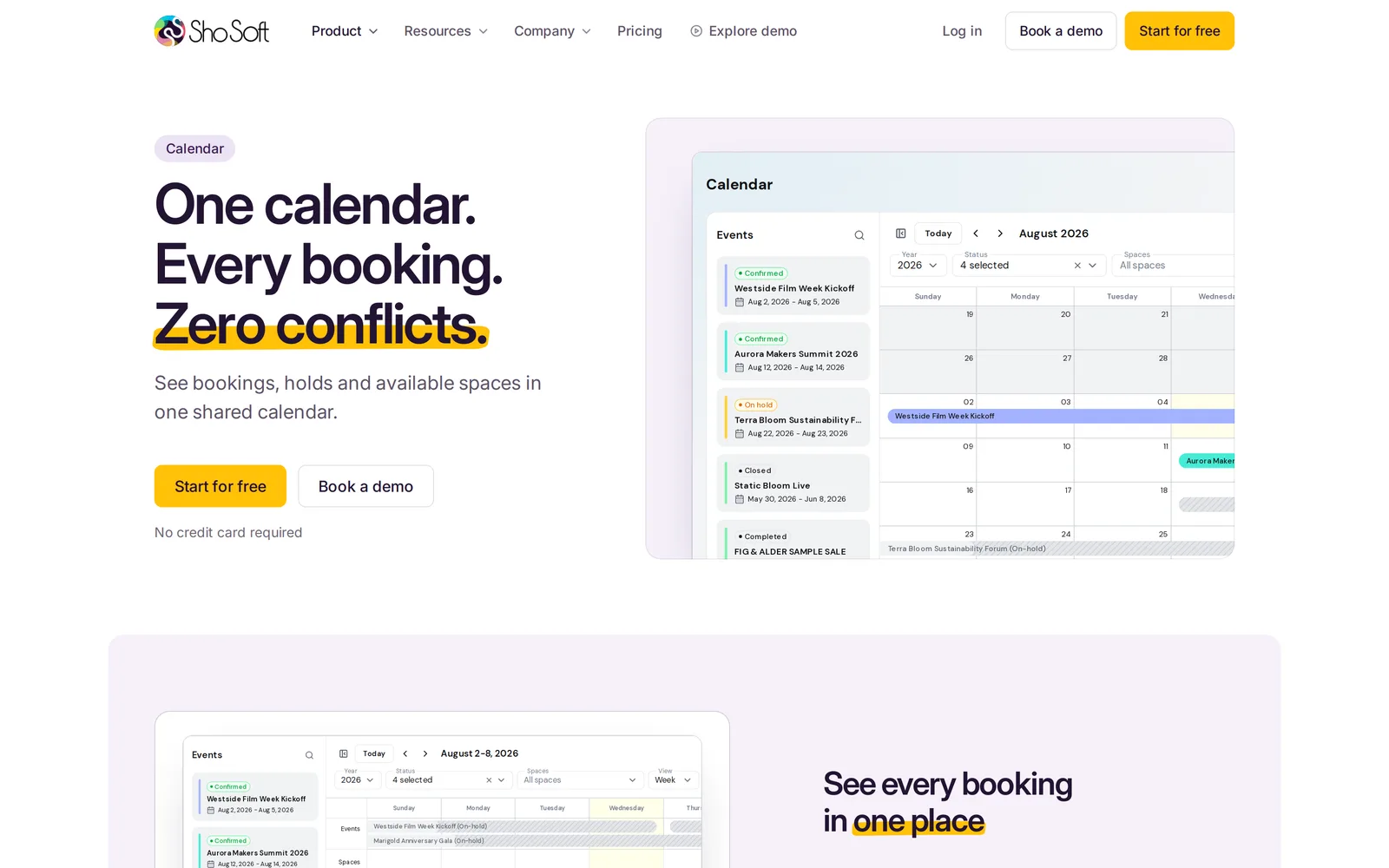
Feature pages put that real screen beside the headline on a soft lavender panel, cropped to the part of the app the page is about. Where the app has no good screen yet, the page uses an event photo, so nothing on the site is drawn to look like the app.
The components
Before we built a single page, we built the pieces. A locked set of components came first (hero, feature rows and cards, testimonial, logo bar, FAQ, closing call to action, footer, tags, stat tiles), then a template for each kind of page. Colors, type, spacing, corners and motion all live in one tokens file, so a change made once lands everywhere.
Our first pass came out too plain. So a second pass brought the old site's craft back onto the new system, with its eleven hand built drawings, a marigold marker on the key phrase of each headline, and real event photography from Magic Box, kept behind the product and in the closing panel.
Two checks run before every release. One fails the build if any text a visitor can read is written into the code instead of the content, which is how we know the editor really reaches everything. The other compares every sentence on every page with the old site, so the redesign could change the design and leave the words alone.
Every page came across
We saved all 104 pages of the old site, pulled the words out of each one, and rebuilt them in the new design. That covers about, contact, the FAQ, the services agreement, the features overview, a compare hub and five comparison pages, 50 blog posts in five categories and 24 help articles in nine.
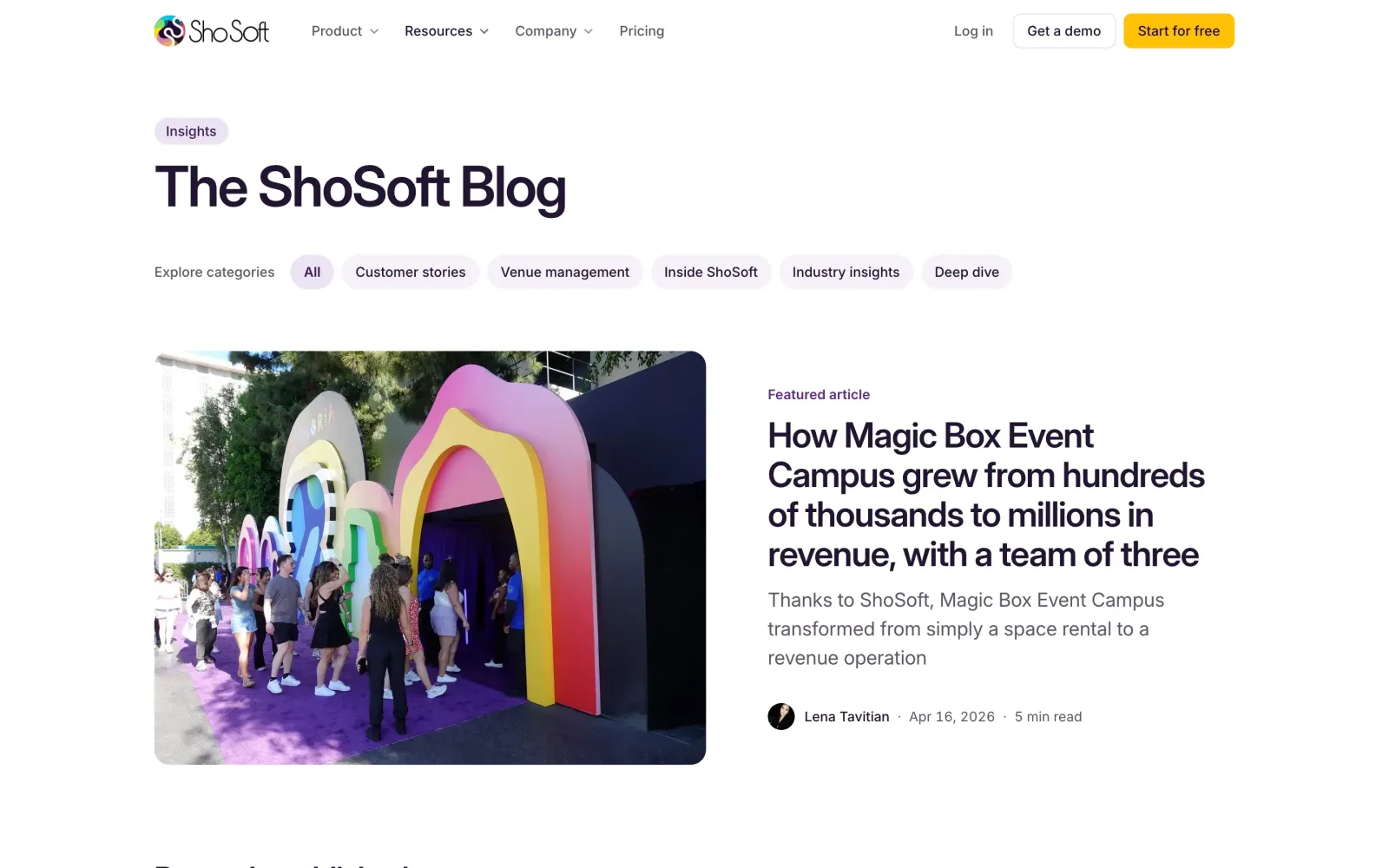
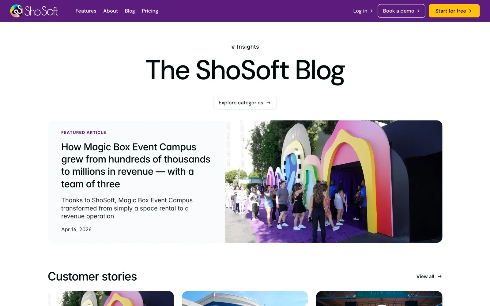
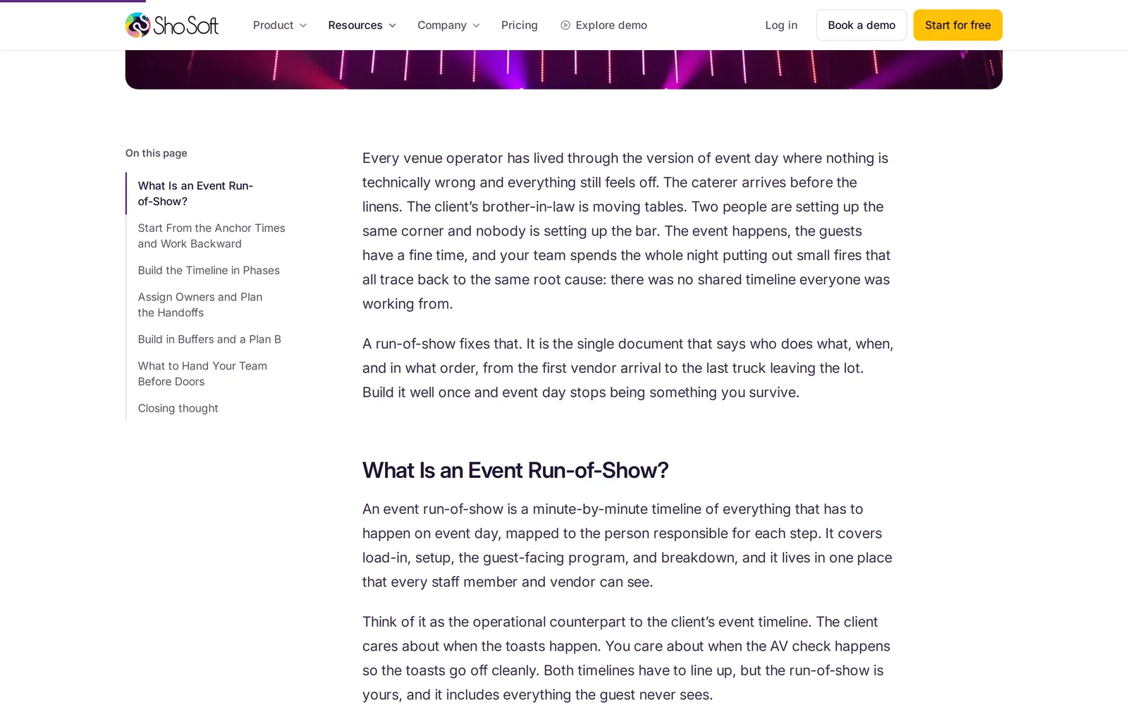
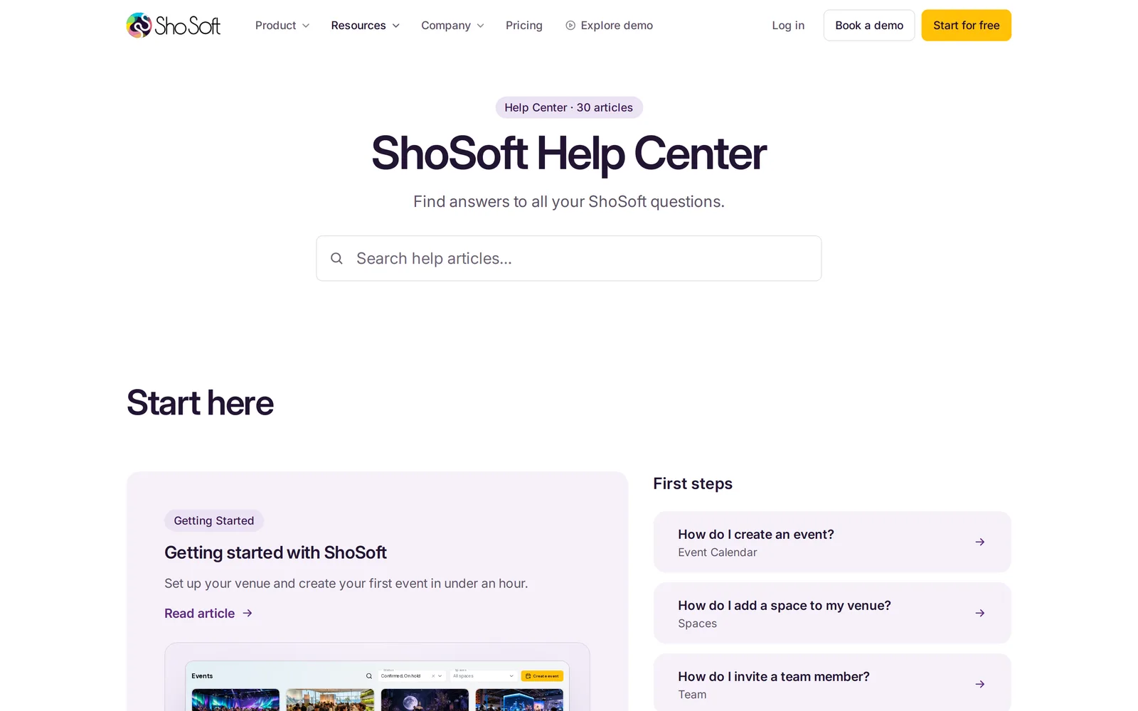
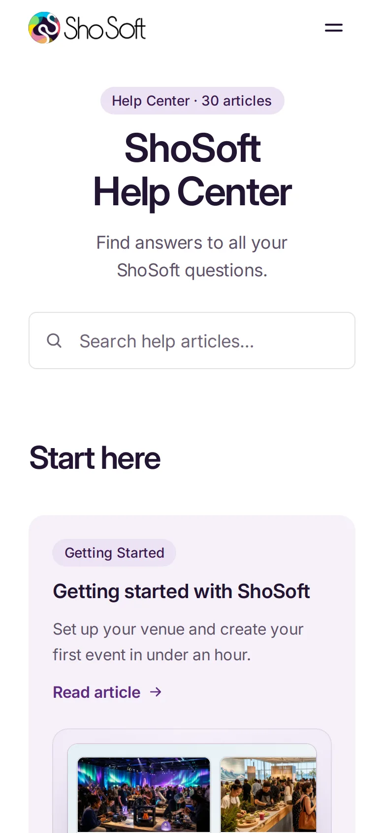
Blog posts got a calmer reading layout, with a sticky table of contents that follows the reader, a progress bar and category pages. The help center got a Start here band, live search and a docs layout with every category in a sidebar.
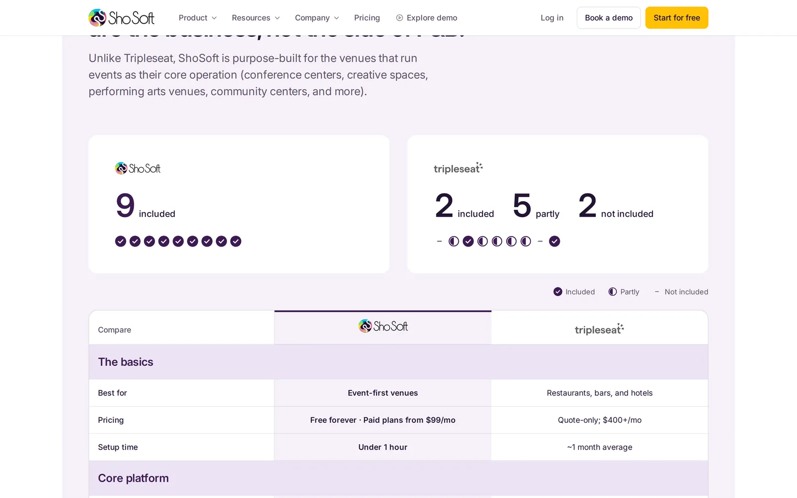
The comparison pages share one template the editor will not let anyone break. A short hero leads into the table, with real competitor logos shown in a neutral tone so ShoSoft leads.
Navigation that shows the product
The menu grows out of the bar itself. Hover a feature in the Product menu and a live preview of that part of the app slides in beside it, while Resources shows roles from the job board.
A job board that fills itself
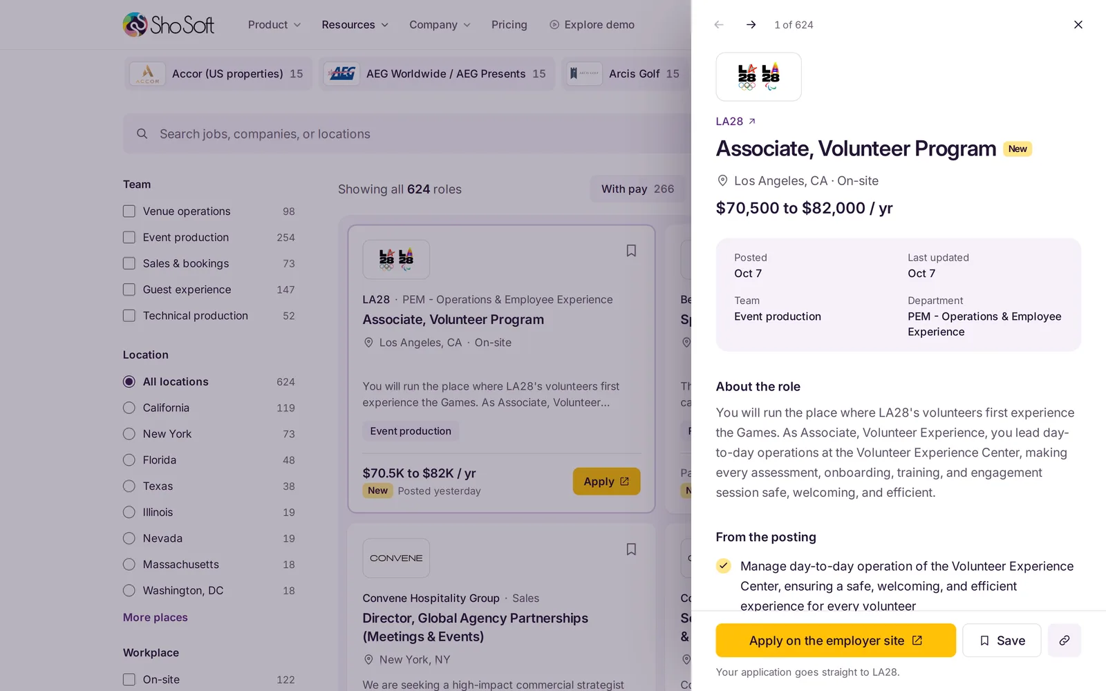
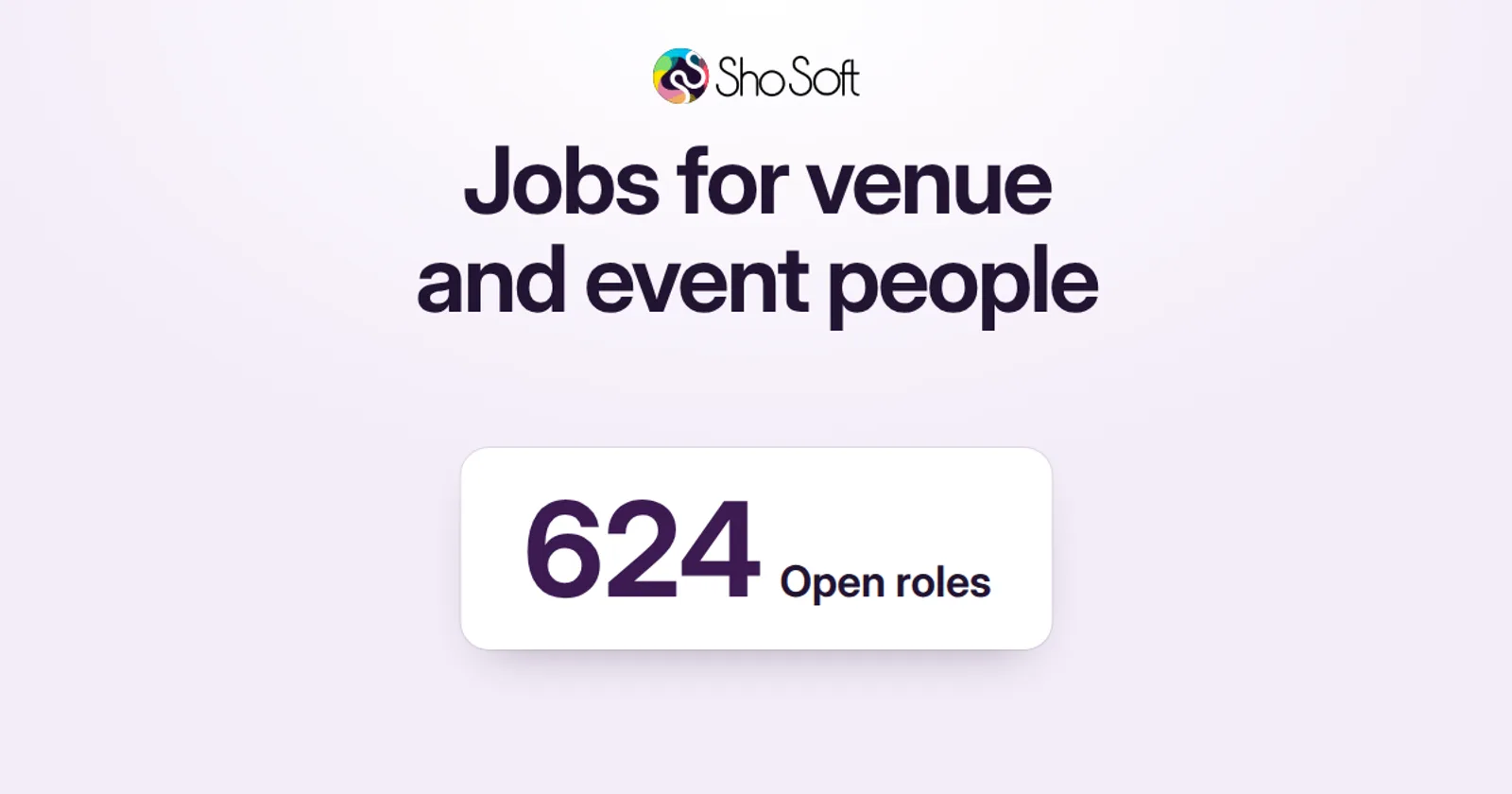
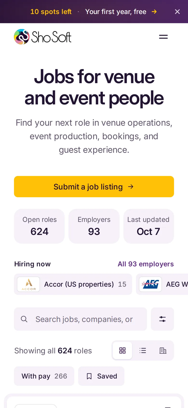
We added a job board for the people who run venues and deliver events. It opened on September 21 with 17 roles from six employers. It now lists hundreds, checked and refreshed every morning through the editor, so the people ShoSoft sells to have a reason to come back, and search engines have a page that never goes stale.
Visitors can filter by team, state and city, workplace, job type, pay and date, and every filter is kept in the address so a search can be shared. There are grid, list and by company views, saved roles, and a detail panel for each role. Apply always opens the employer's own page, and the board never collects an application.
We checked every employer logo by hand, 118 of 119 at the last count, and the daily refresh refuses to publish a role whose logo is missing or broken.
Free tools
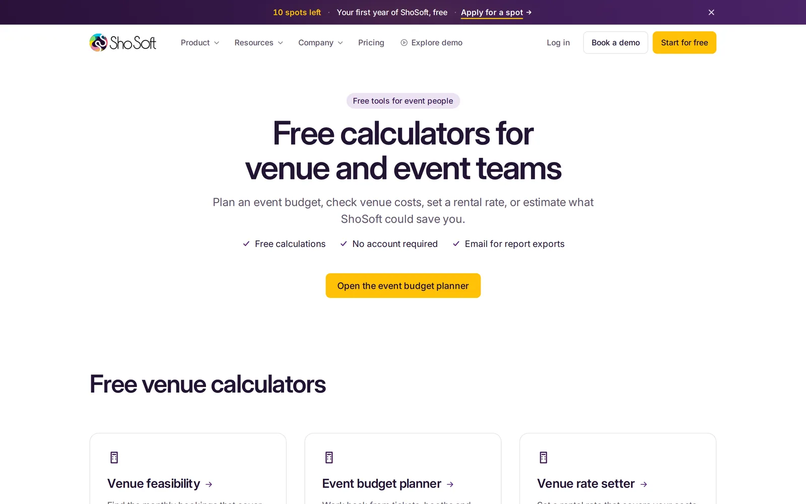
We also built five calculators for venue and event people, among them a venue feasibility check, an event budget planner and a rate setter. Each one walks through a few simple steps, shows its arithmetic, and can send a branded report. They wait as drafts for now, one switch in the editor away from going live.
SEO and AEO
Moving a site is the moment search work tends to get lost, so we carried it across before launch. All 105 addresses in the old sitemap have a home on the new site, and 258 redirects send each old address to its new place with its query string intact.
Titles, descriptions, canonical addresses and social cards are written into the first HTML a crawler sees, and all of them come from the editor. Structured data for the organization, the software, pricing, the team, articles, breadcrumbs and FAQs is drawn from the visible content, so what search engines read matches what visitors see.
For AI assistants, every build writes an llms.txt file and plain pricing files in JSON and Markdown. They follow the pricing page as it changes, Free plan included. The sitemap and the crawler files are generated on every build too, and every public page gets its own link preview, drawn from its own headline and screen.
Tracking, ads and analytics
ShoSoft's marketing tags (Tag Manager, Analytics, Apollo and the demo conversion for Google Ads) are now settings in the editor. They load only on shosoft.ai, and only after the visitor agrees, through a cookie panel drawn in the site's own design with a Cookie settings link in the footer.
Ad and referral links only count if their tags survive the trip through the site. Those parameters now follow a visitor from page to page,and they are still on the link when someone clicks to sign up.
The five legal documents came across word for word, with a check that flags any drift from the originals. Views are counted by ShoSoft's own first party analytics, which replaced Framer Analytics and is read in the internal tool we built alongside the site.
Moving day
On October 7 we pointed shosoft.ai at the new site. The certificate came through in three seconds, 19 key pages answered, and the sitemap listed 127 addresses. Framer stays published for about 30 days, so going back would take a single DNS change.
Phones, and speed
Every template was checked at 1280, 1440 and 390 pixels wide. On phones the hero screen crops to the useful part of the app, the job board filters move into a sheet, and long posts fold their contents into a panel at the top.
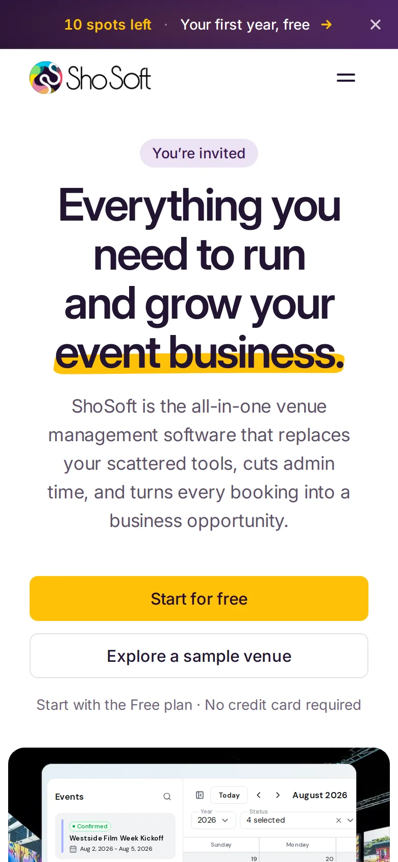
Then we gave phones and tablets a pass of their own. Every page had been carrying the job board's roles and the blog's text whether it showed them or not. Now each page loads only what it shows, and the scripts a phone downloads drop from 583 to 351 KB.
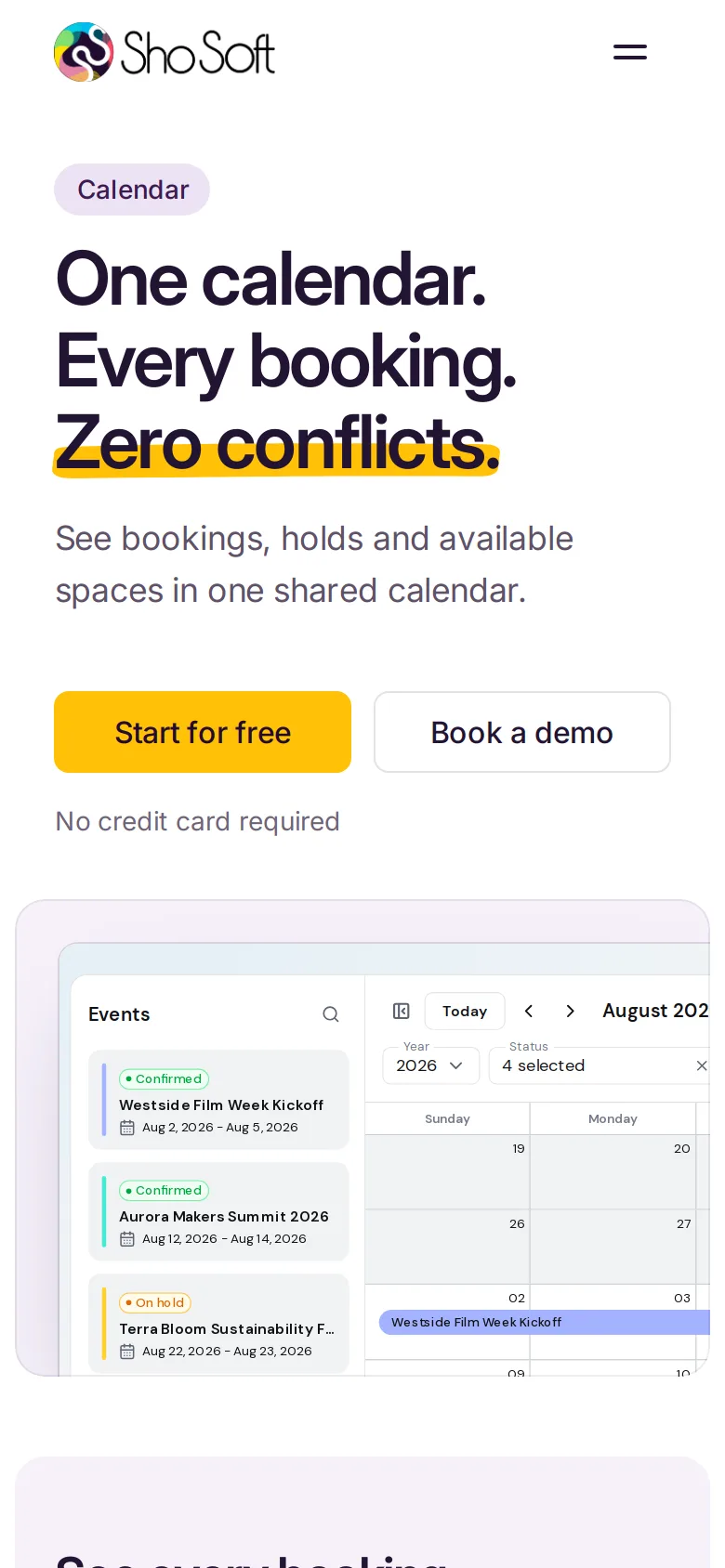
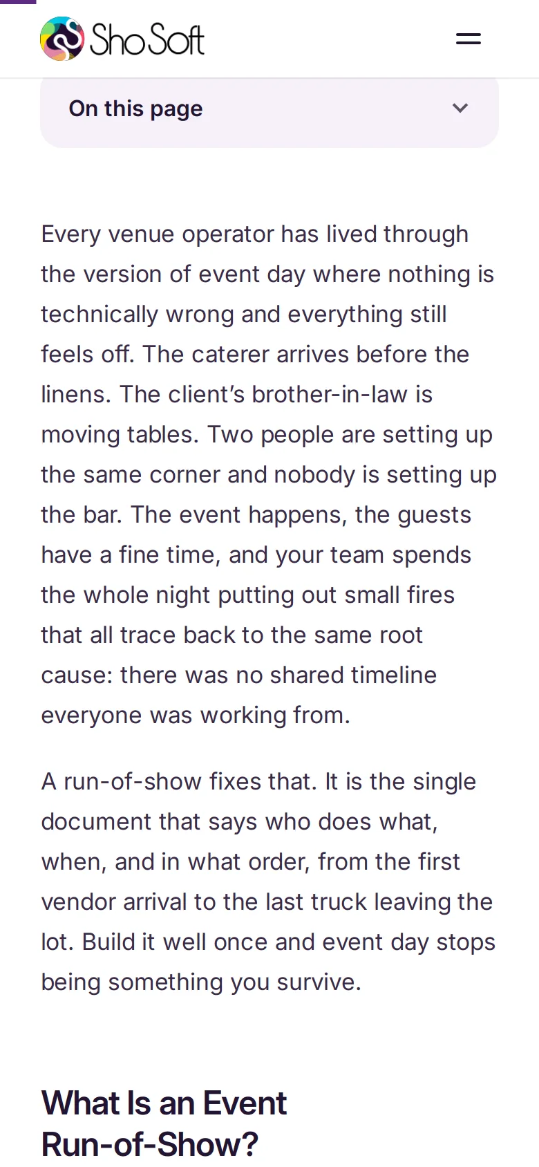
The same pass brought tap targets up to size without moving anything on screen. At 375 pixels wide, the targets smaller than 40 pixels fell from 1,379 to 105, and accessibility in Lighthouse stayed at 100.
What is next
The phone and tablet pass is ready to release, and it goes out next. After that the free tools go live, once ShoSoft signs off their numbers.
Very impressed, great work!