
ShoSoftApp redesign
ShoSoft app redesign
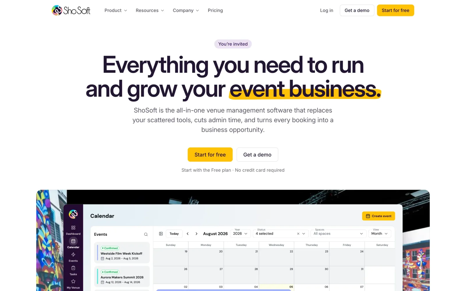
A calmer, faster ShoSoft 2.0, redesigned screen by screen without touching the API or the data.
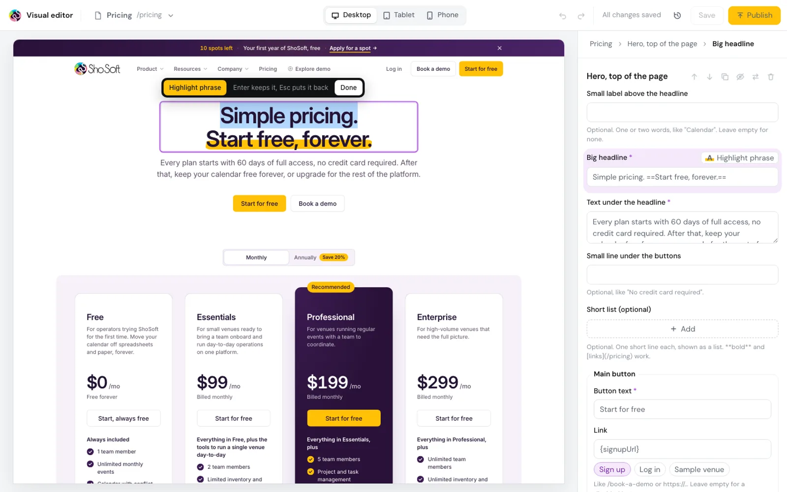
ShoSoft brought us in during May 2026 to work on AI onboarding and the website, and the brief also asked us to fix weak spots in the interface wherever we found them. Between onboarding, tutorial videos and testing, we spent months inside the app, so we found plenty.
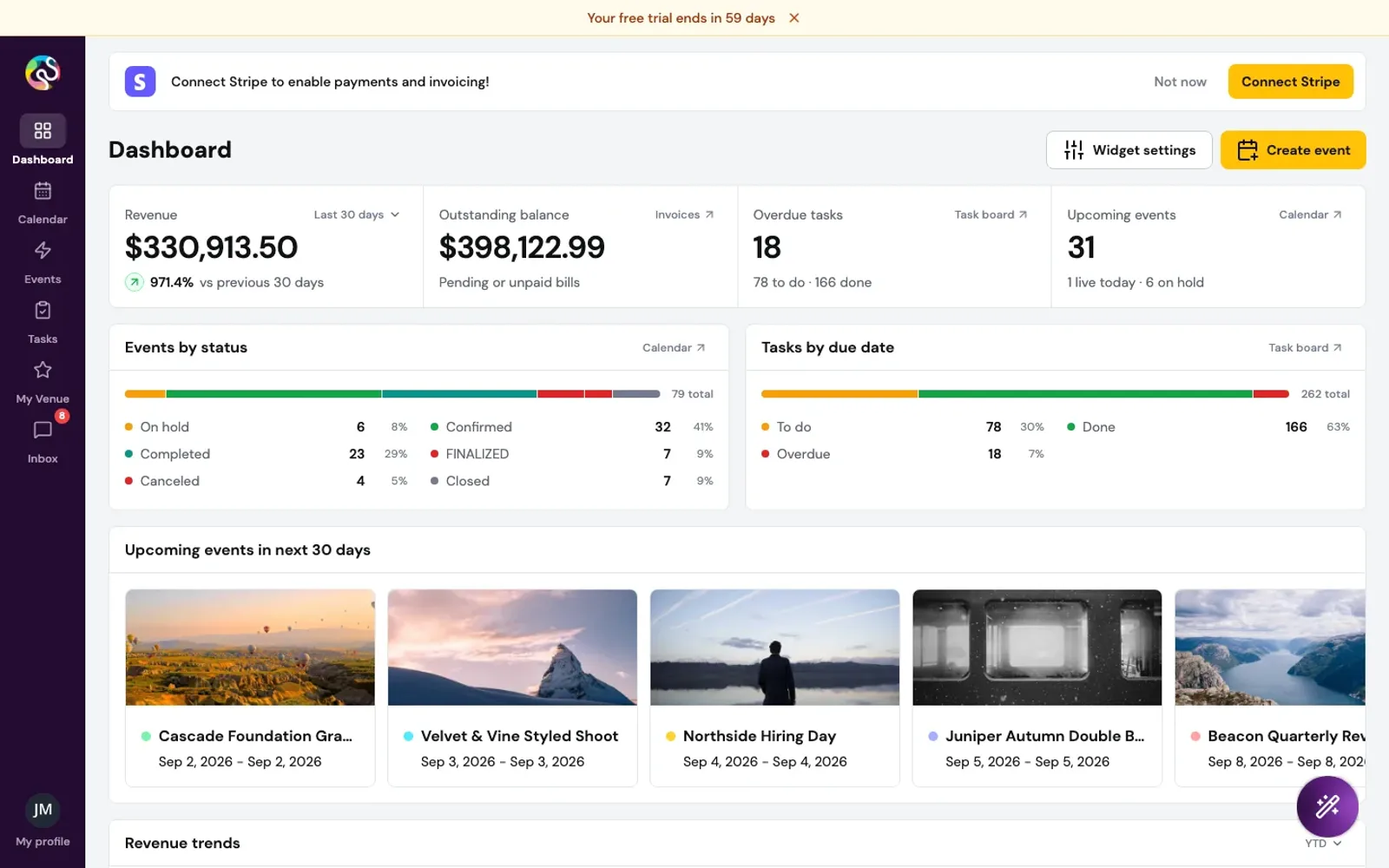
ShoSoft is one place for an independent venue to run its calendar, events, staff, inventory and billing. Version 2.0 had the features. It also had a shadow on every card, gradients, two typefaces, pie charts for four numbers and a dashboard that showed zero while it loaded.
At the end of August we set up our own copy of the whole app to see how far a redesign could go. On September 1 we set a tighter goal, a cleanup ShoSoft's developers could take in about a day, with notes they could follow step by step.
We did it in eleven passes over two days, across about 450 files, without changing a single request to the server. Then we kept refining it and packaged it as one pull request their developers can review and merge.
- 11
- passes in two days
- ~450
- files cleaned up
- 54%
- lighter first load
- 0
- API changes
just so much cleaner
What we did
- A private copy of the whole app on our own server, filled with made up venues
- A deep overhaul there first, to find the direction
- Eleven cleanup passes across every screen, pop-up and edge case
- One set of rules for surfaces, type, colour, radius and motion
- Real charts, a revenue line with a projection, honest loading states
- A Cmd+K search across events, clients, vendors and pages
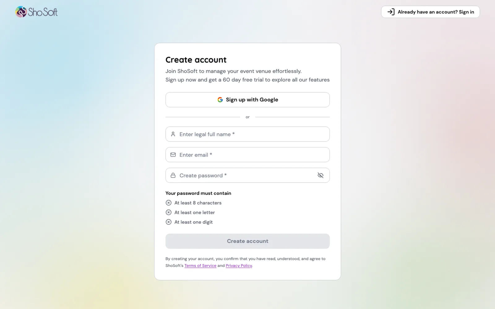
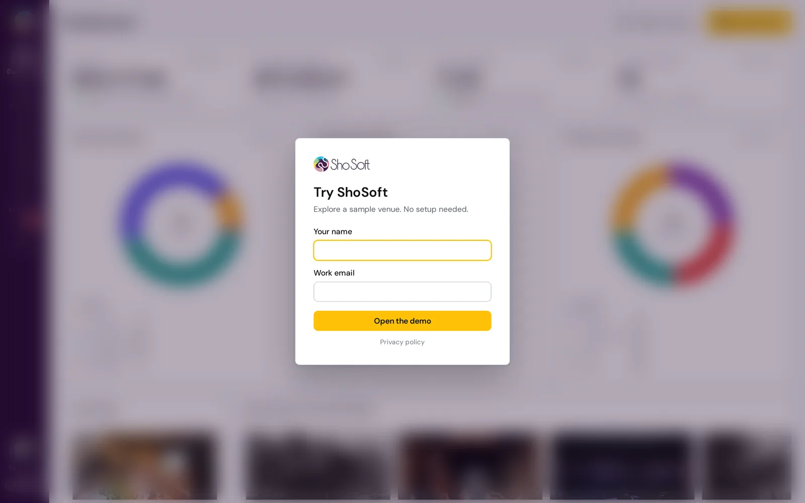
- New sign in, sign up and welcome screens
- A 179 page design record with before and after shots
- Refinement passes in October and one pull request, ready to merge
A copy of our own
We could not redesign a live product on guesses. So we stood up the full 2.0 stack on our own server, the front end, all ten backend services and a stand-in sign in, and filled it with a fictional venue called Fairlight Hall. Events, clients, vendors, crew, invoices and tasks were all made up, and all of it reset every 30 minutes, so nothing we clicked ever stuck.
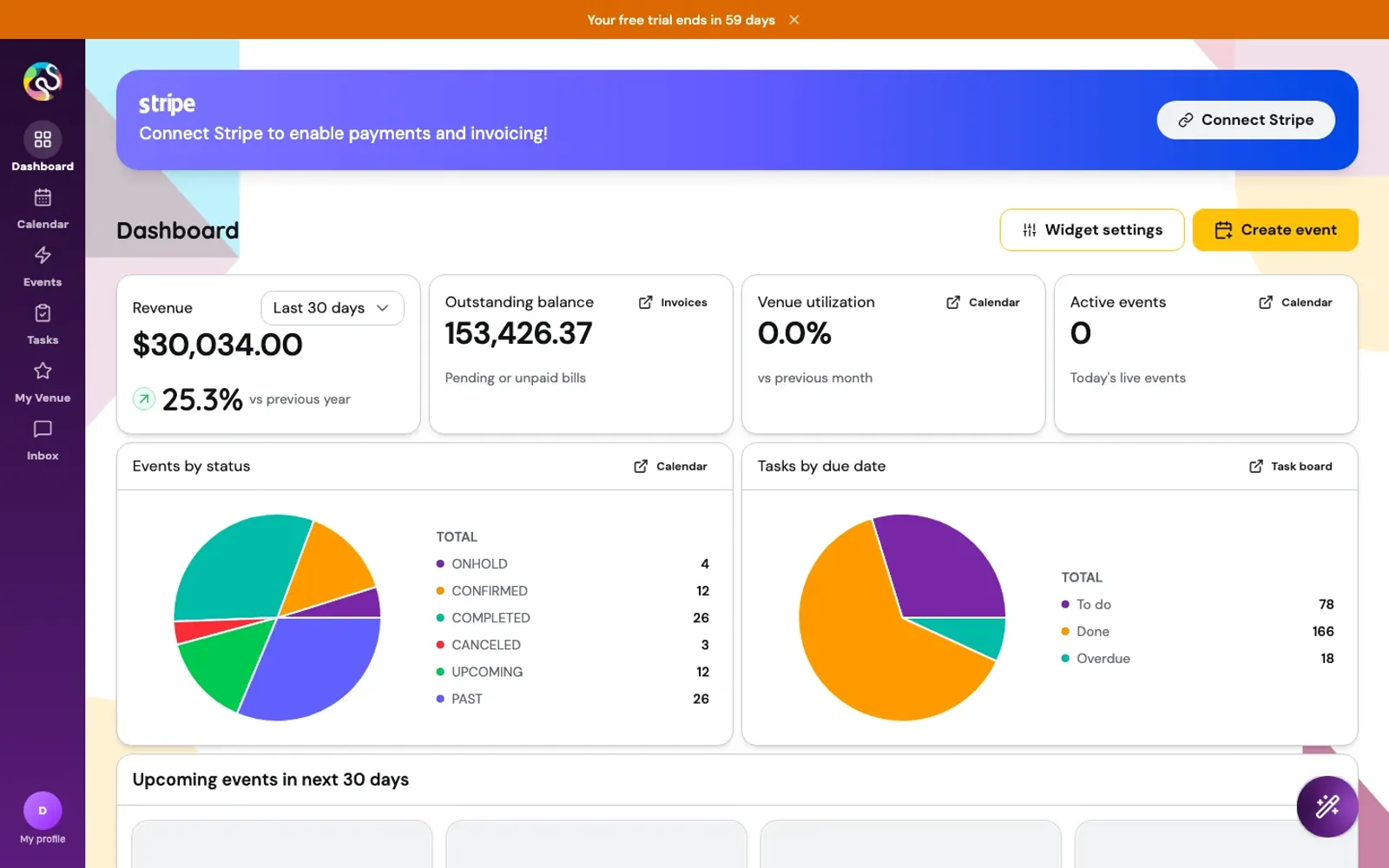
Real looking data showed us real problems. The revenue chart drew one bar because every invoice landed in the same month. Events by status counted 45 events as 83. Active events read zero on every day without a show.
An overhaul first, to find the direction
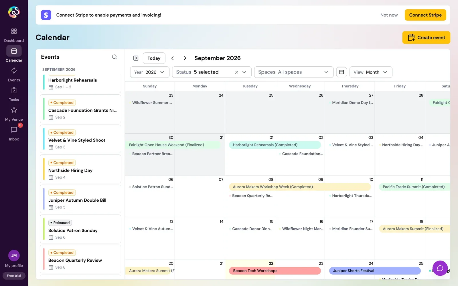
Our first pass was a deep overhaul on its own branch. We took every shadow off, cut the app to one typeface, built a new sidebar that collapses to a 64 pixel rail, rebuilt the dashboard around one band of numbers, and stopped the calendar from sliding open every time data arrived.
Search across the whole app
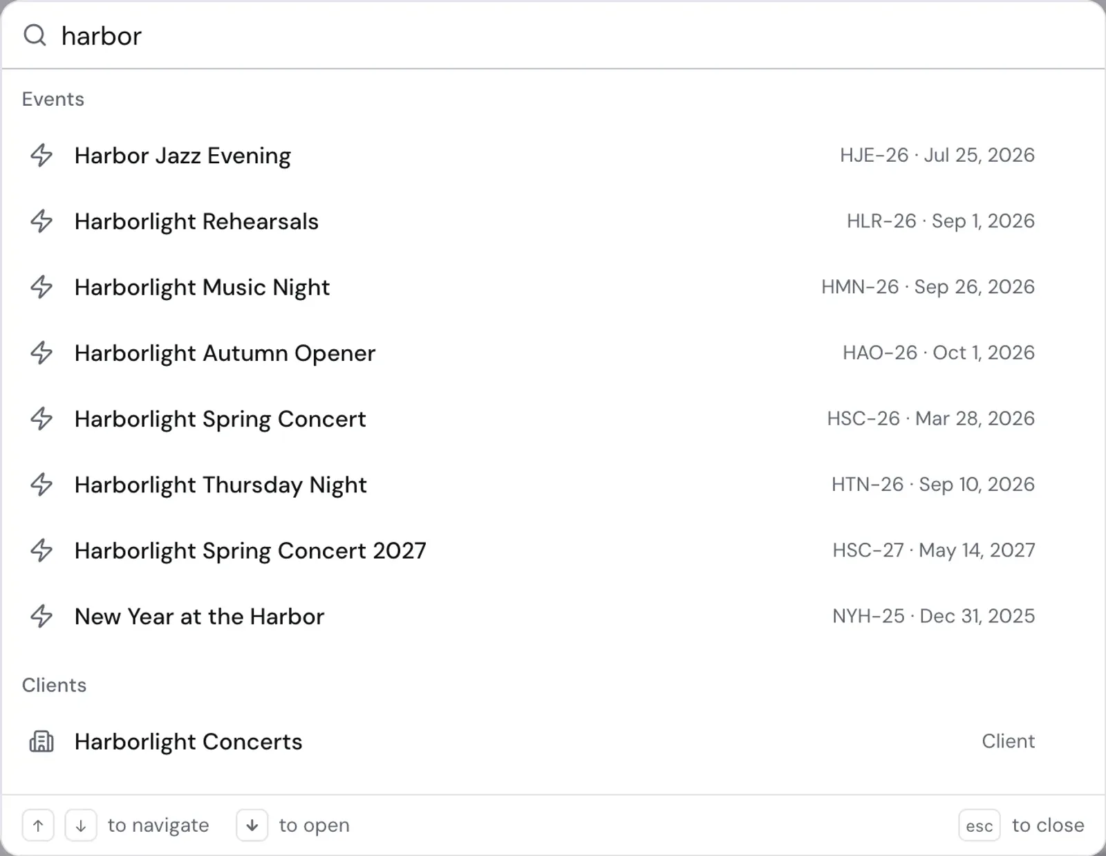
The overhaul also gave the app search. Press Cmd+K anywhere and one box finds events, clients, vendors and pages, ranked from exact match down to loose spelling, with recent picks first. Type "on hold" and you land on a filtered list of events on hold.
Eleven passes, without touching the API
The overhaul showed us the direction. The cleanup had to be something ShoSoft's developers could take as it was, so the rules were strict. No API contracts, no routes, no data models, no business logic and no new dependencies. Their package file stayed byte for byte the same.
That meant search and the page splitting stayed on our copy for now, since both reach past styling. Everything else the overhaul taught us went into the cleanup.
We reviewed each pass on the running app before starting the next. Surfaces and type came first, then charts and dialogs, then the insides of every pop-up, then tables, loading and the calendar, then labels and pickers, then sign in, and last the layers on top and the forgotten edges.
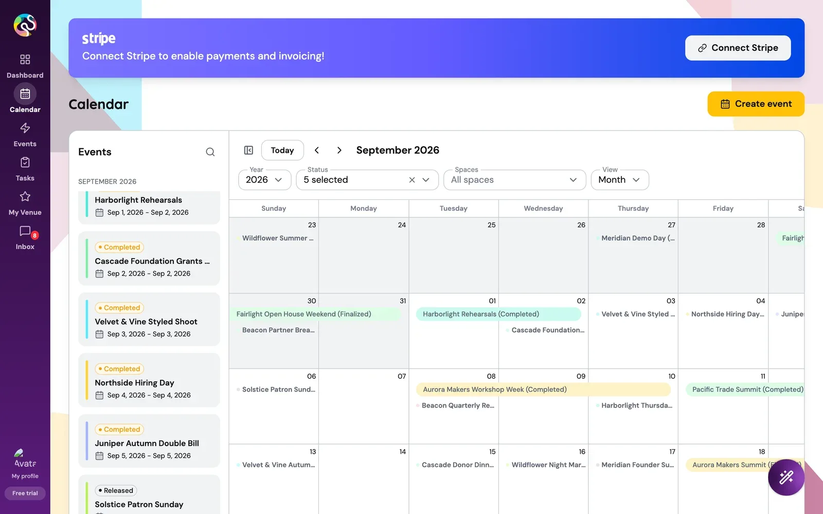
The eleven passes
- Flat surfaces, hairline borders, one typeface, denser layout (63 files)
- Revenue line with a projection, status bars, centred dialogs, 44 pixel controls (88)
- One recipe for every menu and dialog, a compact number band (71)
- Inside every pop-up, the create event wizard, aligned page headers (172)
- Tables that fit, calendar compact mode, loading flows, option dialogs (252)
- Labels above fields, rebuilt date and time pickers (71)
- Welcome dialog on the shared surface (2)
- One soft wash in the logo's colours behind the app (12)
- Welcome dialog restructured, a written design guide (5)
- Sign in and sign up in the app's own design (13)
- Chat widget, alerts, badges, error pages, print, storefront, dead pages (77)
The design rules
Cards and tables carry no shadow now, only a one pixel border on a pale grey page. Only the things that float, menus, dialogs and toasts, keep a soft shadow. There are no gradients on any surface, and one typeface, DM Sans, runs through everything.
Corners went one step tighter across the board. Motion has two speeds, 150 milliseconds for a hover and 200 for a panel opening, and nothing moves just because data arrived. Every colour comes from a token, never a raw hex value.
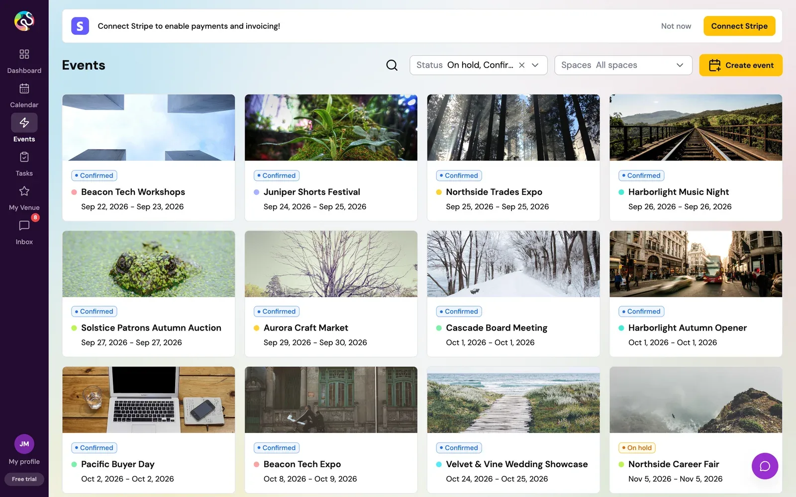
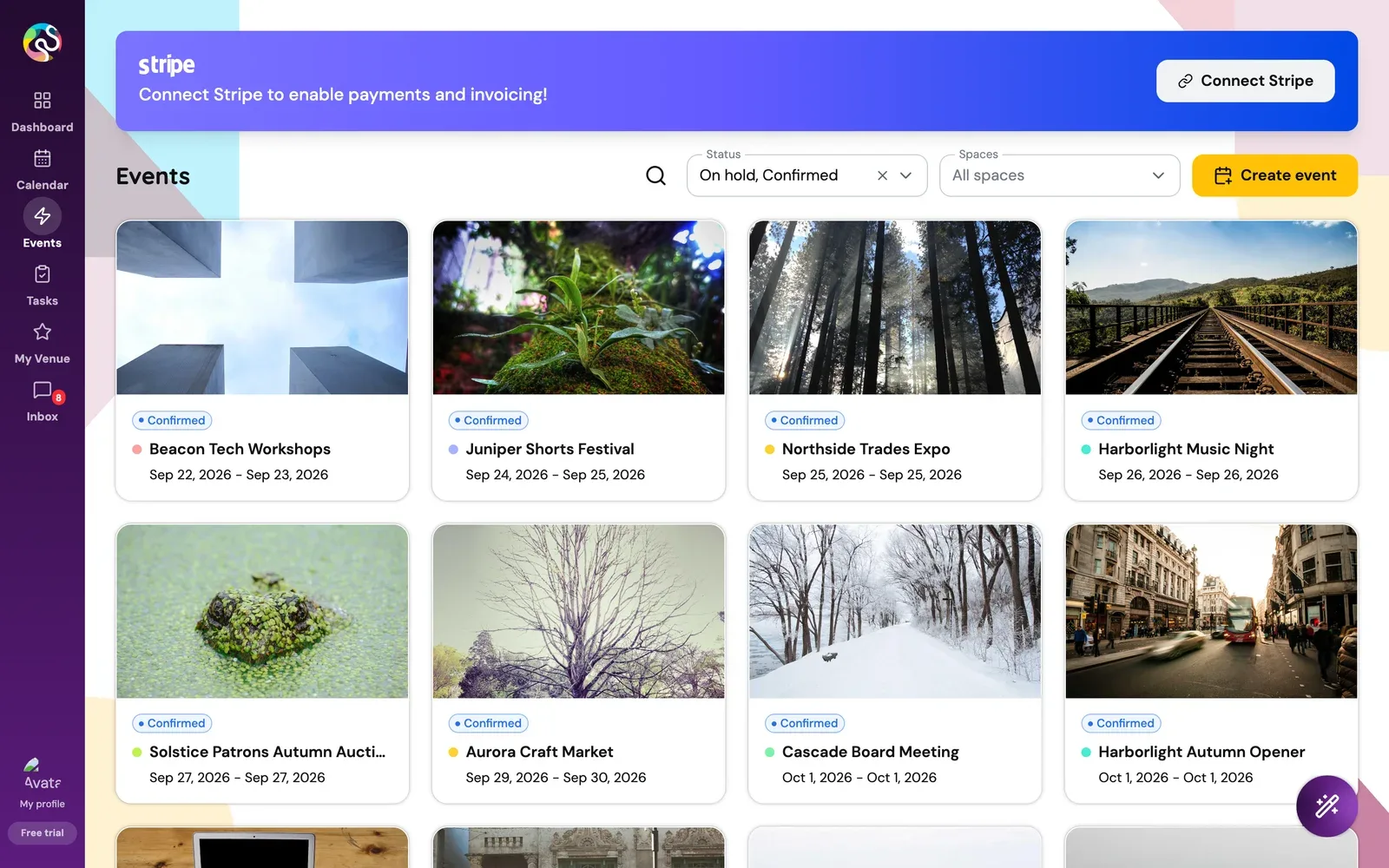
Charts that tell the truth
Pie charts for four values became one segmented bar with counts and percentages beside it. Revenue became a line, with a dashed projection drawn from the trend of the last six real months, and it refreshes every minute.
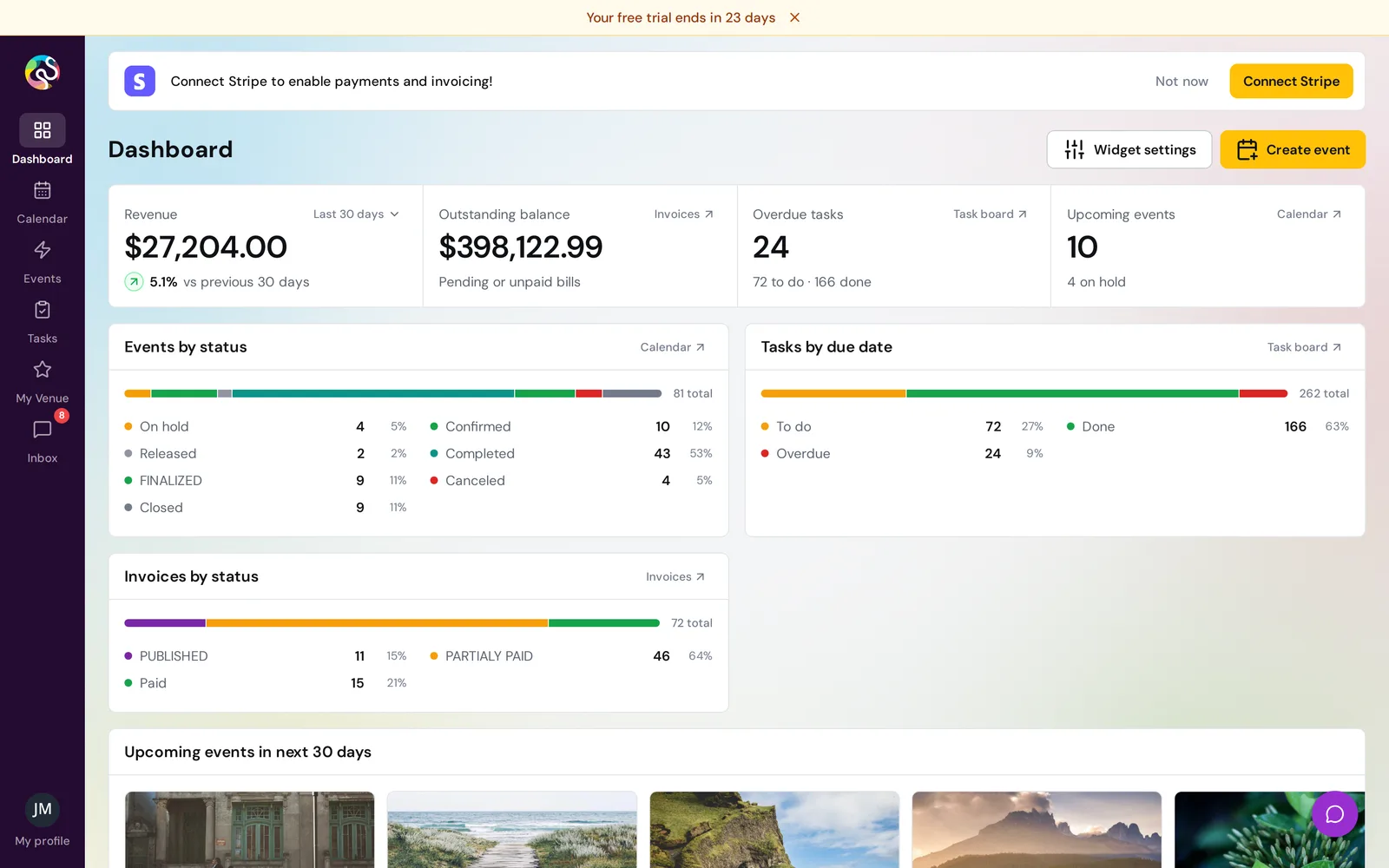
Every screen, every pop-up
Form controls were 56 pixels tall, with 51 places pinning that height. They are 44 now, laid out in two columns, with labels above the field instead of floating in its border. And 128 labels written as instructions, like "Select event day", became plain nouns.
Creation flows used to slide in from the right at a fixed height, so short forms came with a lot of empty space. They are centred dialogs now, built from one three band piece with the buttons pinned to the bottom.
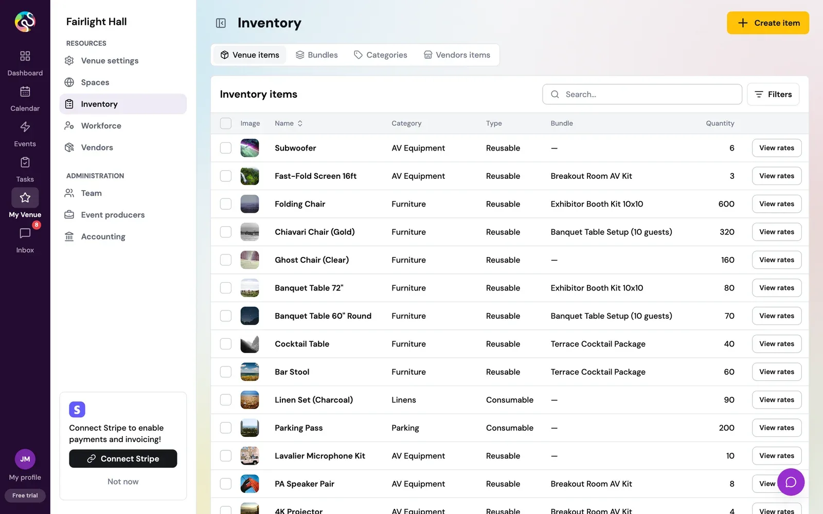
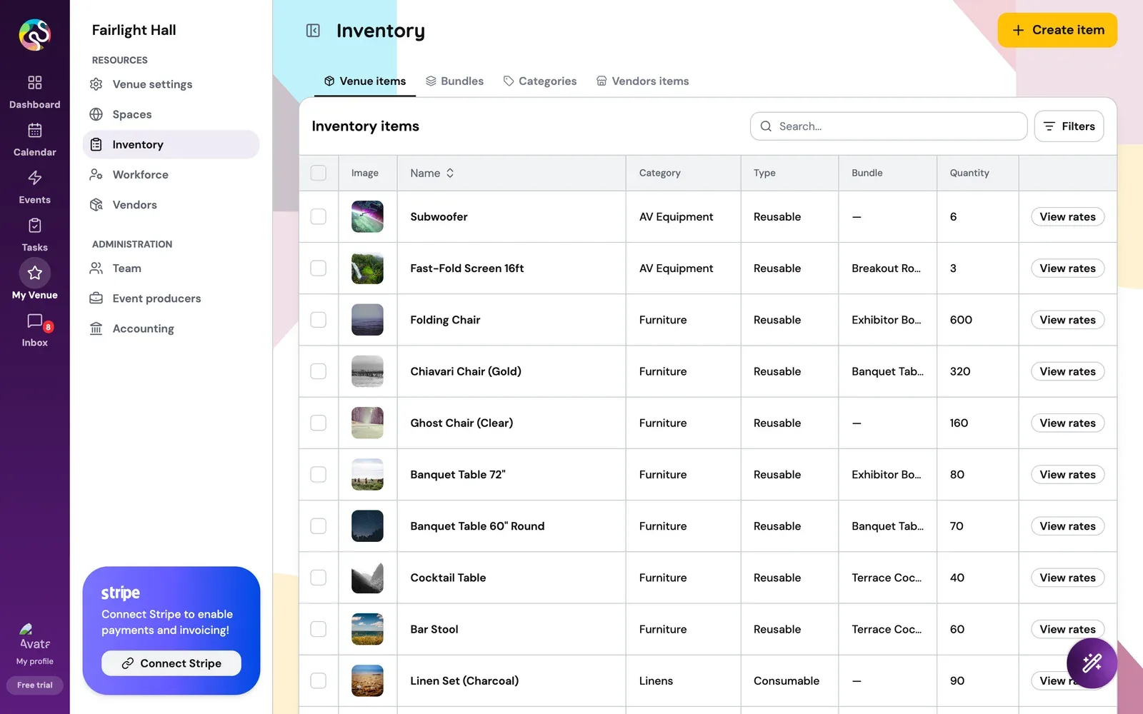
Tables fit the screen first instead of spilling sideways at 1280 pixels, with an Open button that fades in on hover. The calendar list is grouped by month and has a compact mode.
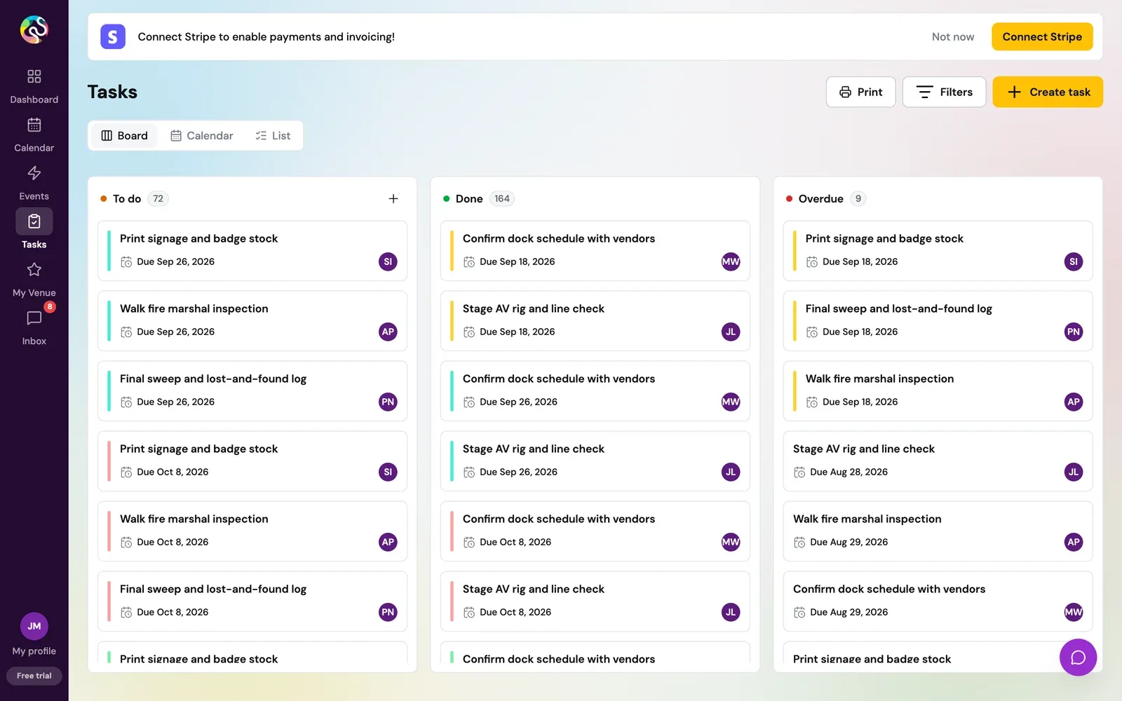
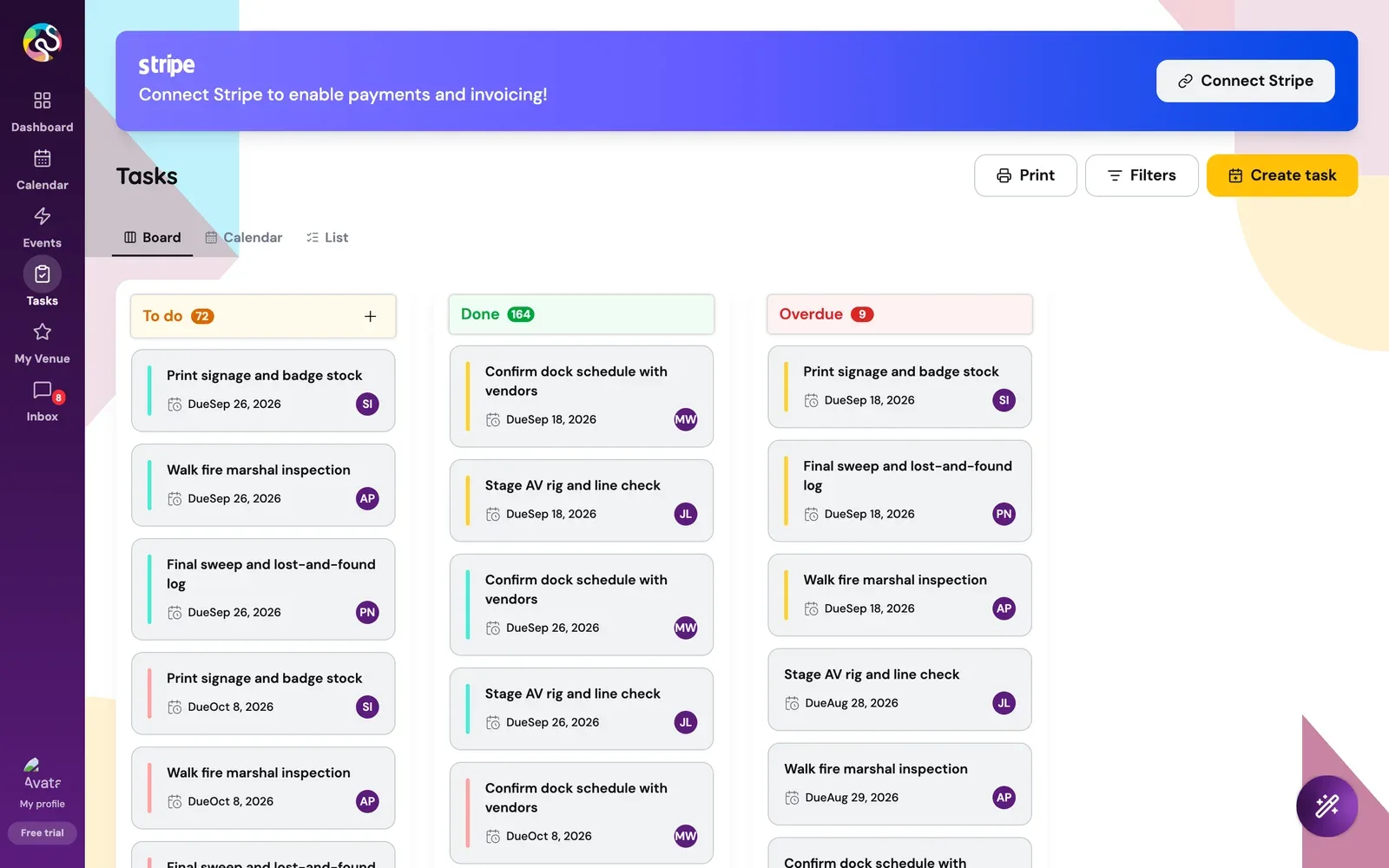
The last pass took on the layers most redesigns skip. The chat widget, the bulk actions bar, alerts, badges, error pages, printed documents, the ticket storefront and the exhibitor portal all moved onto the same rules, and six pages nothing linked to were deleted.
Speed, loading and access
On our copy we split the app by page, so the first download fell from 5.35 MB to 2.48 MB, 54% lighter. Like search, it stays on our copy for now, since it touches the routes.
Loading got honest in the cleanup itself. Numbers wait behind a flat placeholder the same size as the card, so nothing jumps. On a refresh the old value stays and dims instead of blanking, and a spinner only shows if the wait passes 150 milliseconds.
An audit of 129 findings covered the people a quick redesign tends to forget. The focus ring moved onto a colour you can actually see, drawers stopped opening unnamed to screen readers, and the app now honours the setting for people who turn motion off.
Written down so it lasts
Every pass shipped with notes. A 179 page record shows each screen before and after. A short design guide in the code says how a new screen should look. And a table lists the handful of places where the change goes beyond styling, so a reviewer never has to hunt for them.
Refined, then handed over
Their own code kept moving while we worked. In late September we brought the cleanup up to date with their latest staging build, kept their newer behaviour wherever both sides had changed the same screen, and checked the result in a browser.
In October we added refinement passes on pages, filters, consistency, motion, tab titles and plan cards, plus a smoother app load. It all sits in one pull request into their main branch now. It builds cleanly, and it carries 150 lint errors against 316 on their staging build, none of them new.
What is next
The pull request is waiting for their developers, who pick it up once AI onboarding reaches production. Requests from the September review, a personal task view, a task calendar and finishing a task from its row, are lined up as improvements of their own.