
VeckaProduct
Vecka
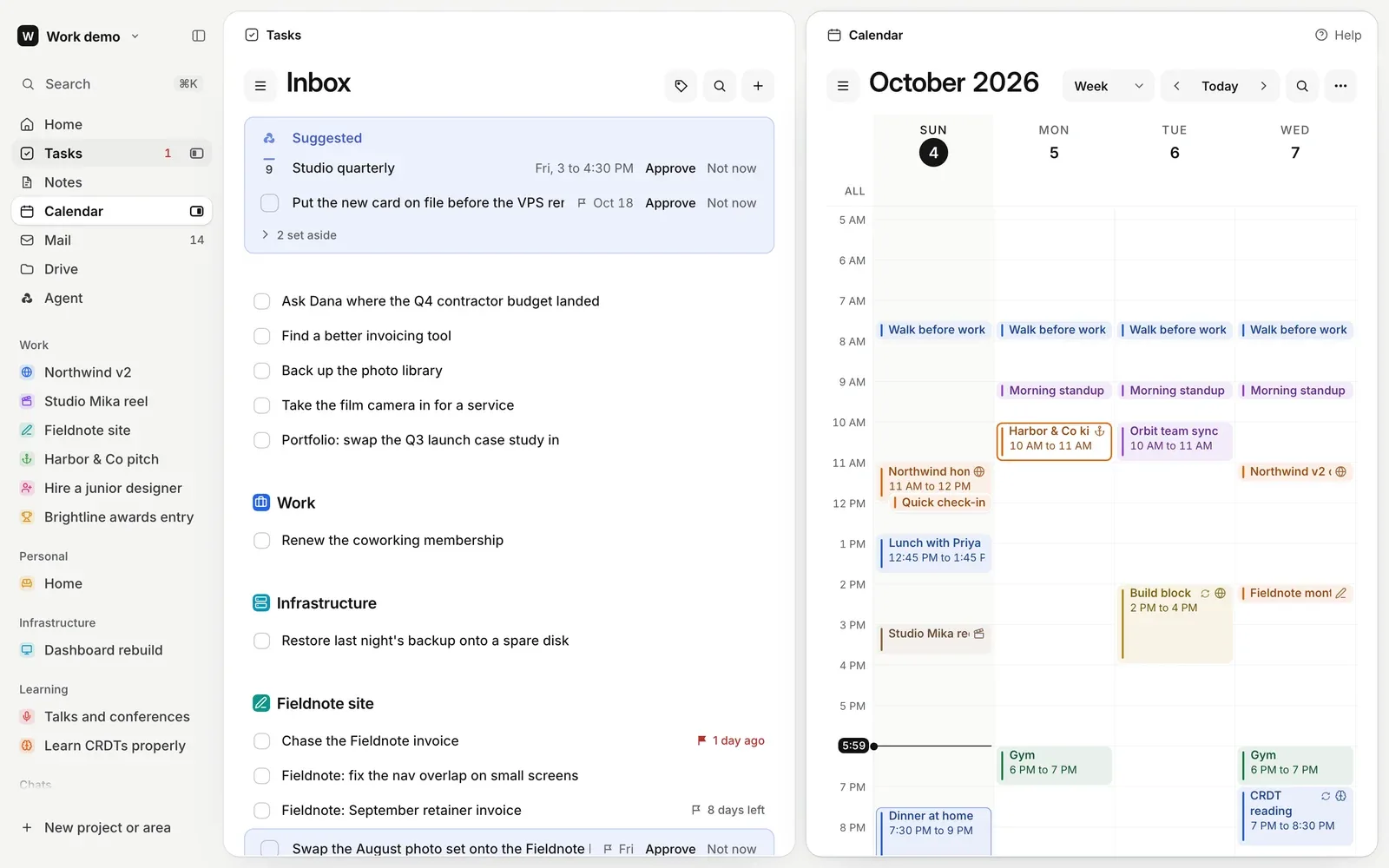
Tasks, notes, calendar, mail and files in one window, with an assistant that knows what you are working on.
A week of work is scattered. The to-dos sit in one app, the notes in another, the meetings in a calendar and the decisions somewhere in an inbox. None of them know about each other, and every assistant bolted onto them starts from zero.
Vecka is our answer to that. The name is Swedish for week, which is what all of those things add up to. We set out to put them in one window, side by side, and to give that window an assistant that already knows what you are working on.
So we designed and built the whole product. The app, the mail client, the files, the assistant, the homepage, the demo and the tools that keep it all honest. It went live at vecka.ai at the end of August and we have kept refining it since.
- 625
- test conversations
- 8,212
- unit tests passing
- 1,026
- browser checks
- 24 KB
- homepage script
What we built
- Every app in one window, any two side by side
- A full Gmail client with Google Calendar alongside
- An assistant that acts through the same code as your own clicks
- Mail, events, to-dos and files that file themselves into projects
- Drive, with notes Vecka keeps for every folder
- A light and a dark theme, and a phone layout that feels native
- The Gather mark, chosen from three directions
- A prerendered homepage with a scroll story, SEO and an llms.txt
- A public demo with four invented people
- An operators' portal that cannot read anyone's content
Where it started
Vecka began life as the workspace inside a larger dashboard. By the end of July it had outgrown it, so we pulled it out, gave it a name and a home of its own, and rebuilt the front end as a single React app.
From the first screen we held it to a few rules. Calm, white and mostly ink, with colour only where it means something. Real data or a dash, never a made up number. Each fact stated once. And a new feature should look like it was always there.
Two apps, one window
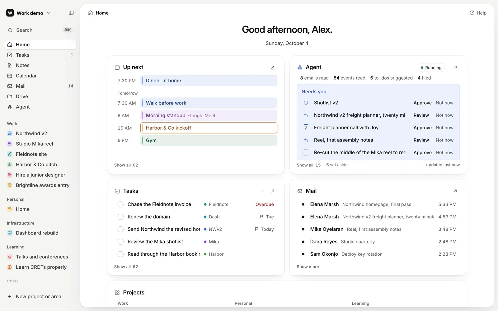
The heart of Vecka is the split. Drag any app out of the sidebar and it opens beside the one you are in. Drag it back to close it, or across the seam to swap sides. The layout follows your hand while you drag instead of waiting for the drop.
We spent a long time on how that feels. An open glides in 160 milliseconds. Each pane keeps its width when it changes sides. The divider answers the keyboard, two percent a press and ten with Shift, and a double click brings it back to even.
When a pane is resized, its layout glides from one width to the next instead of popping. The calendar stands still under your hand rather than stutter, and a test samples every frame of every split motion to catch a single step out of place.
Mail that knows where it belongs
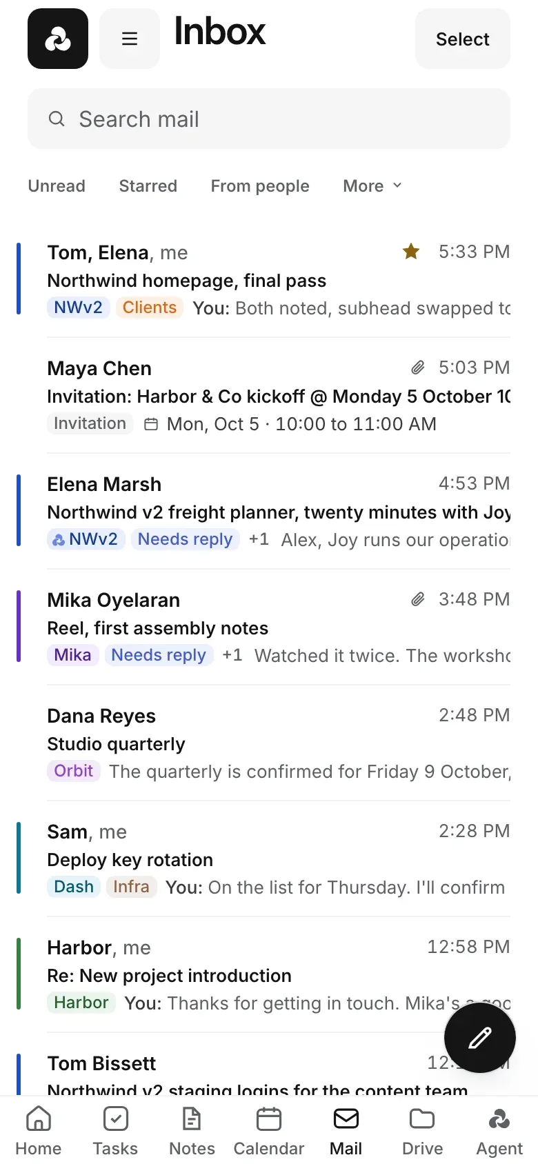
Mail is a full Gmail client, with threads, labels, search and a composer that docks in the corner of its own pane, so the inbox beside it stays live. It reads like the rest of Vecka, one quiet row per conversation.
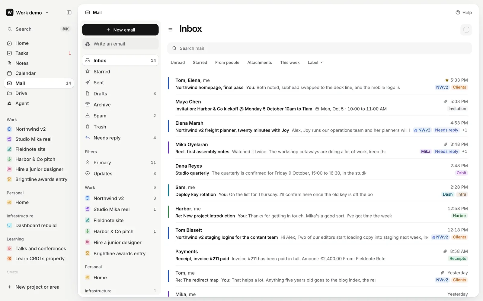
The part that took the most care is filing. Every email gets one request to a small decision model, asking several questions at once. Which project it belongs to, which filter, whether a person wrote it, whether it needs a reply, and whether there is a to-do or an event inside.
Vecka only files when the answer is confident twice over. A strong first answer is checked by a second, smaller question about that one project. Anything short of that becomes a maybe, a faint pill you confirm with one press or wave away.
Your own filing always wins and is never decided again. What Vecka filed shows as a blue pill, and its menu leads with Not this project. Events, to-dos and files go through the same engine. Notes and chats never do, because they are your own work.
Tested against strangers' inboxes
A model that files your mail has to work for inboxes that look nothing like ours. So we wrote a benchmark of 625 invented, hand labelled conversations from twelve kinds of people, among them a nurse, a parent, a landlord and someone writing in Spanish.
Every change to the mail model runs through it, path by path and person by person, and ships only if it helps or holds. Where a score leans on a larger model acting as judge, we say so, since that measures agreement and not perfect truth.
The model sees as little as it can. Never an address, never an event's date or time, and links cut down to their host. Settings says exactly what goes out.
Tasks, notes, calendar and projects
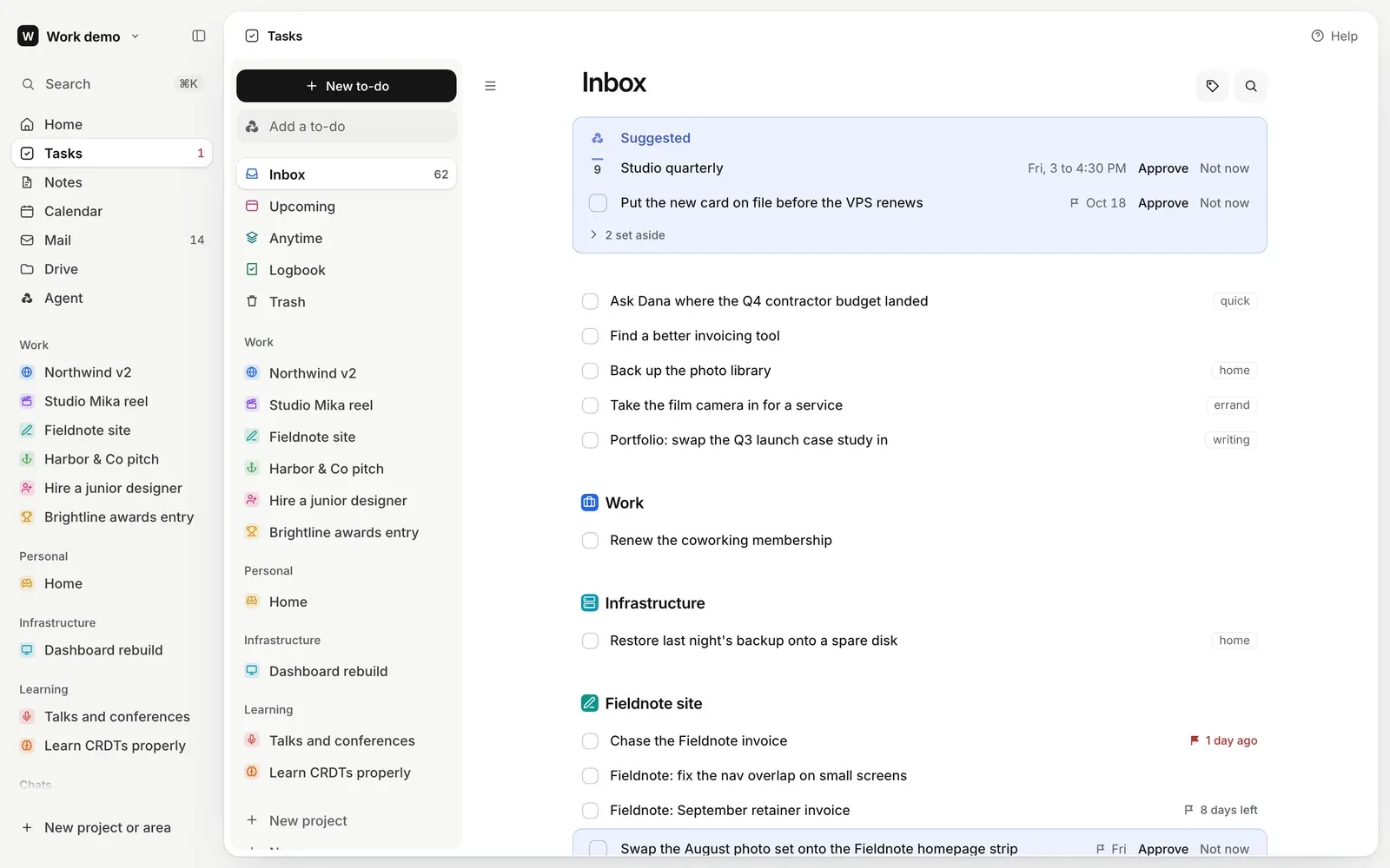
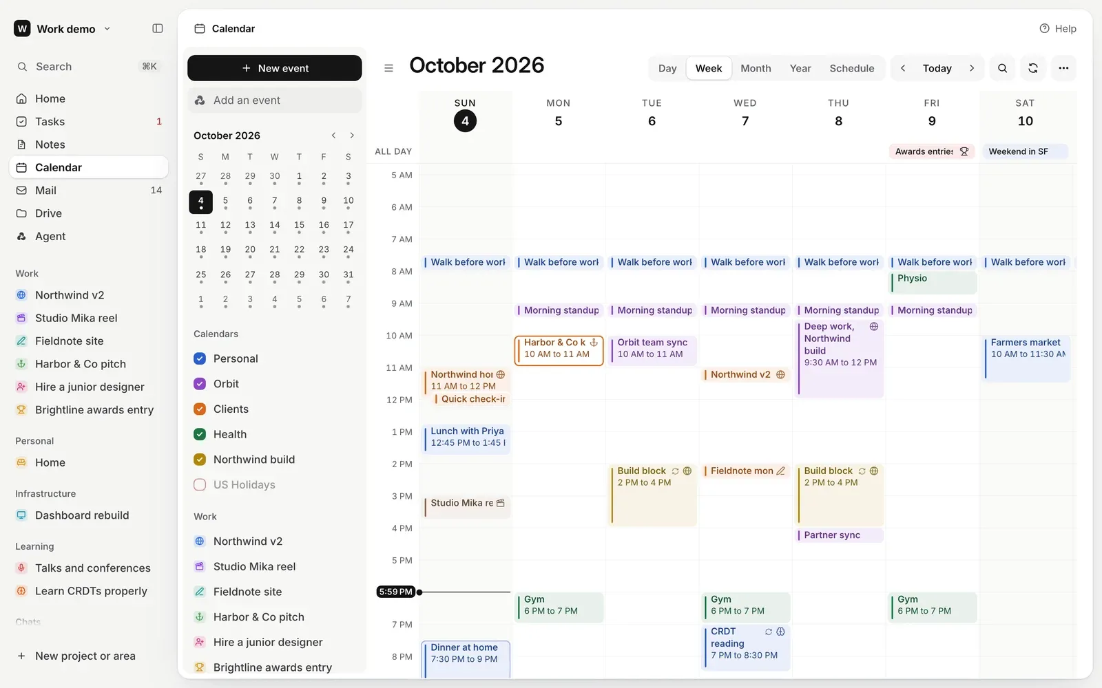
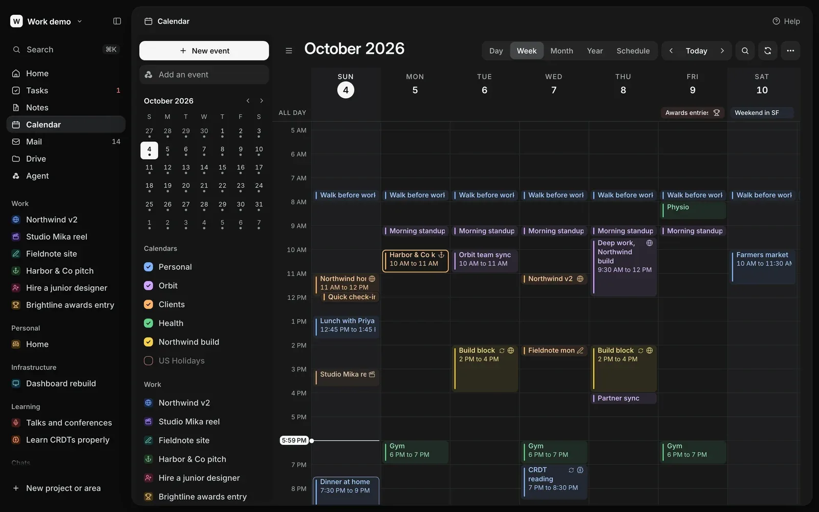
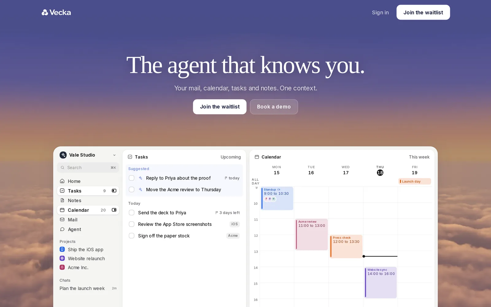
Every app follows the same anatomy, so learning one teaches you the rest. Tasks has projects, areas and tags. Notes is a block editor. The calendar does day, week and month, with Google Calendar connected.
Changes made in Google Calendar arrive as they happen over a live stream, with an hourly sync kept as a safety net. A project gets a page of its own, gathering its tasks, mail, events and files with what the agent knows about it.
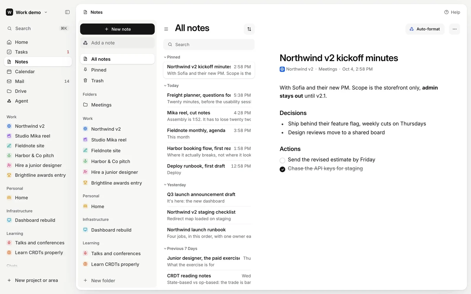
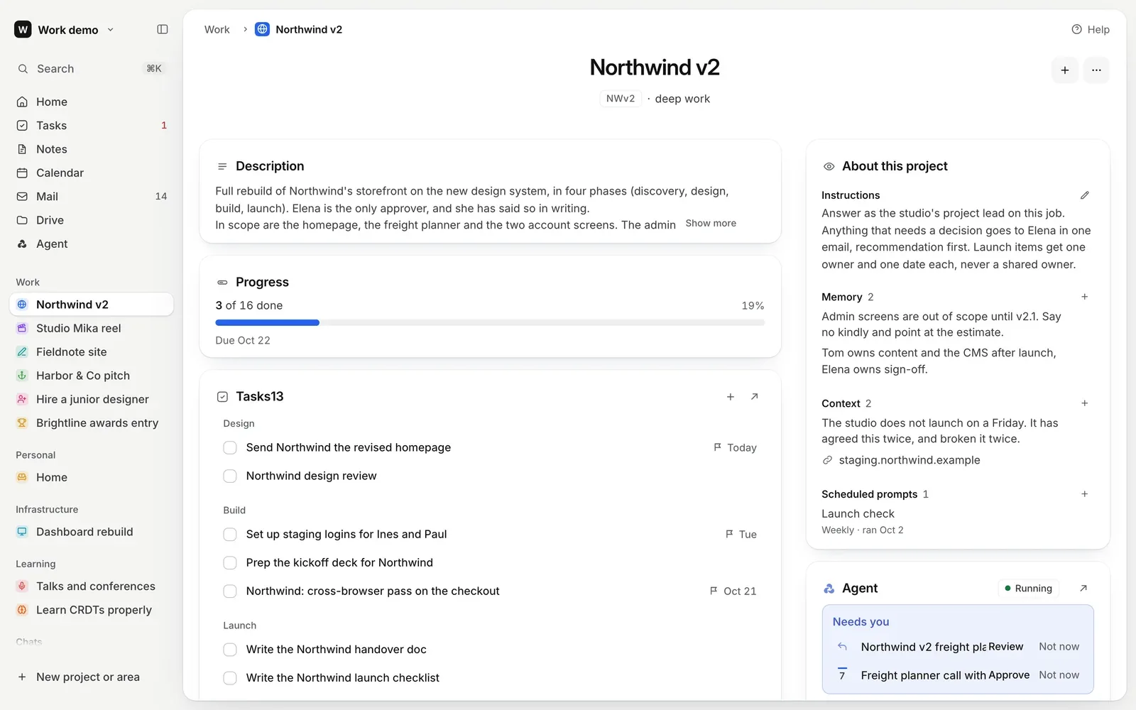
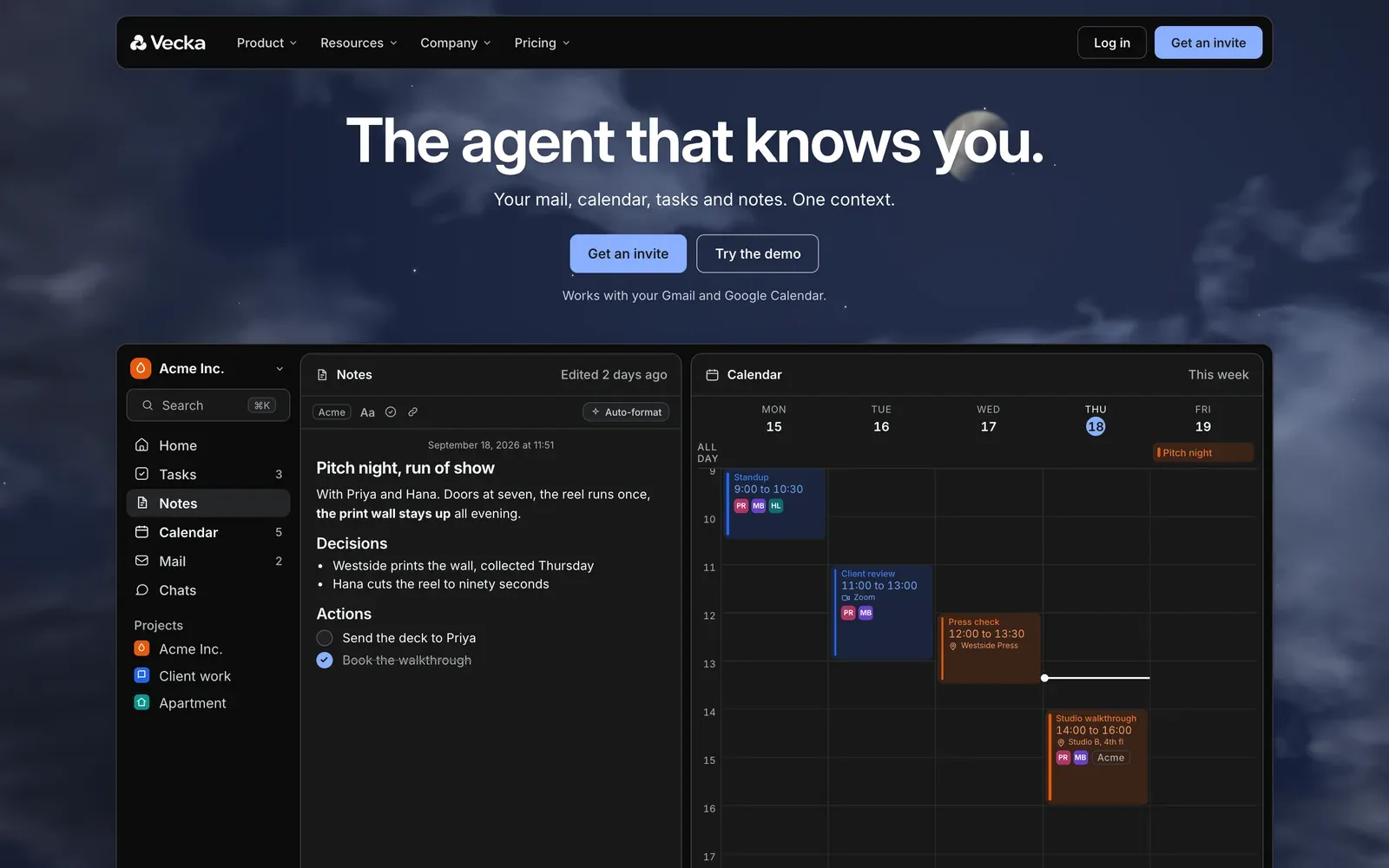
Dark mode is a design of its own, a neutral near black with a near white accent, never a tinted blue. Drag the handle to compare.
An assistant you can undo
The assistant reads through tools on the server, but every change it makes runs in the browser, through the same code your own click would use. So whatever it does lands in the same undo history. It can ask before acting, accept edits, or work on its own, and you choose which.
Saying no is gentle too. Not now folds a suggestion into a set aside list that keeps it for thirty days, and Restore brings it back and takes back what Vecka learned from the no. A yes leaves a quiet done line with Undo beside it.
Drive came last and fits the same mould. Files live in folders that follow your projects. Vecka reads what you drop in and keeps two short documents in each folder, one for you and one for the agent, drawn in blue so you always know what it wrote.
On a phone
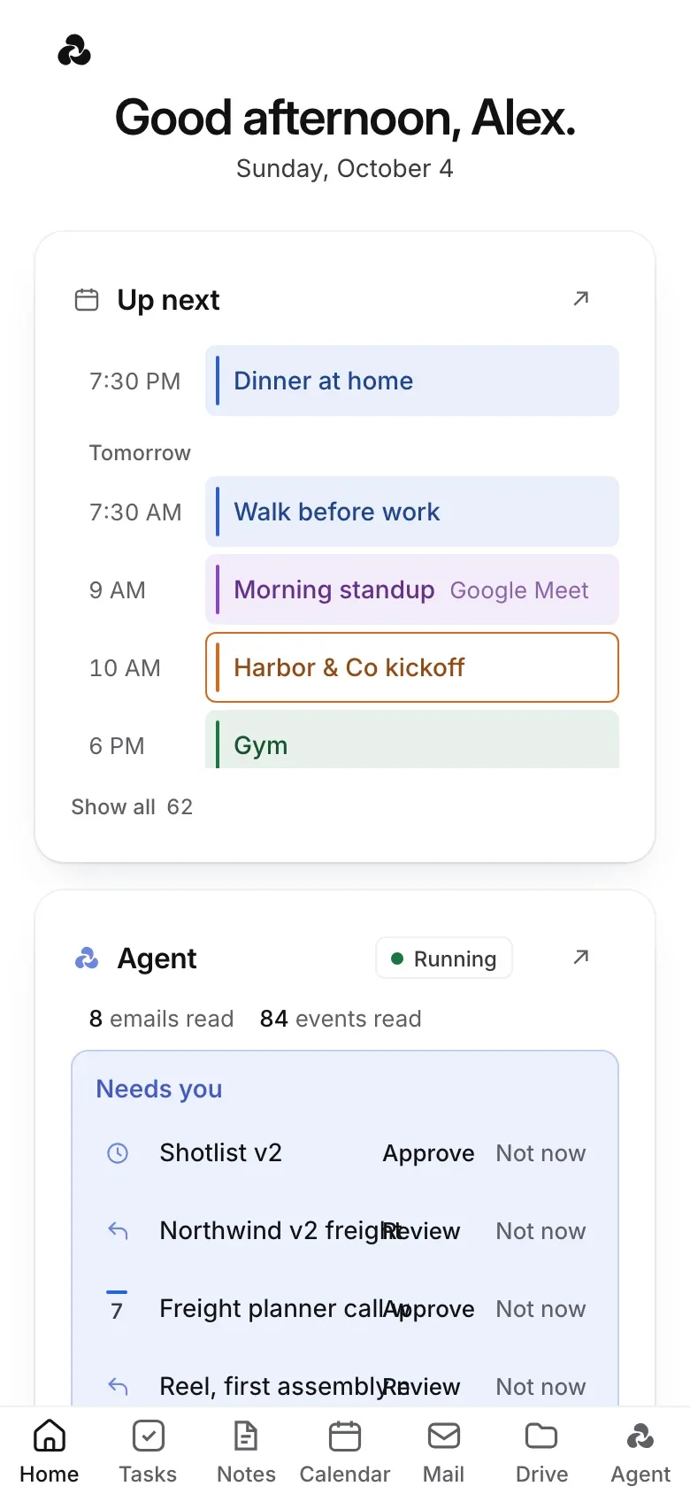
On a phone Vecka is laid out as a native app, with a tab bar for every app and the same rows, pills and marks as the desktop.
The mark
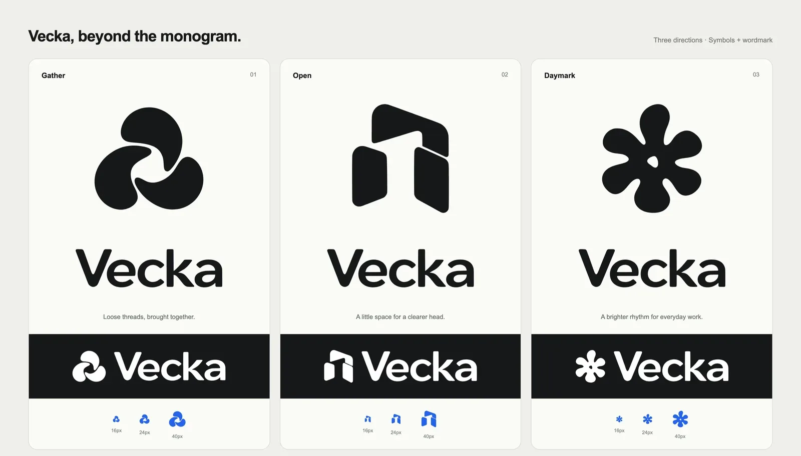
We drew three directions for the mark. Gather, three rounded forms around an open centre. Open, three panels around a passage. Daymark, a six lobed flower. At sixteen pixels Gather kept its opening best, and it became Vecka.
The same mark stands for the assistant everywhere it suggests or does something. While it works, the three petals drift out and gather back in turn, one slow wave every two seconds.
A homepage that tells the story
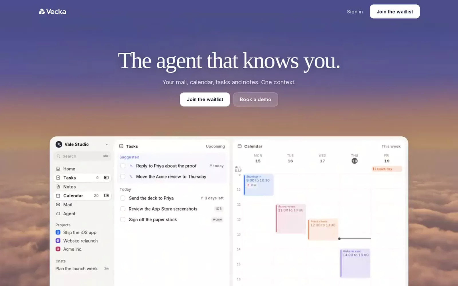
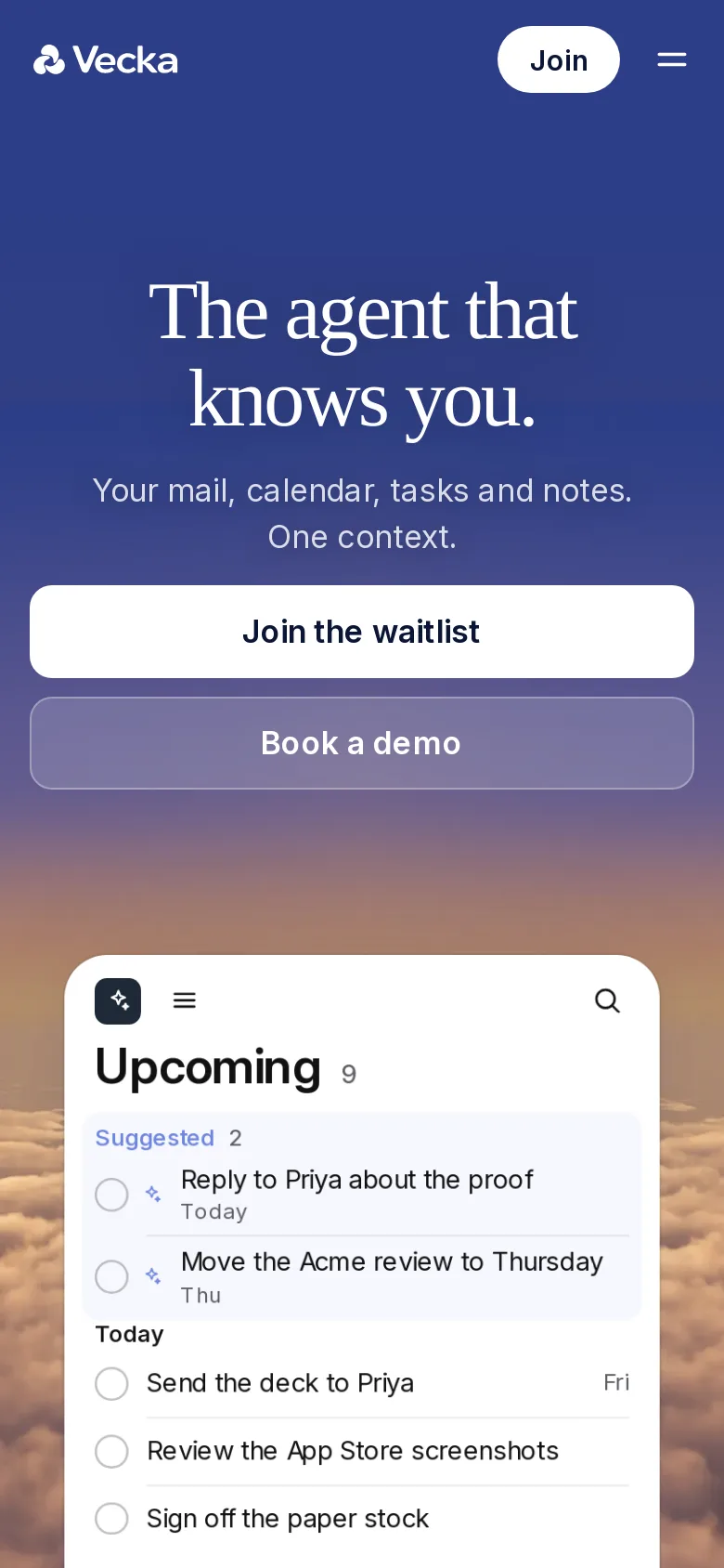
The homepage opens on a dusk sky. As you scroll, sheets of paper and app cards fly in from every edge, shrink into the window and become rows in it. The window fills to a busy, believable day and ends on the app's own split, opening a project.
On a phone the sheets are sized for the small screen, fewer of them fly, and nothing animates a blur, since that is what flickers on iOS. If a visitor prefers less motion, the page simply rests.
Fast, and easy to find
The homepage is written in React but prerendered at build time, so its first paint is plain HTML and it is complete with scripts off. A small bundle wakes it up in the browser at about 24 KB compressed instead of about 77, because the heavier version put the page about 570 milliseconds behind on a mid range phone.
Search engines get a canonical address, a sitemap, rich link previews and structured data that describes Vecka as a product. Answer engines get an llms.txt, a plain summary of what Vecka does, which we rewrote at the end of September to say only what the code actually does.
Built to be checked
Anyone can try Vecka at demo.vecka.ai. Pick one of four invented people and you are inside a full workspace with a history behind it and a plan ahead, on a throwaway account that is cleared after a week.
For the team there is a portal with accounts, feature usage, AI spend and the health of the server. It cannot read anyone's content by construction. Its answers are built only from counts, sizes and dates, and a test plants recognisable text in every document and searches the whole portal to prove none of it escapes.
Nothing ships without the gate. Type checks, the unit suite, the build and a browser suite against a real server, then live probes. The release at the end of September passed 8,212 unit tests and 1,026 browser checks.
What is next
The assistant is where the work is now. Memory that learns who you are, a reply queue that knows what actually needs you, and mail that files itself into the right project more often and more surely.